Home
Home

 Artists
 Search
 Recent
 Random
 Posts
Posts
 DMs
DMs
 Tags
Tags
 Random
 Importer
 Import
 FAQ
FAQ
 Account
 Register
 Favorites
 Login
Login

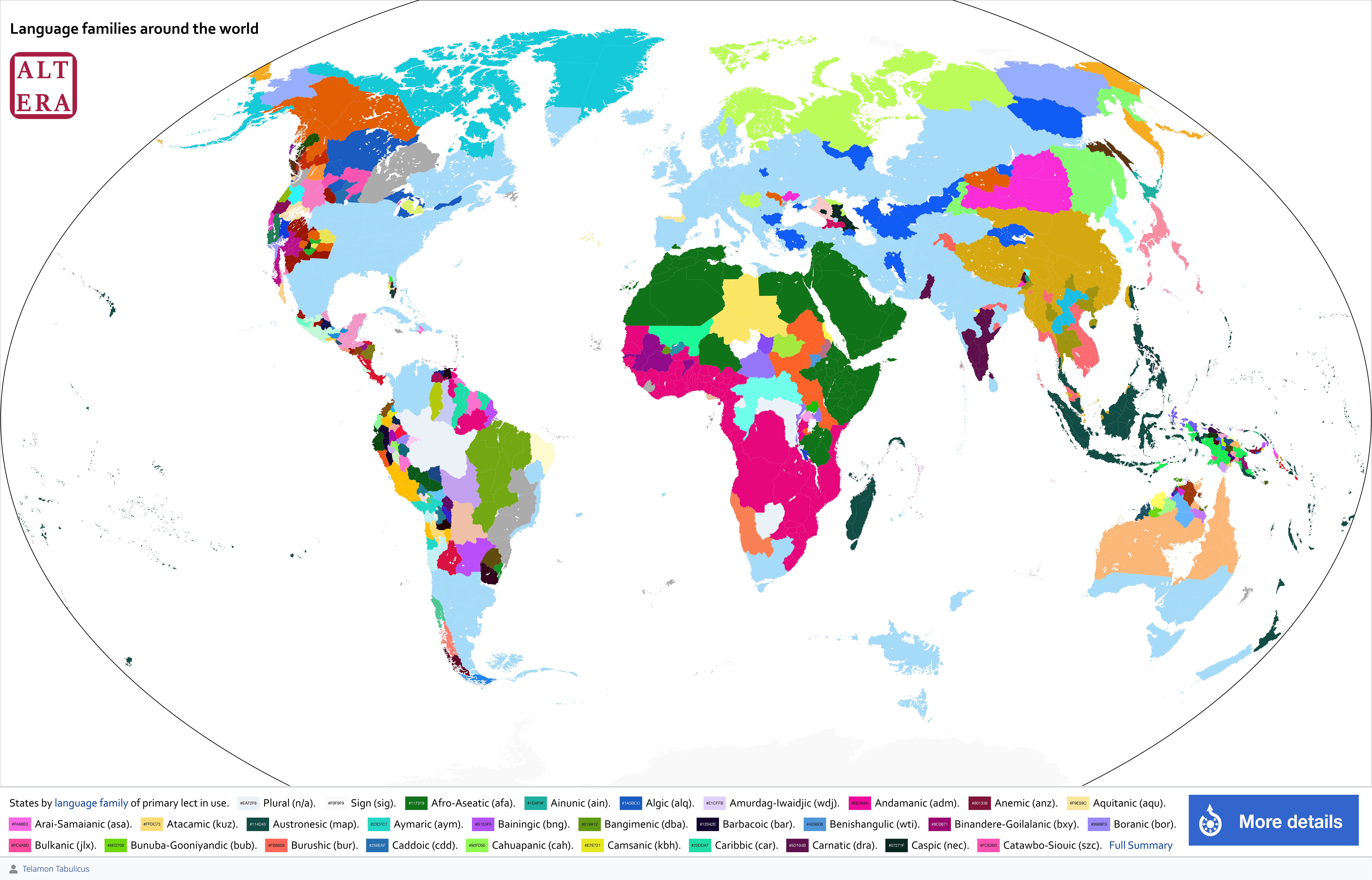
How many language families of Altera can you identify? (Patreon)
Content
Over the winter break, I was busy testing out my coding method for my Wiki-style maps. I finally was able to figure it out and produced this language family map for Altera!
This map (view full size here) is based on the primary language used by a state. There are over 200 represented here (hence the colour theory nightmare). I should note that in our world, only about a dozen language families can be represented on the political world map.
I also revamped the website to better organize the information I want to share there. Check out https://www.atlasaltera.com/language-families for a full legend of the language families on this map. I was inspired by the Periodic Table for the aesthetics.
For those interested in taking a closer look, all the linguistic data for Altera has already been released on Patreon (Armchair Academic tier and above) through the GaiaPolyglotta spreadsheet. I have updated the GoogleDrive link with an new version for those who already downloaded the spreadsheet. Please refer to previous posts for the download link.
We're currently working on a fully interactive version for a better way of exploring the content here, though the long term goal is to port the whole project to GIS and a full database.
On a more personal note, I've been itching to share this as I worked to fix all the glitches over the winter break. I have not been able to fully imagine what the language spread of the world I created until now, when I generated this map with my data set. So although this map doesn't look like much, it's a bit of a personal milestone!
PS: yes, there are new additions/countries on this map from the update that I am releasing later in January. Consider this a sneak peak / first look.
Files