Home Artists Posts Import Register

Content

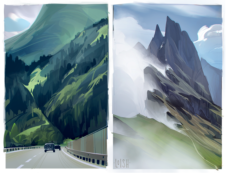
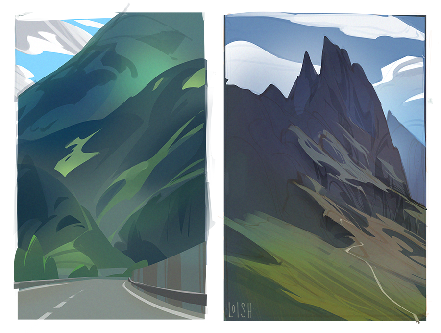
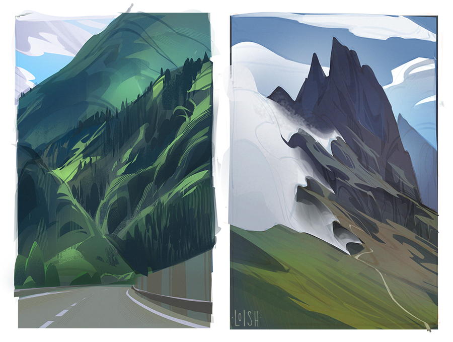
I felt it was time to dive back into some environments! I still have this goal to find a workflow for landscapes that allows me to really show the sense of scale and volume that I feel when I am there. But I don’t really feel like I’ve found that workflow. I struggled a lot with these - there was this constant tension between wanting to use simple stylized shapes, and wanting to add the detail necessary to give it a majestic feel - and one approach kept weighing down the other. Gotta keep practicing and searching for the technique that will help me convey what I’m aiming for!

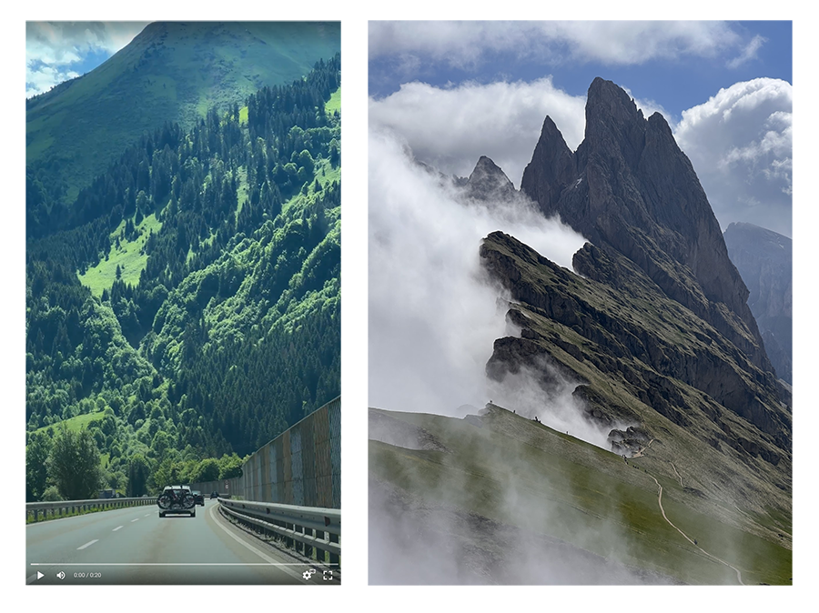
These are based on images I took on my vacation in the Italian alps, ref is included above!

Files

Comments

Anonymous

Gorgeous as ever!! I haven't been to mainland Europe in so long 😢😢 I just recieved your new book too! What a delight! 💕💕💕

salomon varela

The same thing happens to me when I draw, even sometimes I forget the technique since sometimes I improve it or because I'm a detailer I lose shapes or results that I liked more (seeing the process), this illustration thing apparently becomes somewhat indecisive to obtain results that are often liked by experimenting or adding ideas, there are endless ways to please our demanding mind, by the way that tour was great, and being honest (and with shame I say it) I took some screen shots of the shots you made for studies and shared them in the fb group, but I couldn't organize my time at work and time at home, apart from the fact that I also hoped in those days that you would bring out your magic and combine wonderful ideas , your teachings are very special to me, I appreciate all that, in fact right now I was looking at your instagram (again) since your first images, everything is great and I apologize for not putting a like on all the posts when I see them but to be I would give love to all your gallery and maybe it will become spam but as I said a while ago, I appreciate what you teach us, greetings, greetings ✨🙌🥰💜🧡💚💛🖼 Pd i use Google 😊😅

Anonymous

I know you’re not happy, but I think the one on the left captures a lot of what I like in the reference. It might have lost some of the vibrating green feel of the reference, especially in the areas that are almost inside of a fresh lime color… but overall it has a very similar mood and intensity. I like that you didn’t shy away from trying to use all those greens. A lot of the time artists dodge green in landscape art, and it can wind up looking a bit weird. The right one, I can definitely see why you’re unhappy. It does not have the same KA-pow feeling the reference gives me. The reference is very very high value contrast, and it’s just loaded with hard edges everywhere, even in the clouds. It’s a great photo! I can see the photo is in color, but it almost has the intensity of a black and white ink drawing done with tools that only allow hard edges, no soft. Both reference images are very high energy landscapes, I really like them. I hope you will keep trying to catch that energy in paintings.

Anonymous

Ah I love when people include references in a post, it helps so much to understand how some things are interpreted by the artist 😍 Really hope there’ll be a timelapse post for these pieces, your environmental studies are so enlightening. I learn so much from each one!

Anonymous

These are beautiful! I get what you mean with the sense of scale - my battle is often with photographs though, trying to get that ~feeling~ when you're totally in awe of just.... How HUGE these mountains are, and they are just mountains in a bigger world, and the world is in an even bigger universe.... It's such an awesome feeling and I feel like it's so hard to capture in any form because for me it's being there that creates that sensation of scale...? Whereas when you flatten it it takes that away a bit. But, either way, I think with the cars driving one it does come across! Maybe in the misty mountains a more obvious/contrasty person silhouette (I missed them the first itme round) to really get that sense? But in terms of majestic I think it conveys that feeling of wonder, at least to me :)

FaroreNightclaw

I think the left one, with the cars, carries the sense of scale pretty much perfectly. Putting all the details in the middle distance seems to really help with making things look Big. I think part of your problem with the right one is that the reference photo doesn't really have the sense of scale either. Your first pass, without the fog/cloud, looks Big, but in both your art and in the reference photo, the big simple shape of white/grey takes away a lot of the look of majestic size. It's also taken head-on instead of looking up at the mountain as the left one is. I don't think it's a fault of your art to be missing out on that size appearance on the right one, I think the issue is with the ref. You did just fine with the left one! Literally the only thing I would consider changing is that you lost some of the saturation between the middle stage and the final, and the ref photo is super saturated. But that can be really hard to manage with greens in art, and it looks great anyway! Good work!

Anonymous

Wondering which digital landscape artists inspire you the most, or right now?

Loish

definitely angela sung, as well as justin oaksford and john park!

Loish

thanks for your detailed reply! i have indeed noticed that in order to get a sense of scale, you really need to have some reference point there. and the perspective needs to suit the subject. there's so many factors that influence it!

Loish

yes that makes sense! the people in the second photo are so tiny that you barely see them. they're like ants. and somehow that totally doesn't register to get a sense of scale from it.

Loish

yes! i think that i need to keep trying and eventually i'll find a workflow that 'clicks' for me and makes things possible. green is a tough color for landscapes, it very quickly looks toxic or fake somehow and i'm always looking for good substitutes. but it is also one of my favorite colors and can be so lush!

cloudie s

Oh, I'm in love with the colors of the one on the left!

Anonymous

I just saw your tutorial of the landscapes and it helped so much (like all of them). 💗 And everytime I see your landcapes i am impressed and getting so much inspiration and help for my own process. But I totally understand the self criticism and the urge to develop skills - i am a master at it😁😁

Anonymous

Really something I needed to see. :D

Anonymous

I really love your landscape illustrations and sketches. I was looking for a tutorial but cannot find one, although Gianni is mentioning it in one of the below comments? Could you please share the link(s)? Many thanks 🤗

Loish

no problem! here's one of them - https://www.patreon.com/posts/tutorial-44069788 - and here's the other which is specifically about procreate - https://www.patreon.com/posts/tutorial-drawing-59043003