Home
Home

 Artists
 Search
 Recent
 Random
 Posts
Posts
 DMs
DMs
 Tags
Tags
 Random
 Importer
 Import
 FAQ
FAQ
 Account
 Register
 Favorites
 Login
Login

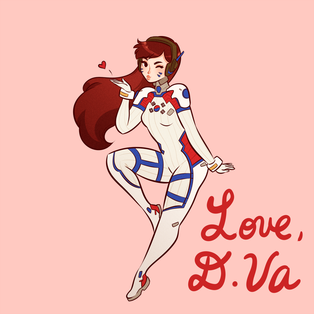
TUTORIAL TIME let's color some ladies~ (Patreon)
Content
Welcome back to my Patreon and happy Friday! :D As you may or may not know, I was recently commissioned by Blizzard to create illustrations for their Overwatch anniversary celebration! I drew all 24 characters and you can find a compilation post of them here that @BatsDontKill was kind enough to put together! I'll be making my own compilation post as well, I've just gotta figure out how to properly arrange all of them. ^^;;
To be honest this project was incredibly time-intensive and I didn't have long to work on it, which is why I was scant with my Patreon posts. But now that things are completed I'd like to share my process with you! Before I even did anything digitally, I did gesture sketches of all the characters on paper with pencil. Here's one of the pages that include the sketch I did for D.Va:

Can you tell who the characters are based on the gestures? I find that's one of the best ways for me to tell if a pose works. If their personality comes through in the sketch, then I know I've stumbled on something worth expanding on. As you can see some characters required several goes before I settled on a sketch I liked. If you don't think it comes out right the first time, no worries, just keep trying till you find one that you like! ^^
After I decided on a sketch I liked, I drew it up in Paint Tool SAI. The star of today's tutorial is none other than the wonderful, the lovely, D.Va. <3
Step 1) Gesture sketch

I pretty much just copied the pose I drew on paper and used it as the base for the rest of my drawing. I prefer keeping gesture sketches loose and full of movement so I have room to pare it down if needed.
Step 2) Rough sketch

I drew in my sketch taking care to focus on major details that are essential to recognizing the character. I don't bother with extra lines at this stage, just a sketch to lock in the character's pose and personality.
Step 3) Inking

I easily spend the longest time on this stage. I like my lines very clean and very crisp so I'll often redraw a stroke several times until I'm happy with how it looks and flows. It can be painstaking, but I always feel like it's worth it when everything's done. I try to draw my lines quickly and smoothly to prevent any bumps or curves that can make the line look wobbly. Caveat: this isn't THE way to do inks, just a personal preference! ^^
Step 4) Flats

This step is pretty straightforward, I flat the colors on separate layers. For example, hair on one layer, skin on another, blues on another...It just keeps things organized and makes it easier when it comes to shading. This way I can lock the transparency on say the hair layer and do all my shading and highlights without having to worry that I'm going into other parts of the drawing. ^^
Step 5) Shading the face

I always start with the face, I don't particularly know why. Just out of habit I suppose! Like I mentioned previously, I lock the transparency on the skin layer and add in shadows/blush with multiply layers. I like using the blur tool on the cheeks to make the blush look like a natural flush. :3
Step 6) Shading the hair

Speaking of coloring the skin first, I always then color the hair second...truly a creature of habit...I lock the transparency on the hair layer and add in shadows with multiply layers. With hair I like to add a gradient using a multiply layer that adds in shadow toward the bottom that lightens as it moves upward. Of course this gradient is dependent on the light source, so if the light were coming from the bottom then the gradient would come in from the top of the head and fade out as it moved downward. I also like to add in subtle highlights using a luminosity layer. ^^
Step 7) Outfit details


Remember how I said previously I don't focus on small details in the rough sketch? It's because I like to add them in when I'm coloring because I feel like it makes the lineart look less cluttered. By reserving these intricate, but important details by using lighter colors I can retain a level of complexity without making the drawing feel overwhelming or look too heavy. I added in the stripes on her bodysuit using a multiply layer on the flats.
Step 8) Finishing touches

At this point I'm done with coloring, it just comes down to color balancing and photo editing. I save my file as a transparent .png and open that up as a new file. I add an overlay layer on top to balance out the colors and add an overall warm feeling. The last step is a gradient multiply layer that starts at the bottom and fades out as it moves up. Doing this helps add some dimension to the character so it doesn't look too flat or lifeless.
And that's it! I followed this exact same process for all 24 characters. I had a lot of fun working on this project and drawing all these characters that have a special place in my heart. ^^ I hope this was helpful or interesting, let me know if you have any other questions! :D
Thank you all so much for your support, I'm incredibly grateful for the opportunities that you've helped me achieve. I've got a lot of fun art (more Overwatch stuff!) coming your way so stay tuned for that! Until then have a lovely day and we'll chat soon! ^^
Love,
Vicki
Files