Home
Home

 Artists
 Search
 Recent
 Random
 Posts
Posts
 DMs
DMs
 Tags
Tags
 Random
 Importer
 Import
 FAQ
FAQ
 Account
 Register
 Favorites
 Login
Login

#2簡易添削(simple correction of illustrations) (Pixiv Fanbox)
Content
今回添削を希望されたのはwillowさんです。
willow asked me to feedback the illustrations this time.
悩んでいる箇所:
1,シルエットに柔軟性が足りない
2,アクセントカラーの使い方
3,全体的に描き込みの量が足りないと感じる
4,背景のテーマの決め方
Areas of concern.
1,Lack of softness in silhouette
2,How to use accent colors
3,Not enough drawing in general
4,How to decide the theme of the background
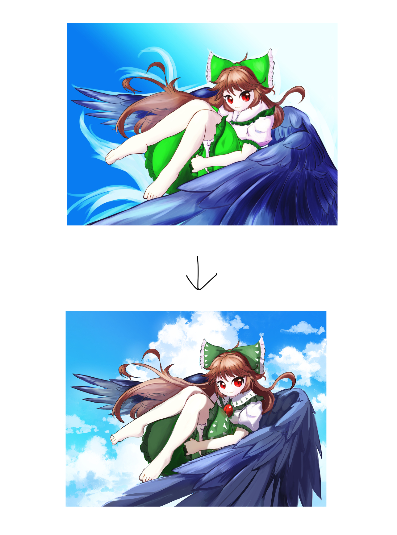
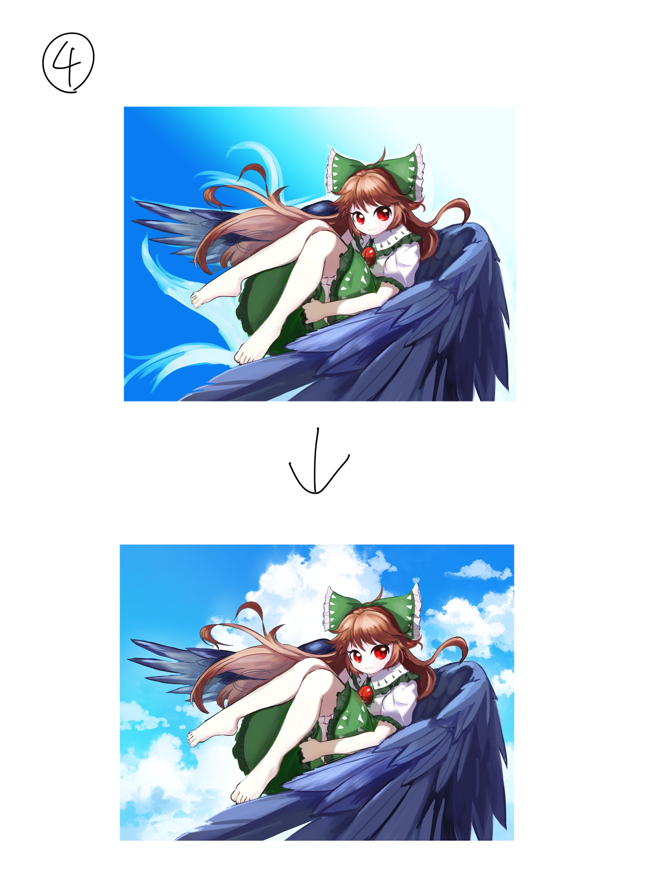
添削結果は以下になります(上:元絵、下:添削後)↓
The result of the correction is as follows (top: original picture, bottom: after correction)
お悩み内容の順に、添削解説していきます。
1,シルエットに柔軟性が足りない Lack of softness in silhouette
イラストを拝見しましたが、シルエットに柔軟性が足りないようには見えませんでした。
むしろ、塗り・線・シルエット含め全体的に柔らかい印象のため、柔軟性が目立たなくなっているのかと思われます。
何かを目立たせるためには、「光→影」「無彩色→有彩色」といったような対比的な要素が必要です。
今回の場合、「硬さ」が画面内にあると良いでしょう。
足や羽部分に鋭さや硬さが見えるよう、加筆しました。
膝・足首といったような関節部分は骨が目立つため、人体の中では硬いです。
また、左側の羽が見切れており、形を把握しづらくなっていたので、羽の先端を画面内に入れました。
シルエットは右側の羽くらいの鋭さがあれば丁度良いです。
I looked at the illustration, and it does not appear that the silhouette lacks flexibility.
Rather, the overall impression of softness, including the paint, lines, and silhouette, seems to make the softness less noticeable.
In order to make something stand out, contrasting elements such as "light → shadow" and "achromatic → chromatic" are necessary.
In this case, "hardness" should be present in the image.
I added sharpness and hardness to the legs and wings.
Joints such as knees and ankles are hard in the human body because the bones are prominent.
Also, the left wing was not visible, making it difficult to grasp the shape of the wing, so the tips of the wings were included in the image.
The silhouette is just right if it is as sharp as the right wing.
2,アクセントカラーの使い方 How to use accent colors
このイラストの場合、青~緑系のカラーが多いため、アクセントカラーは反対色である赤色です。
アクセントカラーはその名の通り、強調したい部分や目立たせたい部分に使う色です。
今回、赤色は目に使われており、顔に視線が向くため使い方は効果的です。
ただ、他の配色がほぼ彩度の高い色で固まっているため、赤色が映えづらくなっているのが気になりました。
なので、服の緑色と羽の紺色の彩度を落とし、色の幅を広げました。
In the case of this illustration, the accent color is the opposite color, red, because the colors are mostly blue to green.
As the name suggests, accent colors are used for areas that you want to emphasize or make stand out.
In this case, red is used for the eyes, and its use is effective because it draws the eye to the face.
However, since the other colors are mostly saturated, it is difficult for the red color to stand out.
Therefore, I reduced the saturation of the green of the clothing and the navy blue of the wings to broaden the range of colors.
3,全体的に描き込みの量が足りない Not enough drawing in general
元のキャラクターデザインに比べ、衣装のディティールが足りていないため描き込みが不足しているように見えるのではないかと思います。
なので、「模様の追加」「フリルの色を緑から黒に変更」「胸部分の目の追加」を行いました。
また、落ち影の不足と陰影が薄い印象だったため、陰影を調整しました。
陰影が薄いと、陰影というよりはグラデーションのように見え、描き込み不足に見えることがあります。
Compared to the original character design, the costume lacks detail and appears the lack of drawing
Therefore, I added a pattern, changed the color of the frill from green to black, and added eyes in the chest area.
I also adjusted the shading because the lack of cast shadow and the shading seemed light.
If the shading is too light, it looks more like a gradation than shading and may look the lack of drawing
4,背景のテーマの決め方が分からない How to decide the theme of the background
背景のテーマの決め方については、特定のモチーフから連想していく方法がおすすめです。
今回は羽、青い背景→青空を連想しました。
他には、キャラクターの設定から考えることができます。
東方の霊烏路空なので、地底や炎などでも良さそうです。
As for how to decide on a theme for the background, I recommend that you associate it with a specific motif.
In this case, I associated "wings", "blue background" → blue sky.
Another way to think of it is from the character's setting.
Reiuji Utsuho of Touhou, so it could be subterranean, flames, etc.
これにて解説は以上になります。
添削にご応募いただき、ありがとうございました!
もし、他にも興味を持った方がいれば、ぜひ応募いただければと思います!
概要は以下の通りです。
If anyone else is interested, I would be happy to receive your application.
The outline is as follows
・添削応募概要
以下の条件で、簡単に添削させていただきます。
・全年齢向け作品(成人向けや過激な表現のある作品は不可)
・自分で制作した作品(模写やトレース作品は不可)
・fanboxの記事として掲載可能
TwitterのDM(https://twitter.com/kyusoukyu)かpixivメッセージで「気になっている・悩んでいる箇所」を記入いただくと共に「添削してほしい作品」をお送りください。
また、以下の2点の可否もご記述ください。
・fanboxの記事に名前を公開
・(Twitterアカウントがある場合)アカウントを記載
※ユーザー名がfanboxと異なる場合、fanboxの登録名もお伝えください。
添削結果の記事公開については、添削希望者数にもよりますが大体1~2週間程度となります。
添削のボリュームは今回の記事と同じくらいです。
添削希望者が多い場合、支援期間が長い方を優先させていただきます。
あくまで作業過程がメインコンテンツで添削はおまけ枠となりますので、気長にお待ちいただける方のみご応募ください。
何か質問があれば、コメントしていただければと思います。
-About applying for corrections
I will briefly correct your work under the following conditions.
-Works for all ages (No NSFW and works with extreme expressions).
-Works drawn by yourself (No reproductions or traced works).
-Works that can be published as articles in my fanbox.
Please send me "your work" as well as indicating "areas of concern" via Twitter DM (https://twitter.com/kyusoukyu) or pixiv message.
Please also tell me the acceptability of the following two points.
-Publish your name in my fanbox article
-(If you have a Twitter account) Mention your account
If your name is different from your fanbox registered name, please tell me your fanbox registered name.
The publication of the article with the correction results will take approximately 1-2 weeks, depending on the number of people who wish to be corrected.
The volume of corrections is about the same as this article.
If there are many applicants for correction, priority will be given to those who have been subscribed for a longer period of time.
Please only apply if you can wait patiently, as the work process is the main content and the corrections are an extra content.
If you have any questions, please comment.
Files