Home
Home

 Artists
 Search
 Recent
 Random
 Posts
Posts
 DMs
DMs
 Tags
Tags
 Random
 Importer
 Import
 FAQ
FAQ
 Account
 Register
 Favorites
 Login
Login

シー(PSD and Process) (Pixiv Fanbox)
Videos
-
xi.mp4
Downloads
Content
描写:ClipStudioPaint
加工:photoshop
タイムラプス
過程画像
・各過程のポイント Points of each process
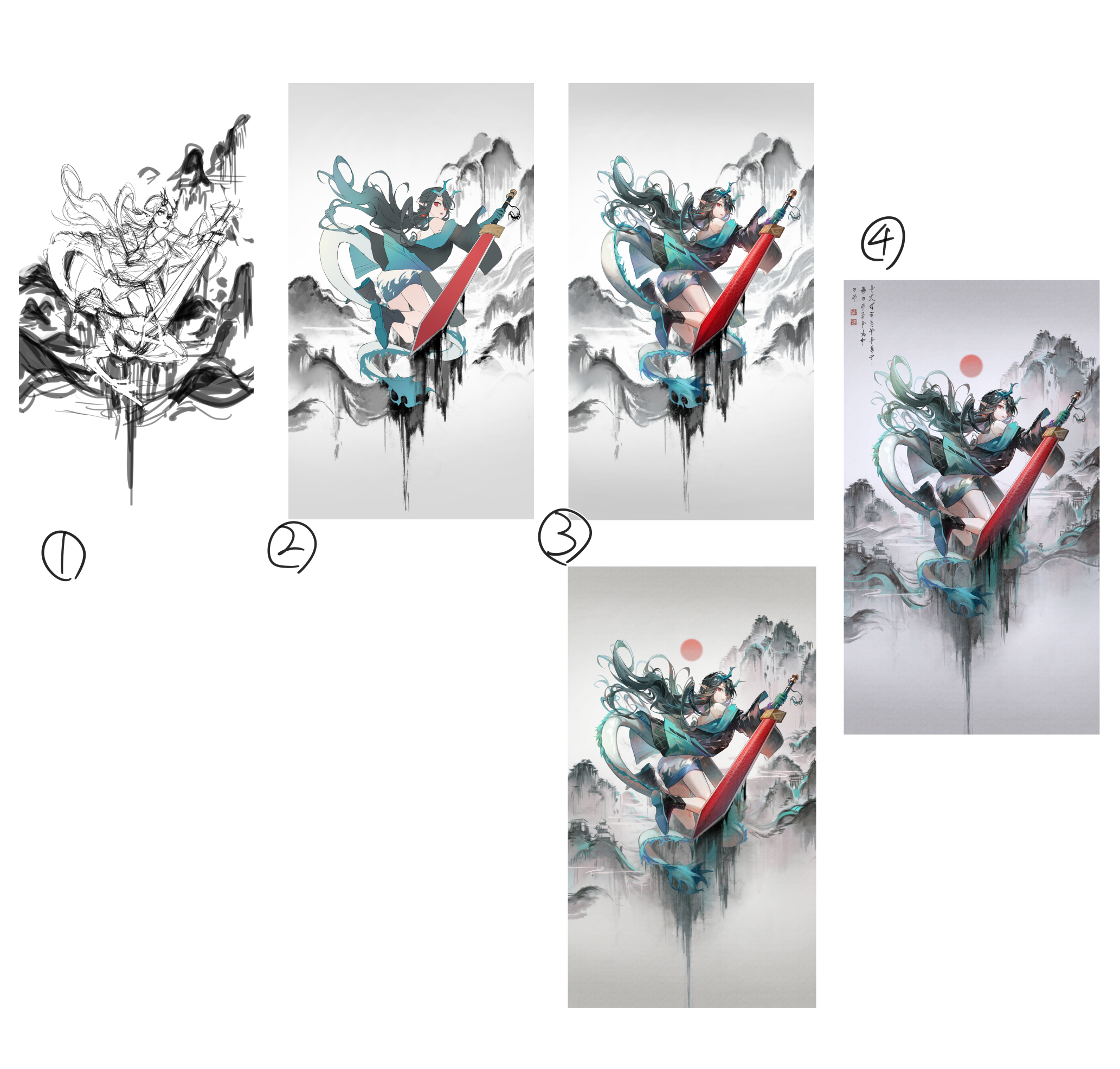
1,ラフ sketch
水墨画っぽいイメージにしたかったので、余白が多い構図にしました。
また、静と動のような対比を作りたかったので、キャラのシルエットは躍動感を出すために逆三角形を意識しています。
I wanted to create an ink painting-like image, so I used a composition with a lot of blank space.
I also wanted to create a contrast between stillness and movement, so the silhouettes of the characters are inverted triangles to create a sense of dynamism.
2,線画・下塗り line drawing and base color
前々から線画が太くて浮いているように感じていたので、今回は普段よりも細い線で線画を描いてみました。
そのおかげか、着彩時に線を整える手間が減りました。
また、この時点で背景もある程度手をつけています。
左右対称にならないように変化を加えました。
まだ細かく描く必要はないのですが、何がどうなっているのかが分かる程度に描いておきます。
For some time now, I have felt that the line drawings were too thick and obvious, so this time I drew the line drawings with thinner lines than usual.
This probably saved me the trouble of adjusting the lines when coloring.
I also did some work on the background at this point.
I made changes so that it would not be symmetrical.
There is no need to draw it in detail yet, but I drew it just enough to show what is going on.
3,着彩 coloring
黒と青緑が多いので、単調にならないように色に幅を持たせることを意識しました。剣の赤を袖部分に加えたりなど、隣接する色を加えると自然に馴染みます。
黒髪を塗る場合、有彩色を含めた黒を使うようにしています。(今回は青~緑系の色を含んでいます)
無彩色の黒のみで塗ると、髪のサラサラ・つやつや感が出ず、べたついた印象になるためです。
背景はモノクロカラーのみだと単調で印象が薄くなりそうだったので、赤、緑系の色を少し加えました。
水墨画風がテーマなので、詳細を描き込みすぎないことを意識しています。
As there is a lot of black and blue-green, I was conscious of adding a range of colors to avoid monotony. Adding neighbouring colors, such as adding the red of the sword to the sleeve part, makes it blend in naturally.
When painting black hair, I try to use black including colored colors. (In this work, blue to greenish colors are included).
If only achromatic black is used, the hair will not look smooth and shiny and will look sticky.
The background is monochrome and a bit monotonous, so I added a few red and green colors.
The theme is an ink painting style, so I was conscious of not overdrawing the details.
4,仕上げ finishing
和紙テクスチャを全体に重ねてアナログ感を出しました。
更に水墨画らしくするため、左上に文字っぽいものを入れました。
最後はPhotoshopに移行して、色味の調整をします。
レンズフィルターの青系フィルターを重ねて色に統一感を持たせました。
剣部分と他を区別させたかったので、エフェクトとして軽く色収差をかけています。
Washi paper textures were layered over the whole image to give it an analogue feel.
To make it look more like an ink painting, I added some text-like characters in the top left corner.
Finally, move to Photoshop to adjust the colours.
I layered a blue lens filter on top of the blue filter to make the colours more consistent.
I also wanted to differentiate between her sword part and the rest of the image, so I applied a light chromatic aberration as an effect.
文字に使ったブラシはこちらです。
Here is the brush used for the letters.
何か至らない点があればコメントにてお伝えください。
その他要望や感想、質問等もお気軽にコメントへどうぞ!
If you have any requests, impressions, or questions, please feel free to comment!
Files