Home Artists Posts Import Register

Content

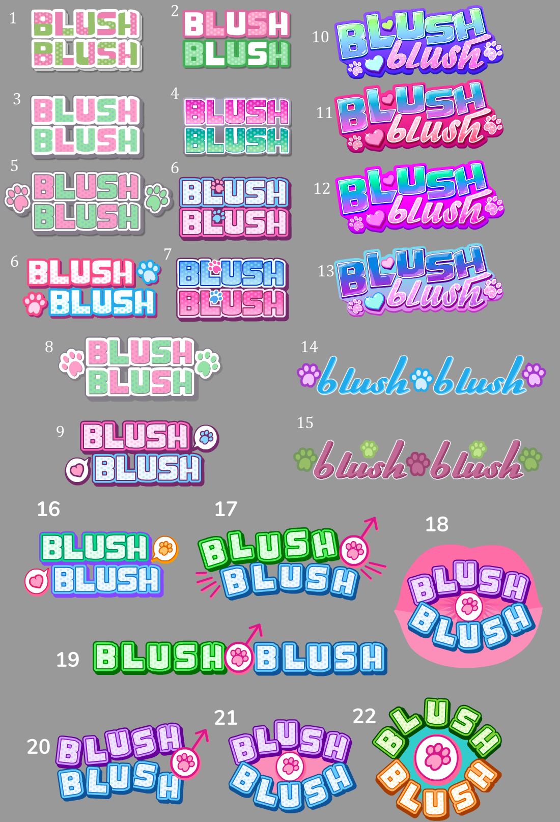
On top of Kitty Catsanova, Crush Crush updates (adding Darya) and gearing up Hush Hush for its Kickstarter I've also been ambitiously chipping away at Blush Blush ^^ Getting lots of pieces done on all the things feels good. So I've been playing around with these Blush Blush logo concepts lately. They're really rough but I'd love to hear your feedback on any that jump out at ya. I think Crush Crush's logo works when it's large but it's super sucky for icons like the ones you see on Nutaku, so I tried to consider that with these logo options.

Files

Comments

Anonymous

Blush blush is the male version, right? I like number 17, but I don’t understand the reason for the paw print... it seems more appropriate to replace that with a heart, if anything. The rest of number 17 looks good to me for the male equivalent.

SadPandaStudios

Awesome ^^ Thanks William. Yah the paw print is just cutesy but there's also be a wolf in the game, so it's kinda tied to that.

Zan Blackk

I like #10. The blue really stands out and is a good color for the heart, too. It's compact nicely.

Anonymous

I like number 9 :3

Anonymous

#7 those little paws filling the spaces in the Ls is a nice touch :)

Anonymous

#11 immediately caught my eye. It was familiar but new.

Anonymous

I have really no idea what looks good at a tiny size. I'm friends with number 6, though. It's so orderly. But then again I maybe wouldn't stray too much from Crush Crush's design. Also I can't wait for you to add Darya. Even if it's just for bringing the number of achievements (at least in the Nutaku version) to a nice round 420. :D

LixxieLicious

I literally 100% forgot that blush blush is the male version... But because of that, I think 19 is the best, since it almost seems kinda sporty, and 17 is close second since it looks more fun (and I think the sporty look is better then fun for this)