Home
Home

 Artists
 Search
 Recent
 Random
 Posts
Posts
 DMs
DMs
 Tags
Tags
 Random
 Importer
 Import
 FAQ
FAQ
 Account
 Register
 Favorites
 Login
Login

Comic Report #65.1 - (Patreon)
Content
Hello! Here's the progress on the next page. Since I'm on the other side of a few key moments in the comic this week I'm going to write a little bit about the art challenges I've had in the past and what I'm planning to work on moving forward in the comic.
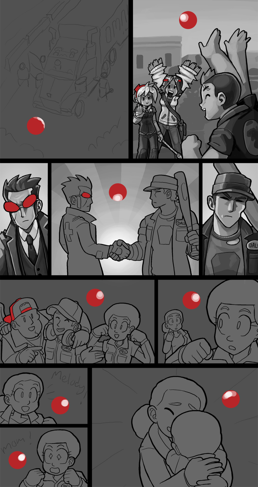
This week I got my page inked, which is always a bit of a tedious step for me, and started work painting in panels. Since the comic is taking place during a new day after a long stretch of night pages I need to make sure I can shift my brain back to rendering daylight lighting. Unlike nighttime lighting, where everything generally came from very specific light sources, daytime lighting comes from everywhere, the lighting is very saturated and I gotta think of a good way to make that look nice. I mean, I've technically actually drawn hundreds of daylight pages already, but I want to improve how I do it and after so long of just doing night shots it's time to work out my approach to outdoor lighting.
The plan I'm thinking about can be seen in the Monday and Dale shots in the second row of the page. In older pages I'd just have light coming from one side and put dark on the other, but over time my style has evolved into something that I've recognized to be a bit smoother or more efficient. Like, I always take pride in my painterly approach to comics but early on I painted a -ton- of gradients, lots of blending midtones into shadows, tons of wrinkles, highlights and so on. Recent pages have been a bit simpler in terms of the painting style but they've still been popping, and I've been wanting to pinpoint why that is and expand on it, and I think it's because I work with shapes more efficiently rather than just try to blend everything. Dialing back to the Monday and Dale shots, instead of plopping a shadow plane on one side of the figures I'm sort of sculpting these shapes with more ubiquitous lighting, like how there's highlights on both sides of the face shots instead of directly in the front or just on one side. I think this will be useful in rendering outdoor lighting on my characters.
One of the other issues I've recognized in my art has been in my value choices. I tend to start with midtones and work outwards into lights and darks, and I've been pushing my darks to their darkest but I think somewhere along the way I haven't pushed lights as far as I ought to. I used a ton of nearly pure white in earlier comics, and somewhere along the way I started using darker light-greys for my top range so I could use pure white for things like eyeball gloss and make it pop. In my 80%-phase background shot in panel 2 I put in a morning sky grey, but I feel like it's not as bright as it needs to be, and the buildings beneath it could also be brighter. I gotta let myself push my brights further to make the outdoor backgrounds look well-lit, but I also need to balance this with how I paint illuminated shadows in the backgrounds. What this means is, basically I have areas that light hits that I want illuminated and I have areas where those objects cast shadows, when I pick values for my shadows I can't make them as dark as the foreground shadows- making my foreground characters harder to read- but I also can't make them too light or else the backgrounds will look washed out. It'll take a little bit of noodling but I think once I hit my stride on these daytime pages the comic is gonna look really good.
One other fun note now that the page is prepped to paint is it has a lot more red in it than usual. During page 600 I added red features to Lou and Alice, who have until this point lacked a red item. Lou has a mesh-back red trucker cap and Alice has some hairclips to keep the hair out of her eyes while she does medic things. From the beginning of the comic only Lizzie and Monday had red features, originally this was because they had a centrally antagonistic relationship, where each one dislikes the other's moral philosophy but they're compelled to work together towards the common goals of survival and finding Lizzie's parents. Alice and Lou both showed up as companions to the initial duo as the comic sort of organically grew, but at this point it's fair to say the four of them are, together, a core inseparable unit. The inclusion of the red items for Lou and Alice is mostly fixing an overdue omission, but tied to the narrative theme of page 599 being like, this is the new rhythm, having them all come out with their red features ties the whole crew together.

This also has the tack-on effect of tying into the game we've been working on. The way the game is structured, the title screen is comic-style black/white/red, and the in-game action is planned to be in color, so the character select screen starts out desaturated before fading into color. Everyone has their red items here, and this was one inspiration to put that feature into the comic itself. The comic and the game halves of this project have influenced each other over the years I've been splitting my time between both tasks, and it has helped me grow a lot as an artist, I think. As a final note, here's what I've established as everyone's canon color palette and favorite alcoholic drink, as per the game's character select screen:

I'm gonna shift back to working on the comic now, I'm expecting to be able to have this page finished before next Friday. I have some gamedev tasks lined up but they're relatively simple, just exporting animation assets and building them in the game engine, but that is all scheduled for after I finish this comic page. Thanks for reading, I will have this page ready for you within the week!
Files