Home
Home

 Artists
 Search
 Recent
 Random
 Posts
Posts
 DMs
DMs
 Tags
Tags
 Random
 Importer
 Import
 FAQ
FAQ
 Account
 Register
 Favorites
 Login
Login

Comic Report #41.1 - Lighting (Patreon)
Content
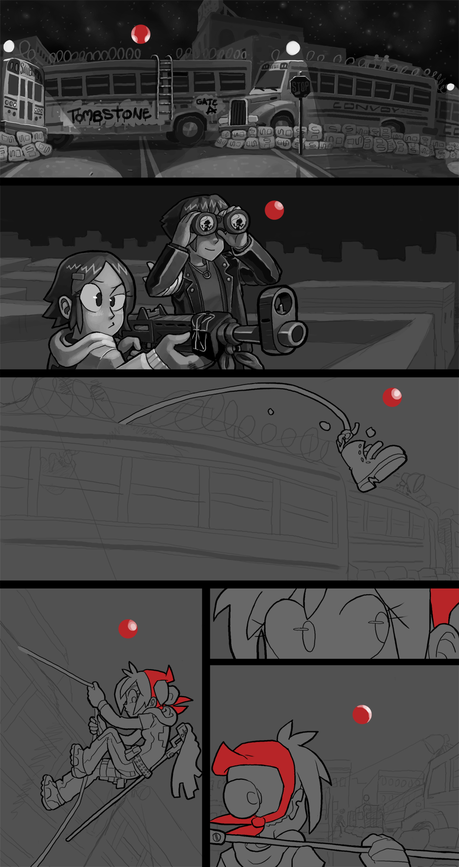
Over the course of this comic I let my style evolve and grow as I learn more and want to try more things. In the beginning it was mostly pencil sketches with smudged toning underneath, and then I applied inks after I did a section in color, and later I tried making the comic completely outline-free before swinging back to where I am now. I give my characters a black outline to help define them but I leave the backgrounds lineless and paint them in directly from my background sketches. I think this balance between approaches helps make the figures in the foreground pop out from the background.
You can see a bit of how I build my lineless backgrounds in panel 2, where I start by blocking in major shapes and then work towards finer and finer detail from there. When working in lineless painting the main thing to keep in mind is Contrast- the difference in hue, value or saturation of two fields of color gives the viewer a visual "line" between the fields that separates one shape from another. Since I work in black & white hue and saturation contrast don't really apply to my work, so I build all of my contrast with value, i.e. dark or light shades of grey. Once I establish that these shapes have sufficient contrast to stand out from each other I can begin interior painting and blending, which involves hundreds of applications of translucent layers, eyedropper picking midtones between layer overlaps and more layers on top of that. I don't think there's a shortcut way to get the kind of choppy, painty aesthetic I really like in my work so it takes a bit of time, but I'm happy to create something unique.
In the first panel I have no actual foreground character subjects, so its all pure background painting to establish a shot I'll be referencing for probably the next dozen pages, so I want to get it right. The important detail I wanted to establish in that shot, and probably the one that I'm most proud of, is the spotlights. In the past I would just draw the dark area and paint in an opaque white cone to show the light, but I wanted to do it right this time and capture the space the light fills, as well as the space it doesn't fill. That's kind of a confusing statement, but essentially what I did is I treated the interior areas of the spotlight cones as their own shapes for contrast purposes, rather than as parts of the entire bus or ground. I chose light or mid-tone areas that are physically in the space I want to illuminate and painted them lighter than the shapes outside the cones, but to give a sense that the light is in a specific physical space and not just everywhere I left the dark shapes in those cones dark, namely the shadows under the bus itself and parts of the road and sidewalk. To maintain the "line" of the cone I gave the dark areas very, very subtle contrast, contrasting the contrast in the lighter areas, and I think this helped give the end result a sense of space you can reach into and exist in. I'm really pleased with the effect of this shot, and with that part out of the way the rest of the page should be a breeze to finish.
As I mentioned above, I'm going to shoot for Tuesdayish to have this page done by, but last time I said that I finished super-early. I have that last panel to paint, though, so I'm not going to overestimate my workload. Thanks for your patience and support of my work.
Files