Home
Home

 Artists
 Search
 Recent
 Random
 Posts
Posts
 DMs
DMs
 Tags
Tags
 Random
 Importer
 Import
 FAQ
FAQ
 Account
 Register
 Favorites
 Login
Login

Comic Report #37 - Digging In (Patreon)
Content
For the past couple pages I'd been leaning somewhat heavily on wide row-sized panels. It's a good format and a good way to pace the flow of a page, but I wanted to mix up how I approach conveying a scene. One of my goals is to make sure no two consecutive pages have the same panel layout, so reading from page to page doesn't feel redundant on an abstract level, and overusing the wide panels was making that more difficult. My solution was to start taking my page structure back to basics.
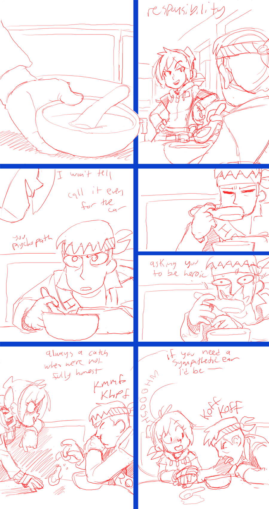
In the very beginning of my comic all my pages were built around a six-panel layout, three rows with two panels in each row, so I set this page up in that fashion. My method has always been to divide a page horizontally, then subdivide the rows to create my panel layout; in this way, the horizontal lines act as constant breaks in the comic and group the panels together, so you read a row of panels like a paragraph and you can intuitively understand when a row ends and you can move onto the next row. There's been some pages where I break this rule but they're the exception defined by the standard, and while it's a small mechanical detail I think it helps make sure a page is always easy to read.
Additionally, when I split a tall panel into two smaller horizontal panels, as in panels 4 and 5 above, I try to keep the split panels on the right side of the page. There are complications in placing the split on the left side, where once you get to the bottom of the first of the row's three panels you could conceivably go down or to the right, regardless of whether the vertical divider leads you downward. Placing a big single panel on the left means you absolutely move to the top right panel of the row, and fluidity is maintained. There are some pages where I'll want to cram a lot of panels into the page and I'll need to put the split format on multiple rows, and in these cases I'll put a split part on the left side, but only after I put one on the right side of the row above. This way a reader is conditioned to read the panels in that pair in a specific order before they get to the row with two on the left and one on the right, and so the whole right side of the page doesn't end up a column of smaller panels that can end up obfuscating the firm horizontal row line. It's all about making sure a fresh pair of eyes can intuitively and subconsciously follow the flow of a page.
This is the page where I can set up the first major lead in the case of who shot the sheriff, and I wanted to present it in a way where Lizzie extracts information rather than passively coming across it, as she'd been trying unsuccessfully over the past two pages. Normally I disable the text layer where I jot down dialogue notes but I forgot to disable it for this one, so you can see how I plan out my page dialogue before I get to that phase of the strip. The idea of this page is that Pat has kinda rolled with the notion that he's the one who saved Lizzie and Alice, and he's enjoying the privileges and prestige that comes with that distinction. Lizzie picks up on this and presses on him that now that he's a hero, people are probably expecting him to do heroic things for them, the sort of heroic things that got him stuck in the building Lizzie and Alice rescued him from in the first place. No one would talk to the waitress, but if someone knows something they might talk to the town hero, and he might be open to share if you're willing to let him have the illusion of heroism. And then, once you find the beginning of the thread, you can just keep pulling until you unravel the sweater and figure out who dun it.
Oh, one other detail I'd like to type about that I feel this page captures well is staging characters in a scene. While this page is mostly just two people talking the camera does a lot of movement to keep the page interesting, but no matter which way the camera is pointing the two characters occupy their respective sides of each panel. Pat is on the right and Lizzie is on the left, just as much when the camera is pointing at them from the side as it is when the camera is looking over Pat's shoulder. By keeping characters from flipping sides you can keep a conversational flow consistent from panel to panel in a way that is very pleasing to a reader's brain. Also, you can underscore the flow of a narrative by who you place on which side of the panel. English-language readers read from left to right, so by putting Lizzie on the left side you can establish that she is the aggressor in this conversation, as she's pointing in the direction the eye moves in. Pat is the defensive character here, he faces against the flow of the eye. This concept works for action pages as well, where you have a character on the left punching a character on the right you can hook into the natural flow of the reader's eye to give it a sense of force, where if you flipped it and had the punch coming from the right then you're punching against the current and the shot looks like a defensive counterpunch, since it's going against the reader. I applied that principle to this page in dialogue. You can see below how putting Lizzie on the right side takes away a bit of her social aggression:

She's leaning in against the flow of the reader's eye, and that change shifts the power dynamic of the shot. It's a small detail, but like all details it makes a big difference in how the composition reads.
This page shouldn't take me too long to finish up, there's a lot of camera shots pointed at walls. I might have the page finished for next week, or if not I should be fairly close to it. Thank you for your continued support!
Files