Home
Home

 Artists
 Search
 Recent
 Random
 Posts
Posts
 DMs
DMs
 Tags
Tags
 Random
 Importer
 Import
 FAQ
FAQ
 Account
 Register
 Favorites
 Login
Login

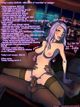
Today's Expenses (Patreon)
Content
A really interesting aspect of this drawing is the background. Instead of drawing a background by hand (and likely have it look like garbage in the end), I decided to try (for the first time!) compositing photos into the image.
The couch is a picture taken at a local furniture store. Same with the table behind the couch that ended up being largely irrelevant. And the skyline is made of two stock photos I purchased purely for this drawing: one of the inside view of a penthouse window, the other of a gorgeous night-time city view.
This process was a lot of fun, but it ended up being a lot more work one would think it'd be. For starters, each photo had completely different lighting, so there needed to be a lot of airbrushing and tone curving to get them to look as if they're in the same room, and even then I don't think I really succeeded. The photos all came in different perspectives, so that needed adjustment as well. Finally, trying to close the "photo-realism vs anime" gap using only Clip Studio's pitiful roster of photo adjustment tools was tricky.
I don't feel I succeeded in any one part of the image. The perspective is off in places. The stench of photo-realism is still present. The lighting of the couch is way off. The reflected lighting on the window was totally half-assed. And yet, the whole is greater than the sum of its parts. I think the final image looks gorgeous.
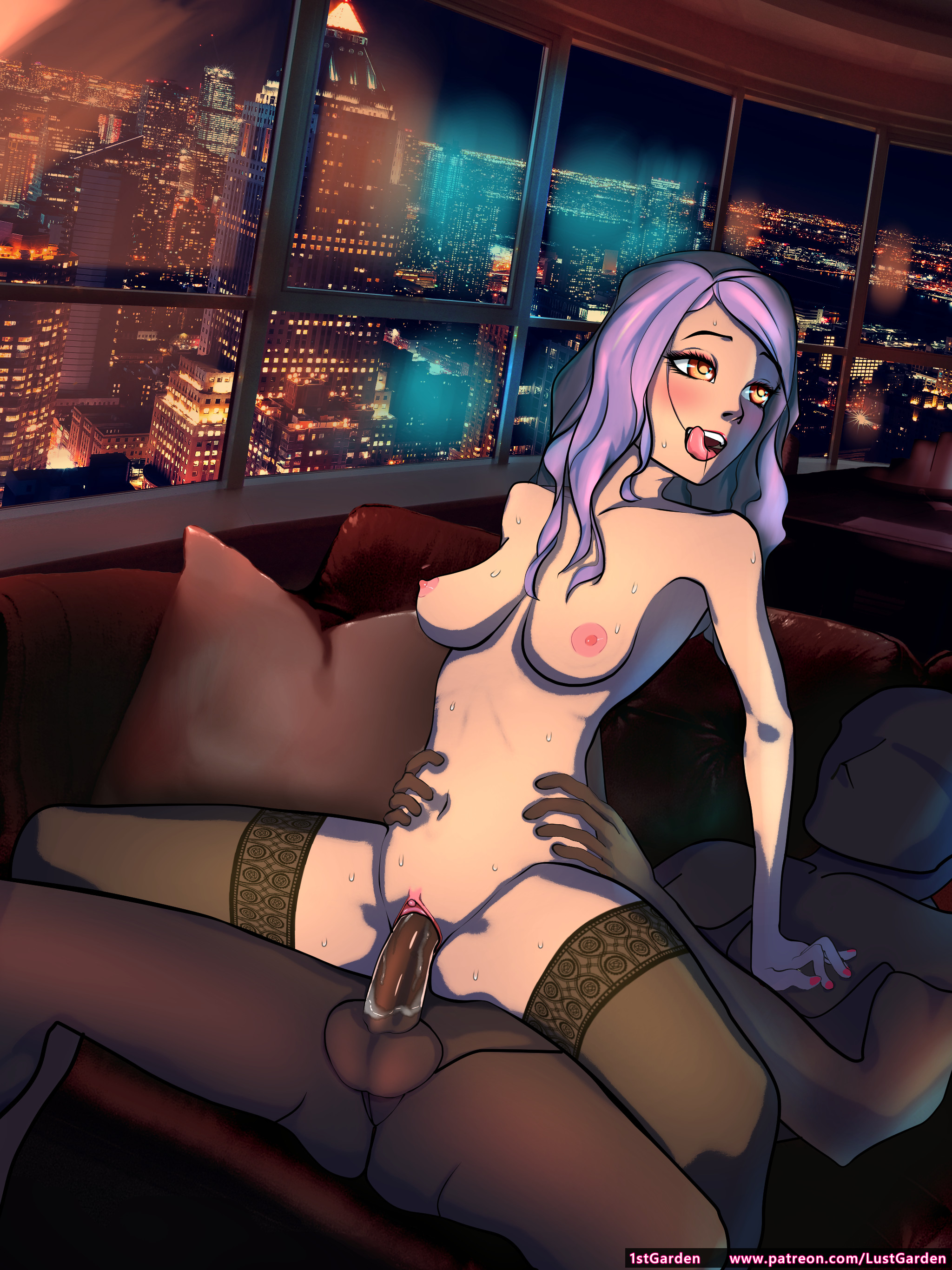
For the actual drawing, I'm somewhat satisfied with everything except the painting of the hair. I'm still trying to figure out what kind of style I'm going for with the hair, and this isn't it. The way the hair is partitioned by the shadows though turned out pretty well I think. Better than I've done in the past.
The girl's face is to me the best part of the image. Absolutely gorgeous. Beautifully expressive, with a faint tint of "ahegao" without going overboard. The mouth itself took two hours and a lot of indecent mirror posing to get right, but boy was it worth it. And the lip gloss. Omg.
Perfect blend of elegance and sluttiness. Elegant slut.
This, in addition to the skyline, makes for an amazing header image for all my web pages. The face is the one part of the image I'm actually impressed with myself for.
I also tried slicking some grool onto Mr. Tall/Dark/Handsome's penis, but I feel like it looks too clean. Needs to be dirtier, grungier, to better reflect the fluid transfer dynamics of, uh, space thrusting.
Finally, the caption. I'm happy with the story it portrays, how it physically fits into the picture, and it really shows this girl knows how to have a good time. This caption was a bit strange as I came up with the story AFTER I drew the sketch, but BEFORE I thought to incorporate the photos. In fact, the "swanky hotel" is what necessitated the photos to begin with.
I hope to make her a recurring character in future illustrations. Moreover, for my captions, I love to throw subtle curveballs and easter eggs into the finer details, such that they insinuate certain other things about her or her situation that get your imagination running wild. The biggest one, of course, is the reference to her "girlfriend", which in this context definitely refers to "romantic female partner" as opposed to "girl friend", if you were confused.
I think these easter eggs add depth and intrigue, but it's important to not let it derail the focus of the image. The initial caption was supposed to have more references to her "girlfriend", but I felt adding more than just a single casual mention would've shifted the weight of the caption toward her personal life rather than her night out. Balance.
Files