Home
Home

 Artists
 Search
 Recent
 Random
 Posts
Posts
 DMs
DMs
 Tags
Tags
 Random
 Importer
 Import
 FAQ
FAQ
 Account
 Register
 Favorites
 Login
Login

Auto-Tailor - page 15 - Process (Patreon)
Content
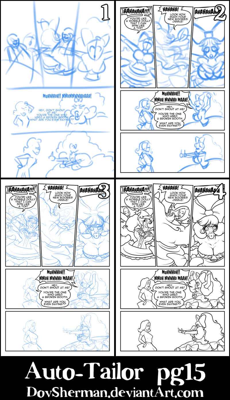
Since the colors and shading were done by my partner, Jade, I'm going to talk more about other aspects of my process in more detail.
1. I start with a rough thumbnail to plan out the page. I already knew what I wanted to do with the last two panels here because I want our dolly to piss off his date, giving her motive for what happens on the next page. For the top of the page, my first thought was another wide angle, showing the date spinning our dolly around like a top but my sketches just didn't feel very dynamic so I switched to this three-panel approach with tight shots of the character at crazy angles. The tightness of the shots makes the movement feel more disorienting, as our dolly must feel while being spun around.
2. Now I go in and work out the final poses and proportions. I used symmetry rulers to block in the character in the first and third panels. On the bottom half of the page, I wanted the character to remain balanced and in mostly the same positions so I copied some of the sketch from one panel to the next, adding the changes. I placed the date and the dolly at exactly the same distance from the center of the page. Of course, since the dolly has such big hair (which I wanted to fit onto the page), that meant a surprising amount of white space behind the date.
3. Now I go back and work out all the fine details. Again, I used symmetry rulers to draw some parts of the first and third panels, then adding variations and secondary motion. The dolly's hair in the second panel needed a lot of tweaking to find an path that felt flowy enough while still letting us see enough of the date for context. On the lower half of the page, I was again able to reuse some of the pencils from the fourth panel as a basis for the fifth panel, only changing the expressions and the arms of our dolly. I had to tweak the sleeves of the dolly a bit to make sure we could still see enough of the dolly's face to understand what was happening. Plus, I really wanted to see our dolly using those big DSLs to make a pouty face.
4. Then I ink everything, using a couple of different pens (one with a blunt tip, for outer edges, and one with a fine tip, for fine detail). Thicker lines in closer objects contrast with thinner lines in distant objects. I did not use the symmetry rulers to ink at all because I wanted to ensure that there would be enough subtle variation to make it seem more natural.
Files