Home
Home

 Artists
 Search
 Recent
 Random
 Posts
Posts
 DMs
DMs
 Tags
Tags
 Random
 Importer
 Import
 FAQ
FAQ
 Account
 Register
 Favorites
 Login
Login

Latex Mobwife - Process (Patreon)
Content
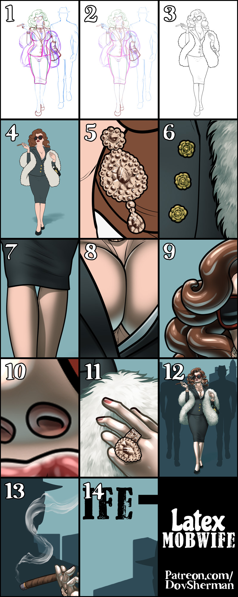
1. Rough sketch. First, I sketch out the layout and poses. I used Clip Studio's 3D models and perspective rulers as references and roughed in the general shapes for the clothing and props. I use separate layers in multiple folders for the various props and the character which makes it easier to plan, especially when so many of the parts overlap. If you look closely, you can see that I draw some parts that I know will be completely hidden behind others, particularly the basic body shape, to make sure it will all make sense together. Keeping them on separate layers also makes it easier to shift the positions of individual features when final details on foreground features might change the layout needs.
2. Refined sketch. This is where I refined the details from the rough sketch where more precision is needed. To try to get more efficient with my art, I'm trying to keep this limited and only refine places that need it instead of unnecessarily redrawing the whole rough sketch.
3. Inking. I scale the canvas up to four times the size and use a variable-width inking brush for the character and a constant-width brush for hard things on vector layers. I use lots of different layers for different parts, which makes it easier to overdraw and erase as needed. Planning for the line coloring later, I try to use a different vector layer for each part that would be differently colored as linework such as one for the character's skin, one for everything that will have black linework, etc.
4. Color blocking. I set the folder containing all the different inked vector layers as the reference layer. Then I made new raster layers underneath and started filling in the flat colors. Sometimes I used a round pen, sometimes the color fill bucket, usually with the fill set to follow only the reference layer, stopping at the middle of a vector. I also draw in the heart on the gag and designed a simple cover for the book.
5. Jewelry. I'm trying some different with this one. I made some new brushes with different types of hand-painted jewel shapes. Then I used them to stamp in all of the jewels for the jewelry. I used a combination of raster and vector layers so I would get different effects when I used mesh distorton to place the designs in perspective. With the vector layers, I was able to stamp the round beads in a pattern, then distort the whole thing and get perspective with variations in bead size while still keeping each bead perfectly round. I added a border line effect to the folder for all of the jewelry, then drew in some additional linework where appropriate.
6. Form shading. I create a desaturate blue solid color layer (linear burn) and start painting in the basic form shading. In general, I start shading each section by color block, starting with the shading layered filled at 50%, then I use hard brushes at 75% to added some basic shade and highlight, then deepen it with 100% shade and highlight, adding detail with watercolor brushes and using blur and blending to soften the shading where needed. For the fur, I start by using a scatter brush of small soft blobby shapes to rough in the general form, then I use a smudge tool to draw the blobby-filled space into individual hairs of fur.
7. Cast shadows. I make another b;ue solid color layer set to linear burn and start painting in the cast shadows with soft brush, using a smaller brush in places where the object casting the shadow is closer to the thing the shadow is on or a softer-edged brush when the thing casting a shadow is more diffuse, like hair or fur.
8. Backlight. For the secondary lights, I used a pale desaturate color layer away from the light source and a white layer toward the light source, with the back light set to vivid light for a more intense reflection. Then I paint with a soft airbrush or a watercolor brush (when I want it to be more textured) on opposite sides of shiny objects. The forelight is used only on the shiniest parts. When I combine it with the form shading, backlighting really makes the characters pop. I don't use any backlight on non-reflective objects. On the hair, I used the watercolor brush to streak in the shape of the hairs and then used an airbrush, selection-masked to the shading, to add softer backlight.
9. Shiny. For the glossiest parts, I used light watercolor brushes to paint reflections for both primary and reflected light sources, then I used a strong watercolor brush for the specular highlights (or a variable round hard brush when I want the highlight extra strong), using a thumb tool to smudge for detail. For the shine on the hair, I started with thin strokes with a soft watercolor brush, then use an airbrush to add a soft glow to groups of streaks, and finally use a soft round brush to erase a few streaks in the middle of each group. After painting all the shine, I use the cast shadow layer to make a selection and delete the shine from anywhere covered by shadow.
10. For the natural blush, I add in a raster layer and airbrush red just on the skin for the cheeks and places where bone is near the surface of the skin.
11. Colored linework. Since the linework is still all vectors in Clip Studio, I simply selected the vectors and changed their color to whatever colored linework I needed, sampling from the darkest shade in each section and then shifting the color to be more saturate and dark, more or less depending on how hard or soft I want each thing to feel. The hardest things I keep black. Then I collapsed all of the linework into raster layers, locked the pixel transparency, and used an eraser to fix up any places where different color linework crossed over each other.
12. For the backdrop, I added filled in the silhouettes of the bodyguards, then used my own stock building silhouettes for the skyline.
13. For the cigar smoke, I grabbed a simple smoke ribbon brush from the CSP assets library.
14. Finally, I used simple text layers for the title and a vector for the frame, masking out the frame where the character crosses it.
Files