Home
Home

 Artists
 Search
 Recent
 Random
 Posts
Posts
 DMs
DMs
 Tags
Tags
 Random
 Importer
 Import
 FAQ
FAQ
 Account
 Register
 Favorites
 Login
Login

DIY Art Degree - May Learnings (Patreon)
Content
This month was all about application. Rather than trying to learn any specific new skills I was trying to apply my learnings to pick apart what I like and what might work best in my own style.
The "style transfer" studies were really interesting. I'm not going to post these anywhere public because it's a bit gauche to "bite someone's style" this directly, but it was very valuable to my learning.

This one was one of my favourites in terms of how well I think it suited my style. Source is by ka3l (no adventure here..., @luxjii ‘s oc, do not use w/o permission (tumblr.com)) based on a character by LUXJii LUXJii (tumblr.com) The inking is completely different from the way I usually work, but the big flat colours and inside-only-coloured lines really suit the way I draw.

I thought this source image (by yunjung yunjung @ Momocon AA 1005 on Twitter: "Feeling Blue 💙✨🌊 https://t.co/Y6hv6t8jey" / Twitter ) was super-duper striking. I thought maybe it would work for me but actually I don't think it suits my style at all.
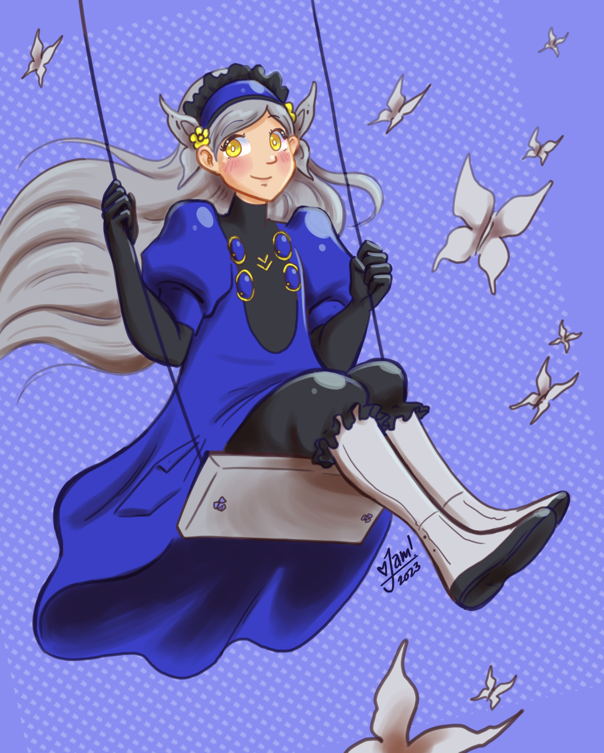
Same with Lavenza on top, whose colouring is based on an artist I've been admiring lately named Spirited Smile. Smile (@spirited_smile) | Instagram I LOVE this anime style... but not on my work, somehow! I think it suits this particular piece because it's of a very anime-esque character, but not my normal work.
I'm going to take these learnings forward and try to bend it into something new and unique to me :) I'm still going to do a few more studies though because I'm still not quite happy with the shading styles, and there's a few more I'm keen to test.
Colour Studies
These colour studies were time consuming because replicating intricate lineart takes a lot longer than making an abstract blobbier version of a photograph. But they were still fun to do. These were really interesting because I was able to pick apart the different principles and choices the artists were making in composing THEIR piece. It helped me to get inside their head in a limited way as they were solving the problem of expressing what they wanted to express.
I learned that I am quite attracted to pieces that seem simple on the surface but then have a lot of intricate detail upon inspection. I also seem to be attracted to analogous colour schemes. (Or analagous + complement).


I think I will keep going with this method for awhile longer :)
Files