Home
Home

 Artists
 Search
 Recent
 Random
 Posts
Posts
 DMs
DMs
 Tags
Tags
 Random
 Importer
 Import
 FAQ
FAQ
 Account
 Register
 Favorites
 Login
Login

Learning Goals and Gradient Maps (Patreon)
Content
So it's been about a year since everyone's plans were completely upended and disrupted. I've written before about how this really shuffled a lot of my priorities, goals and plans. Since then I've been trying to think about where I want to invest my time.
I decided on two main objectives: I want to take a step back and work on levelling up all of my "component skills". What on Earth does That Mean...? Well! Comics are a very complex art, and combine a lot of different skills - writing, drawing accurately, portraying emotion in art using line and colour... when you make comics you're using a lot of skills and thankfully all of them improve with this practice. However, sometimes it can be faster to focus on one skill at a time.
The other objective is I want to become a Clip Studio power-user. Clip Studio is the software that I'm using to make my comics these days. It's great! I consider myself pretty proficient in it... but I know this software has a lot more power than I know how to use. So while I'm taking a step back, I'm going to try to figure out these less-obvious features and use them in my levelling-up process.
While I was working on Shenzhen Fast I was able to practice with a number of new tools - namely Clip Studio's Page Manager tools and Perspective tools. Very handy for drawing all those buildings and machines...!
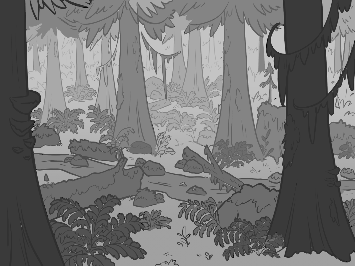
Another one I wanted to figure out was Gradient Maps. Basically, it's a tool that takes a greyscale image and applies colours that you define - so each tone of grey corresponds to a different colour. The drawing at the top is one you've seen before - it was the header image for last month. I started by laying down these grey "flats".
Next I made some quick light and shadow layers...

Now here's where the fun starts... I can now apply a gradient across the whole image and have it map to these areas of light and shadow.

Immediately a lot more interesting than just grey! Using this method I can also very quickly mock up a bunch of different colour styles/moods...


So that looks... cool, but it doesn't necessarily look like a real forest, right? So next I made another "flat" layer with some basic colours for bark, foliage and rocks.... This is how it looks with just a plain "overlay" mode applied to the greyscale.

More realistic... but a bit "flat". The lighting isn't very interesting and it doesn't have a lot of mood. What I can do now, though, is use those "flat" colours to make a set of gradients - each one with its own gradient map.

Interesting...! But maybe not the best for this image. As you can see I have some masking problems here... the ferns are not.......... the best shapes for doing clean flats, regrettably. But this might help if I was trying to plan out a more detailed painting that I might do later on. And with this level of control I can do a lot of interesting stuff.
The last thing I tried was leaving the flats as overlay, and then making gradient maps just for the light and shadow layers. This way I can more easily control the "mood" or time of day of the panel...

Not too bad! This one is a lot more realistic, and definitely has more realistic light, but again my, uh... rough treatment of the light layer needs a lot of work.
So that's what gradient maps are! Now I know :) Which one is your favourite?
Files