Home
Home

 Artists
 Search
 Recent
 Random
 Posts
Posts
 DMs
DMs
 Tags
Tags
 Random
 Importer
 Import
 FAQ
FAQ
 Account
 Register
 Favorites
 Login
Login

June Sketching + Gibson Girl cover inspo (Patreon)
Videos
-
220606-coverideas.mp4
Downloads
Content
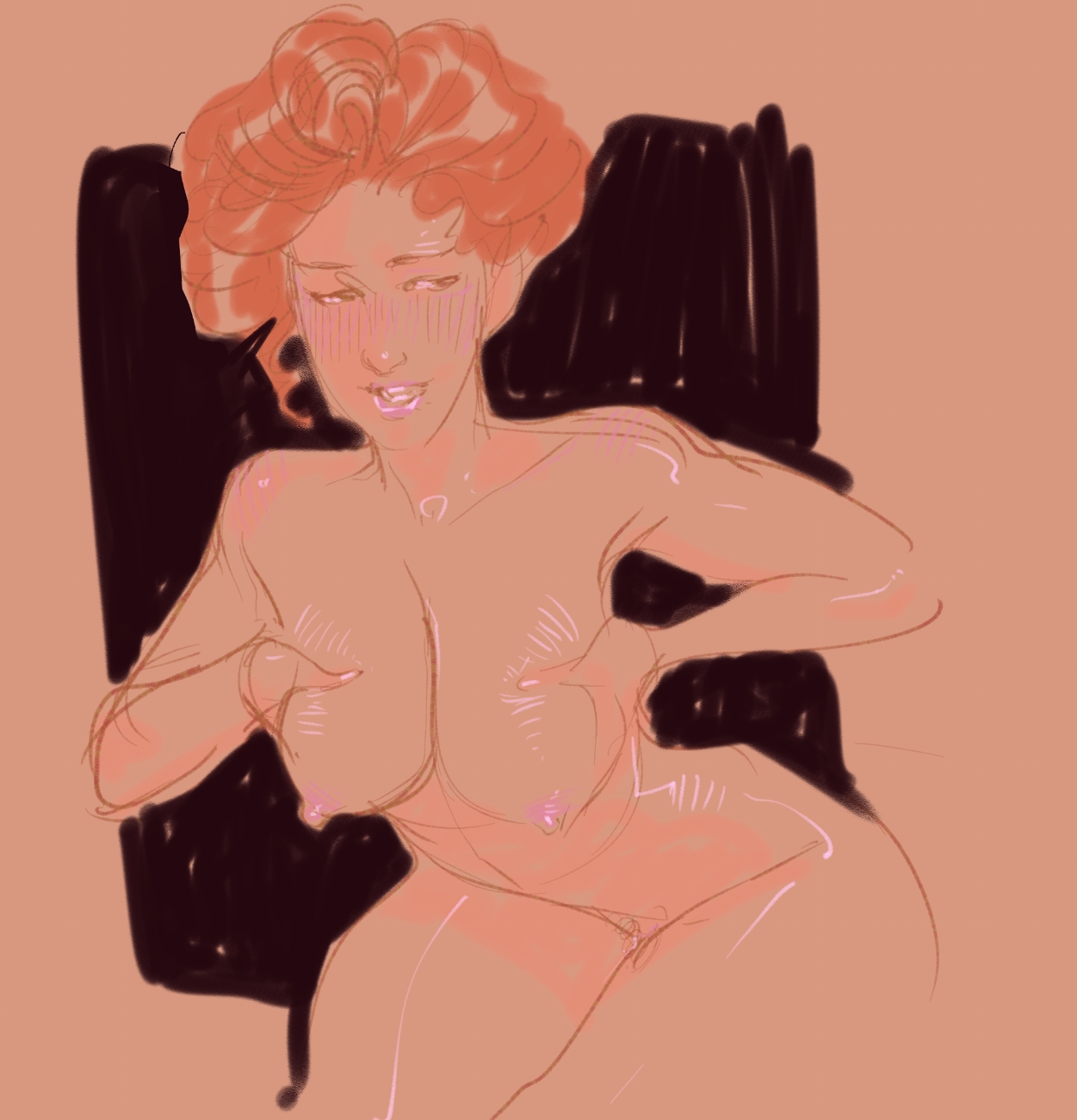
I opened up this CSP the other day with the intention of drawing cover ideas for the Gibson Girl story which still has no title (whoopsie, oh well it'll show up eventually) and then just started sketching and this came out. :)
I did also do a lot of inspiration gathering as a part of the process, trying to find illustrators I didn't know about who were working at the time. Here are some of the ones that stand out as good styles to steal 😈

Coles Phillips --he made these bold, graphic cover illustrations with the figure evaporating into flat color. Quite stylish.

Harrison Fisher-- a more painterly counterpoint to Gibson with really charming and cute ladies in his portaits.

Elizabeth Shippen Green -- someone I just discovered! She painted a lot of mothers and children in a style that feels like a bit of a neighbor to Edmund Dulac, watercolory and wistful.

Ruth Eastman -- Stylish as can be, but definitely more of 1910-20's illustrator. I love the approach to flat color in these that would definitely inspire some of the 1950's-60's illustrators that I love as well.

This one in particular struck me because she's just an adorable Mary Poppins type. I really adore the subtle stylization of the early 20th Century illustrators. She has kind of doll-like proportions, a miniaturized mouth and nose with larger eyes. It's impossibly cute and I desperately want to steal it.

I think of my style as being generally pretty fluid, but the one thing that's inescapable is just the way you naturally put down lines. I can use different brushes and rely on different techniques but certain types of faces always come out of my hand whether I want them to or not, and that's hard to retrain.
It's like trying to speak in an accent all day. Eventually you need to pronounce a word you've never heard spoken by someone with that accent and you revert to the way you normally speak, just for one word and the accent is broken.
Whatever direction the cover goes, what I love about this era of illustration for women's magazines is how it can oscillate between this sort of femininity, softness but also really bold, moody colors like black, red and orange. It's a very stark combo and I find it fascinating.
Happy Tuesday everyone!
♥ Winton
Files