Home
Home

 Artists
 Search
 Recent
 Random
 Posts
Posts
 DMs
DMs
 Tags
Tags
 Random
 Importer
 Import
 FAQ
FAQ
 Account
 Register
 Favorites
 Login
Login

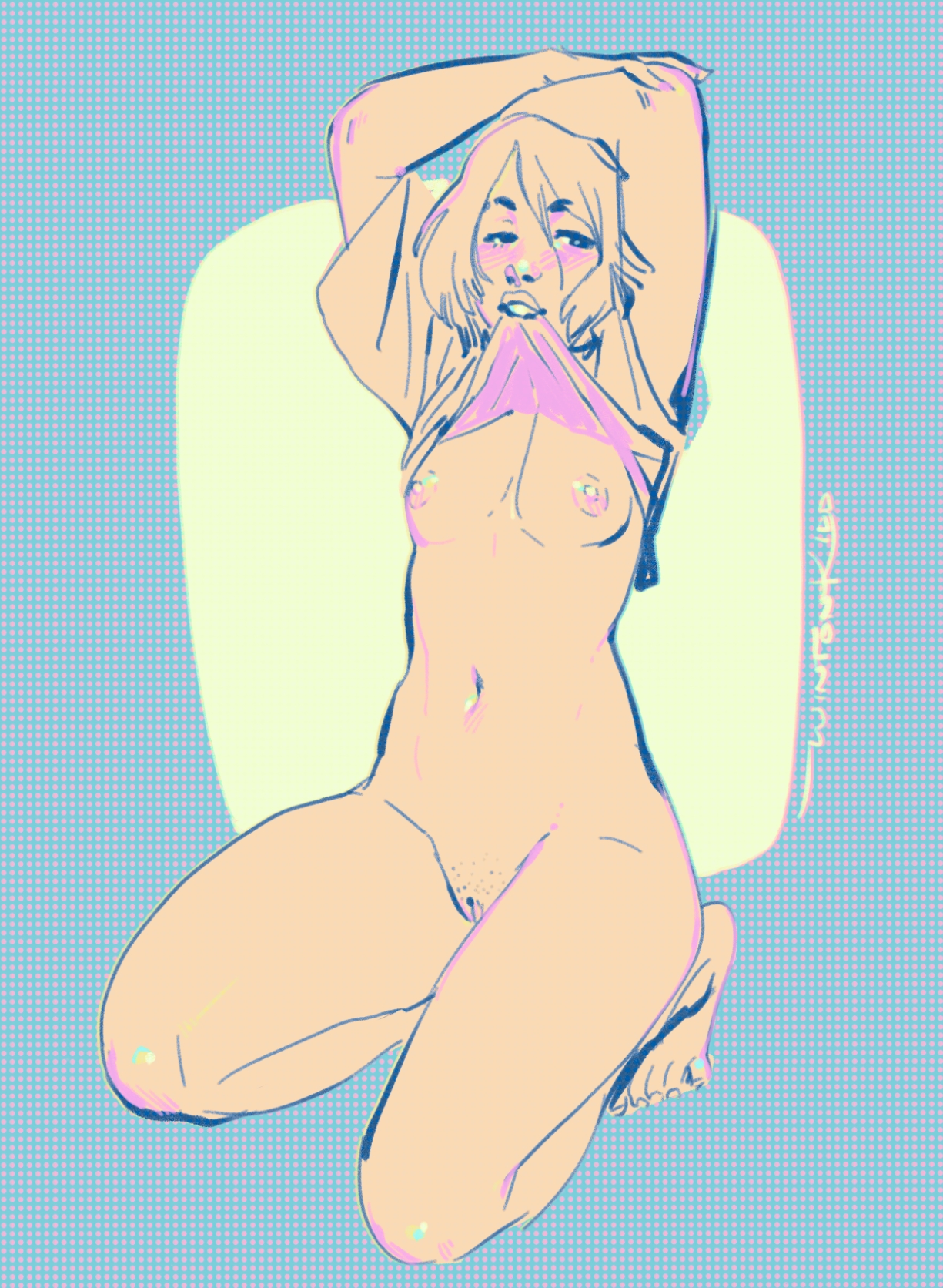
80s Halftone Fun + Color and Nostalgia art talk (Patreon)
Content
Happy Thursday everyone! Still playing with my new halftones and tinkering with CSP brushes.
An art professor in school once described to me how when Rembrandt painted a highlight on an eye or nose he would put a cluster of small dots of white paint, one tinted blue, one tinted yellow, one tinted pink, so that they would create some sort of optical sparkle effect through their color vibration.
I don't know if I ever have actually been that close to a Rembrandt to confirm this, but I always think about that when painting highlights, how you can create color vibration through those intense colors playing off each other. I am certain that Rembrandt didn't have access to neon colored pigments like I'm using here tho ;)
I feel like it's a little bit of a trend to use a real pale teal blue/green as a highlight on flesh tones right now. I see it a lot and I can't deny that I like the iridescent quality it creates to the skin.
One of the most playful, fun things about art to me is how you can play with a viewer's perception by treating something in a particular manner and I think about this a lot with erotic art. I always am trying to make things look appetizing, soft and delicious.
The more I think about it the more that 'edibility' kinda factors into the way I handle color. It's kinda challenging when you want to communicate a certain kind of material while still making the world look soft and warm. I think about Oak's acorn cap in this away, by its material properties it should have way more texture, but I wanted it to look like it could be made out of peanut butter almost.

The more I think about it, Candyland's 80s illustrations were a big influence on me. I love the color usage in that game and try to replicate that way that flesh glows as if it's made of marzipan or is so translucent it glows from within.

Candyland was probably just my first brush with this sort of commercial illustration style that used to be really common from illustrators like Haddon Sundblom who I believe mentored or taught Gil Elvgren in some fashion, which makes a lot of sense when you see his Coca Cola girls. Just so gooey and slick---nothing could ever hurt you in this painterly world:

But this sort of uber-appealling mid century product illustration technique is kinda just embedded in I'm sure at least the American psyche at this point. I'm definitely a sentimental sort and I can't help but make work that is escapist in nature. I know we can't actually live in a world that's eating ice cream cones in a perpetual summer sunset but it feels achingly good to go there in art.

Look at those sexy glowing cheeks. Perfection.
Nobody asked for this color rambling but I'm feeling really distractable today I'm trying to put it to use :)
<3
Winton
Files