Home
Home

 Artists
 Search
 Recent
 Random
 Posts
Posts
 DMs
DMs
 Tags
Tags
 Random
 Importer
 Import
 FAQ
FAQ
 Account
 Register
 Favorites
 Login
Login

Space Camp: Making Page 4 (Patreon)
Content
Let's look at some more of the edits I made between the two drafts of a chapter from my Letters From Space Camp book! For reference:
- Day Two: First Draft (16 pages) 🔒 Comics Tier Patrons
- Day Two: Revised (22 pages) 🔒 Comics Tier Patrons

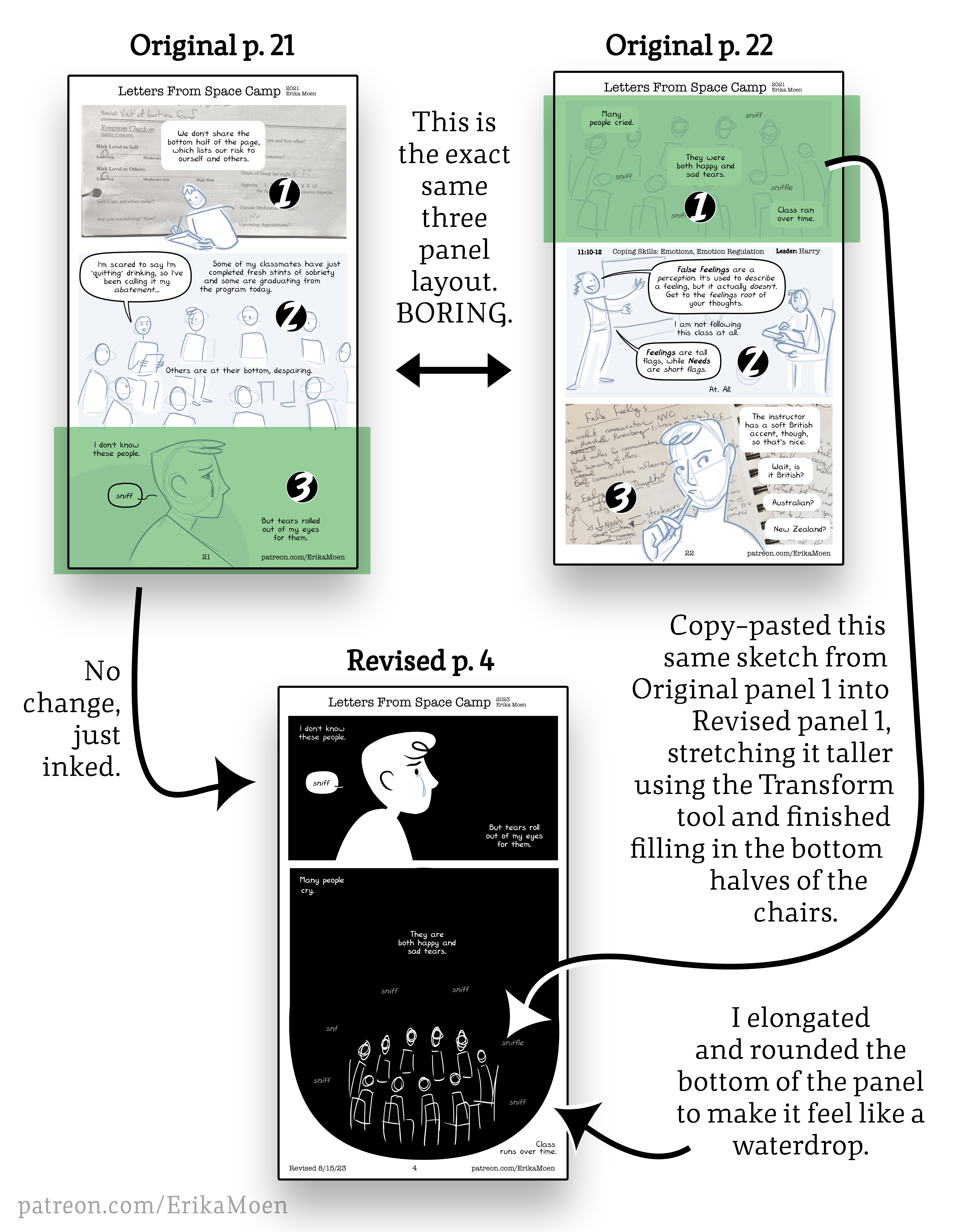
As you can see, the original pages 21 and 22 had the exact same layout: three horizontal panels. Like I explained in my last post, I was just copy-pasting my text down onto each page as fast as I could go, not considering what the layout would look like until I returned to figure that part out it later.
In these two pages, I was just listing off the events in their chronological order. We've got:
Page 21:
Panel 1: Filling out our class worksheet before class starts.
Panel 2: Class starts with the check-in, where patients share how they're doing.
Panel 3: My emotional reaction to my fellow classmates' struggles.
Page 22:
Panel 1: My classmates' emotional reaction to our struggles.
Panel 2: NEXT CLASS. I don't understand what we're being taught.
Panel 3: I wonder about the teacher's accent.
Comic panels are like the inflection you add while speaking. If you talk in a perfect monotone while listing off what you did that day, the listener is going to struggle to tell which events were more important or how you felt about them. By presenting the various events on those two pages in the exact same kind of panel, I gave them each equal importance. Filling out the class worksheet is no more impactful than my class crying together or me wondering about my next teacher's accent. It's a visual monotone.
For the revision, I gave an entire page to focus on one specific event: the crying.
The original third panel of me crying on page 21 and the first panel of the whole class crying on page 22 are part of the same moment, they need to be on the same page.
I expanded the group crying panel to show the entire cluster of people in their chairs, rather than cropping off their legs like I did in the original. I wanted to show us united, like a little island floating together on an overwhelming sea (an image that comes up again later). To create the sense of both falling and reinforce the idea of crying, I rounded the bottom and elongated the top of the panel shape to make a very lose teardrop-shape.

The original rectangular medium-close panel showed that we were sharing our stories in a group setting, the revised panel still shows that, but by pulling the camera way back it now helps convey the feeling of the moment, the isolation and the comradery at the same time, the feeling of falling, the weight of our tears.
Several times I attempted to draw the class group on the new page but it never turned out "right". They're stick figures, how hard can it be? Surprisingly hard! Finally, I just copied my original sketch and pasted it into the new page. With a little adjusting from the Transform tool and drawing in the missing legs, I finally had the look that I wanted. You just can't recreate that raw sketchiness!
The last line reads "Class went overtime.", which I placed just outside the black teardrop panel on the bottom right. My thinking was that the class is taking place in the black panel, we're lost in that moment together, and the "overtime" text happens outside of that space because it was outside our awareness. We hadn't realized we were overtime until we were. However I'm afraid it's too easy to miss that last little sentence, particularly on my web page template with the stock footer information that is printed on the bottom of each page (Revision date, page number, URL). On a printed page without that extra info, I think it'll show up fine. But in this online version, I'm afraid it blends in with the boilerplate.
Files