Home
Home

 Artists
 Search
 Recent
 Random
 Posts
Posts
 DMs
DMs
 Tags
Tags
 Random
 Importer
 Import
 FAQ
FAQ
 Account
 Register
 Favorites
 Login
Login

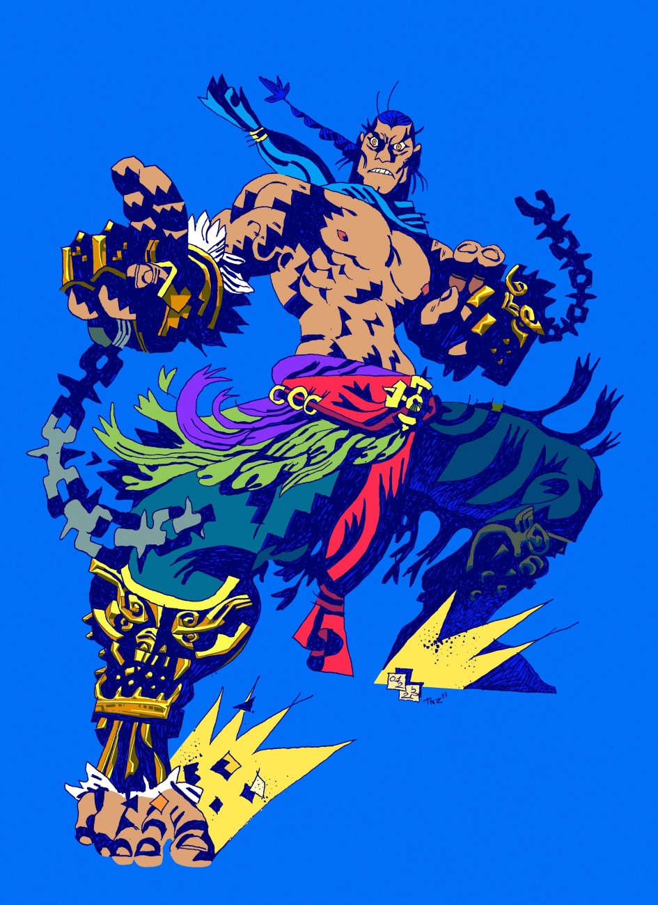
Feng Wei - playing with colors (Patreon)
Published:
2023-02-03 12:47:37
Imported:
2023-06
Content
As of recent few months, more and more I'm starting to think about my work in terms of color (or, at least, more nuanced volumes), so even when Sergey colors a piece of mine on his own, I can't resist going further with it in some of my coloring experiments. What do you guys think about this style? It's pretty similar to the story me and Sergey made back in December, so this style of rendering is definitely here to stay, in one way or another:

(Unfortunately, both our versions are digital-only, because this is how it would actually look in print-ready CMYK:)

Files