Home
Home

 Artists
 Search
 Recent
 Random
 Posts
Posts
 DMs
DMs
 Tags
Tags
 Random
 Importer
 Import
 FAQ
FAQ
 Account
 Register
 Favorites
 Login
Login

Witch Breeding (Patreon)
Content
Be sure to check out Discord for the image and your rewards!
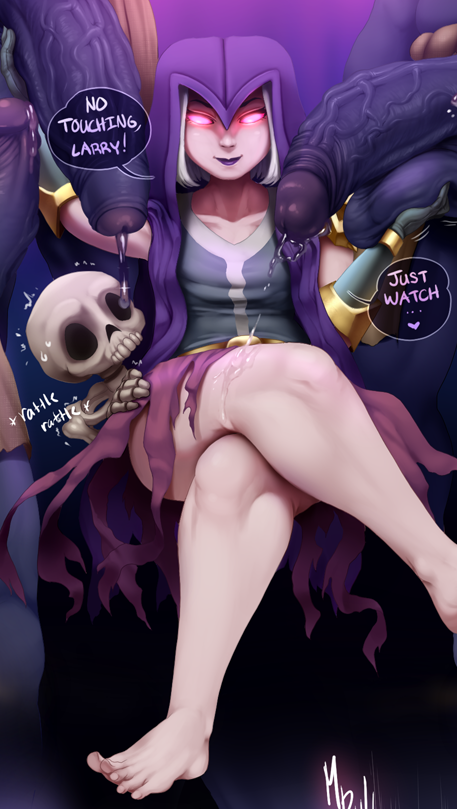
Christ alive, REALLY late Halloween piece but finally done with this one! For those who dont know, this is the Witch from the game, Clash of Clans going up against some Bowlers! The differences from the original design were that I gave her legs and visible hair, however I couldnt decide on what color so I put it to a vote and putting white hair was the winner! Man, this was a butt load of work, which is odd because I know Ive done things longer than this so Im not sure why this one was far more difficult. I wanted to pinpoint what the reason was and the only conclusions I couldve come up with was self-discipline issues, balancing life and work, or probably rendering differences of past projects. Maybe I was being too meticulous with certain details in this? You can definitely notice the rendering deteriorate the further going down which Im not too proud of at all due to impatience and my anxiety of things piling up.
Again, not sure but Im becoming more lenient on the self-discipline issues because I felt I was failing on the balancing act I was doing with multiple works with art and the works I had to do for schooling and personal life issues and Im trying to develop a better sense of focus. But youve heard me yelp that out before so Im not going to get into detail on that x) Onto aspects of the piece itself, I loved working with analogous colors in this! I recently tried learning different color theories (mostly basic stuff) and I thought analogous was something to definitely experiment here with the witch being purple, her eyes on the pink/purple side, and the bowlers being blue from the game. As you guys know, Ive wanted to always try to make color finally make sense in my images rather than just ironically eyeballing it so hopefully I can apply what Ive learned through future pieces! Not going to be 100% accurate and Ill definitely stumble across the path but I hope I can display my efforts better.
I guess you can almost argue that its split-complimentary as well? Since there are tints and shades of yellow here in contrast with the blues and purples. 1 new method that I tried for subtle texture was creating cross-hatchings for the cloth of the bowlers. Very small and unnoticeable at best, but I felt some sort of tiny visual remarks on that would help rather than it being flat as a board. As for the wetness, I tried studying other styles that emphasizes how heavy and goopy they were rather than how real they were if that makes sense? Im trying to develop demonstrating more feeling into the piece rather than being more so accurate with the works since I personally find more appeal in artworks that emulate the excitation and sensibility with exaggeration or changes rather than it being correct. But thats just my perspective and subjective opinion on the matter :o anyway, dont want to be too rambly in my descriptions since I can make them obviously way too long so Ill leave it at that and hope you guys like!
Files