Home
Home

 Artists
 Search
 Recent
 Random
 Posts
Posts
 DMs
DMs
 Tags
Tags
 Random
 Importer
 Import
 FAQ
FAQ
 Account
 Register
 Favorites
 Login
Login

Logo Evolution (Patreon)
Content
With the recent logo change - and to celebrate finally designing something that isn't blue - I thought I'd share how it came about.
Original Logo - 2014
The original logo was one of the very first things I created with Inkscape, after I was convinced that creating things pixel-by-pixel in Adobe Fireworks was a thing of the past.
This logo doesn't have much meaning behind it. For some reason I wanted a logo where it looked like a monster took a bite out of it - I think back then I was right into RPG games.
The earliest copy I can find is on my Dribbble page, back in August 2014:

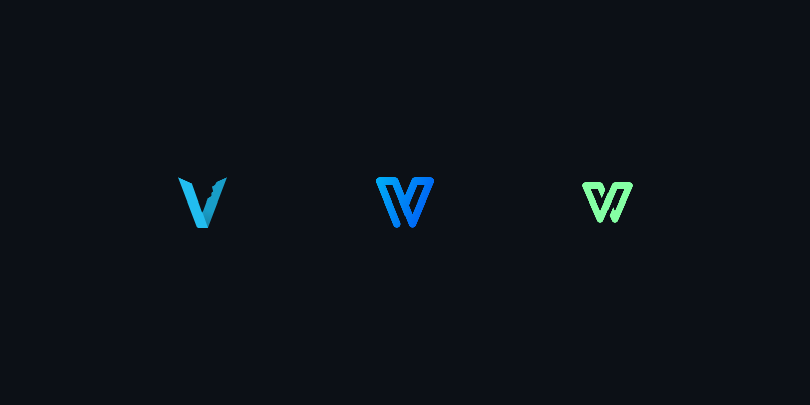
V Monogram - September 2018
This logo was designed by my friend Alex for a university project. We had to brand our own fake creative agency and ours was called "Vice Versa". Our theme was feedback and flexibility:
"Our logotype visually expresses both a monogram and an ambigram, creating the concept that two different ideas can blend together and build upon one another.
Our design process values the client as part of the studio design process and our solutions are designed to push the boundaries and go against the grain."

I took the right-half of the logo and changed the colours over time.

Green V - 2023
99% of everything I've created is blue. Changing from blue to green is not like me at all!
I was working on a new UI design for Sector's Edge and had a nice colour palette consisting of:
- Cyan blue (used everywhere in SE),
- Golden yellow (used for loadout power)
- Agaman orange (used for warnings / errors)
- No green!
I've always struggled to find a nice green colour to use in Sector's Edge that matched the futuristic feel. I like pastel-like colours and eventually landed on this light green colour:

I liked it so much that I started an entire new UI design for Sector's Edge that used this green as an accent colour:

But why stop with a Sector's Edge refresh? With the shutdown of Sector's Edge and the start of a new project for Simon and I, was it time for a brand refresh too?
The new Vercidium logo represents:
- Letting go of the past - changed from blue to green
- Our shift in direction - flipped the logo horizontally
- Being humbled by failure - reduced the height
- Staying connected to our players - connected the line
- Moving forwards - the central line is a forward-slash instead of a back-slash

There's also some extra symbolism in our wallpapers. Moving the logo to the side reminds us that creating games isn't about us - it's to help others enjoy themselves.
I've uploaded these wallpapers to the Dropbox folder for this post. If you would like a different resolution please let me know!

Thanks for reading :)
- Mitch
Files