Home
Home

 Artists
 Search
 Recent
 Random
 Posts
Posts
 DMs
DMs
 Tags
Tags
 Random
 Importer
 Import
 FAQ
FAQ
 Account
 Register
 Favorites
 Login
Login

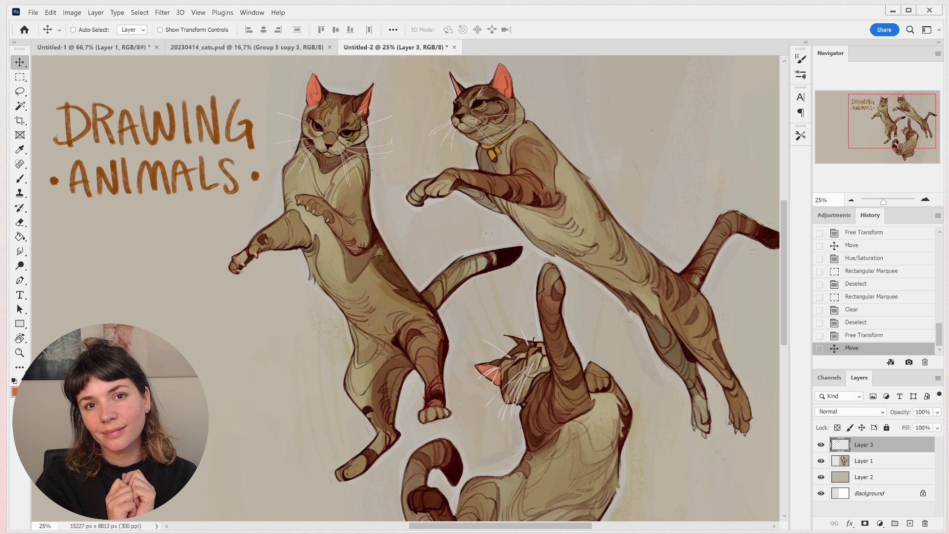
RESOURCE // drawing animals (Patreon)
Published:
2023-04-26 10:54:09
Imported:
Downloads
Content
Here's a little resource video about this month’s challenge! In this video, I do a quick review of the artwork posted in the discord, walks you through my process for creating the artwork for this challenge, and discusses common mistakes and tips for tackling animal sketches like these in the future!
I hope you find it helpful ❤ And thank you to everyone who participated in this challenge! If you haven't posted yours yet, head on over to the monthly-challenges channel in the discord server and share your art with us!
Files