Home Artists Posts Import Register

Content

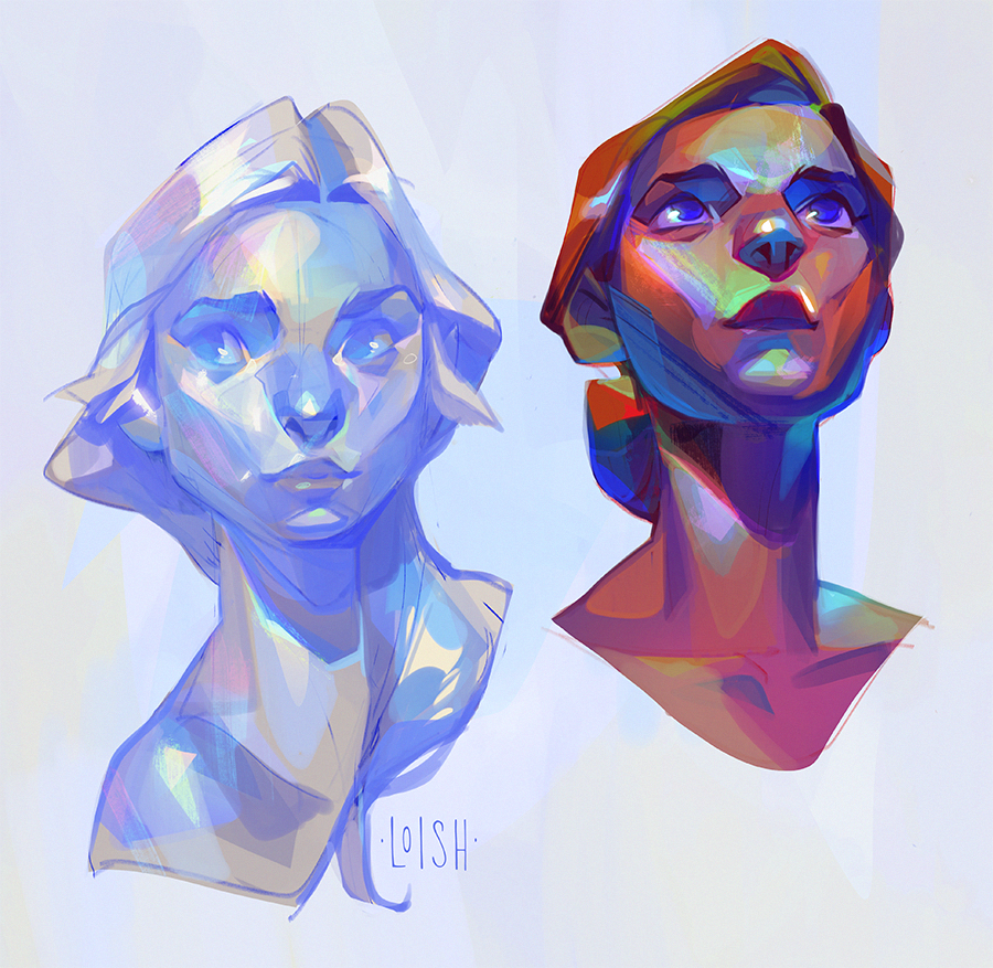
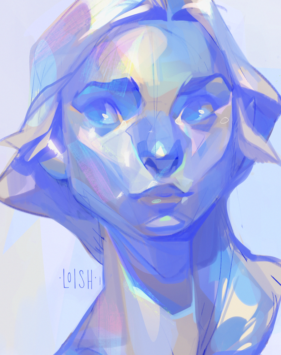
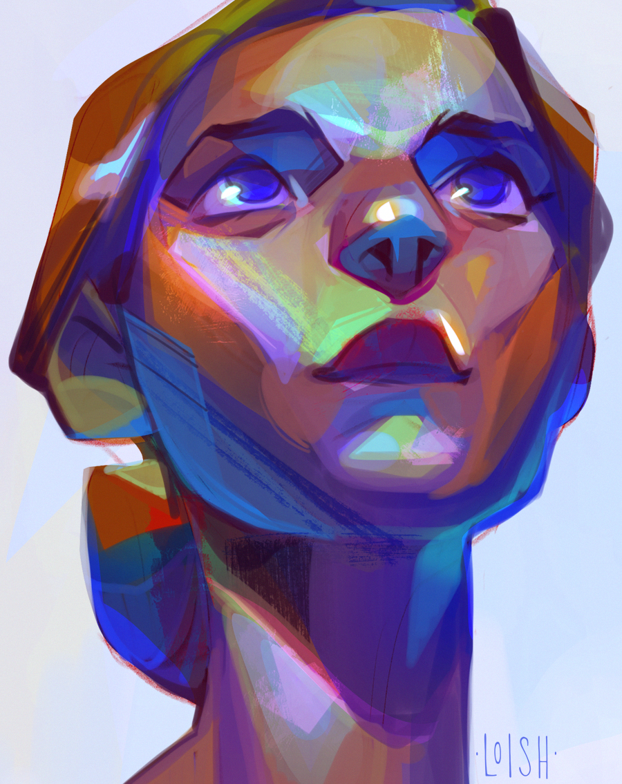
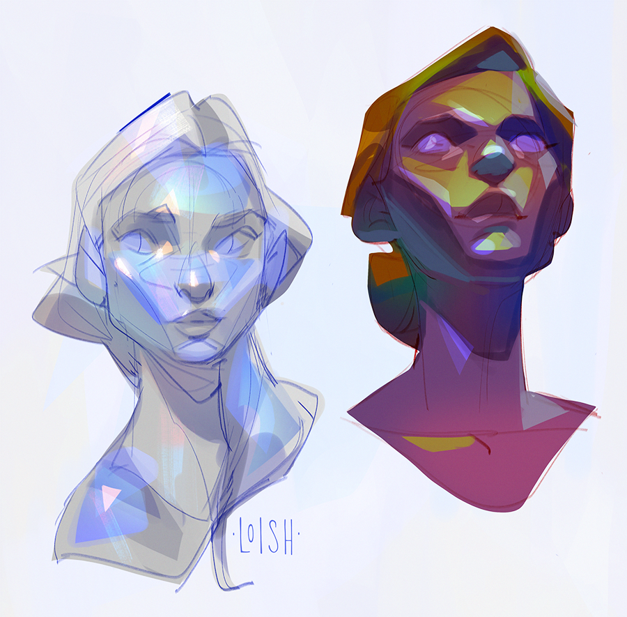
I wanted to try some portrait studies where I took the color / surface texture of an iridescent stone, and applied this treatment to a face. The left one is inspired by reference photos of moonstone, and the right one by rainbow quartz. It was fun to do, I think it would be fun to expand on this idea for a digital painting in the future! Have a great weekend everyone ❤

Files

Comments

Anonymous

I’d love to see more in this vein, the color choices you’re making here are fascinating.

Niquey

Amazing! I know an artist who did (and is still doing) a series of characters based on gemstones. I myself have OCs based on gemstones ^ ^

Anonymous

Wow they remind me of holographic party cellophane 😍 I love these!! Good job! 💕

Anonymous

I’d love to see a full picture. Especially moonstone.

Anonymous

Beautiful colors!!

Anonymous

Truly stunning. 😍

Anonymous

Wow these blew me away. I'm going to try to copy these as a study to learn about how you did this! I hope you decide to put out a process video!

Klara Art

I love it. This si really good idea. I have to try that too ❤️😍 I have similar idea artwork in process but I gave the person texture of fruit (strawberries)

Anonymous

This is quite beautiful, definitely unique. Perhaps you should try cat's eye? Lovely portraits, so glad to be a part of your Patreon page, you are SO inspiring! <3

Loish

thanks so much for supporting me here! it means a lot!

Loish

ohh that's a great exercise too! very curious to see how that one turns out!

Loish

thanks! i was thinking that one would be interesting for a more detailed piece :)

Anonymous

The pleasure is mine! Thank you for creating wonderful content and videos. I especially love watching your traditional work. :)

Anonymous

Can I ask how you decide the range of a gradient ? Something I noticed while doing master studies is that the larger the contrast in values ( I mean values that sit directly next to each other ) the less clear the rendering is up close. For instance richard schmidt though a traditional abstract artist his paintings read extremely clearly from a distance but zoom in and rendering is extremely rough. I love your work and I noticed unlike a lot of Digital artist you seem to vary from piece to piece, I know the above is early access but its stunning, If I zoom in on the left eyes lower eye lid for instance, on the drawing on the right its one shape with I think maybe 3 values , from a distance it has a polished rendered look, up close you see you've used such simple quick details. Sorry long message , Do you decide these value ranges while painting or do you plan before hand ? ( Sorry again if I'm getting this all wrong )

Loish

hey kevin! i kind of wing it with the values, i just build gradually from one base color and try to check as I'm adding colors whether they feel harmonious. then I just kind of wing it from there when it comes to adding detail. I think my 'sculpting with color' tutorial explains it pretty well, the way I build color and then use that as my jumping off point for detailing: https://www.patreon.com/posts/tutorial-with-53897099 i hope that answers your question! if not, don't hesitate to let me know!

Anonymous

Thank you so much for the reply , it does answer my question 😊 I'm gonna gift that video a watch thanks so much for taking time to answer

Anonymous

Iridescence is my fave! 😆 love it! 💚