Home Artists Posts Import Register

Content

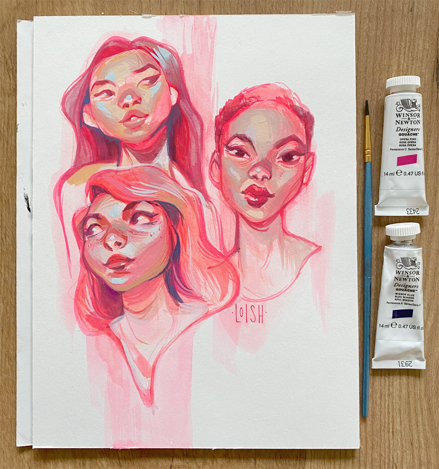
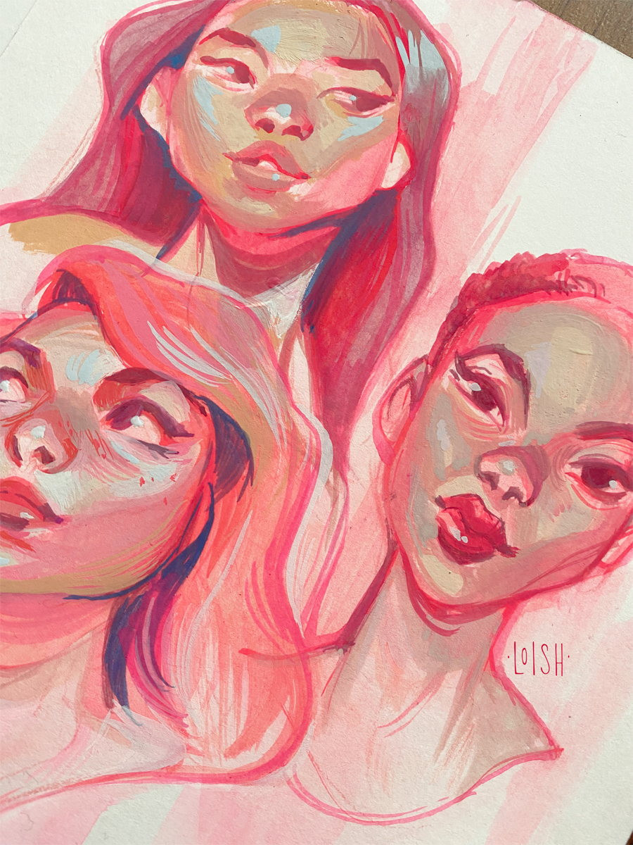
Here are some gouache studies I did before new year’s, but didn’t have the time to properly photograph until today! I bought a new tube of ‘opera pink’ winsor & newton gouache and wanted to try it. It blends wonderfully with reds and blues!

Even though I still struggle with this medium, I just love it so much because of the way the colors dry. They turn into softer, more muted versions - the darks get a bit lighter and the lights get a bit darker. I just love how that brings everything together as it dries.

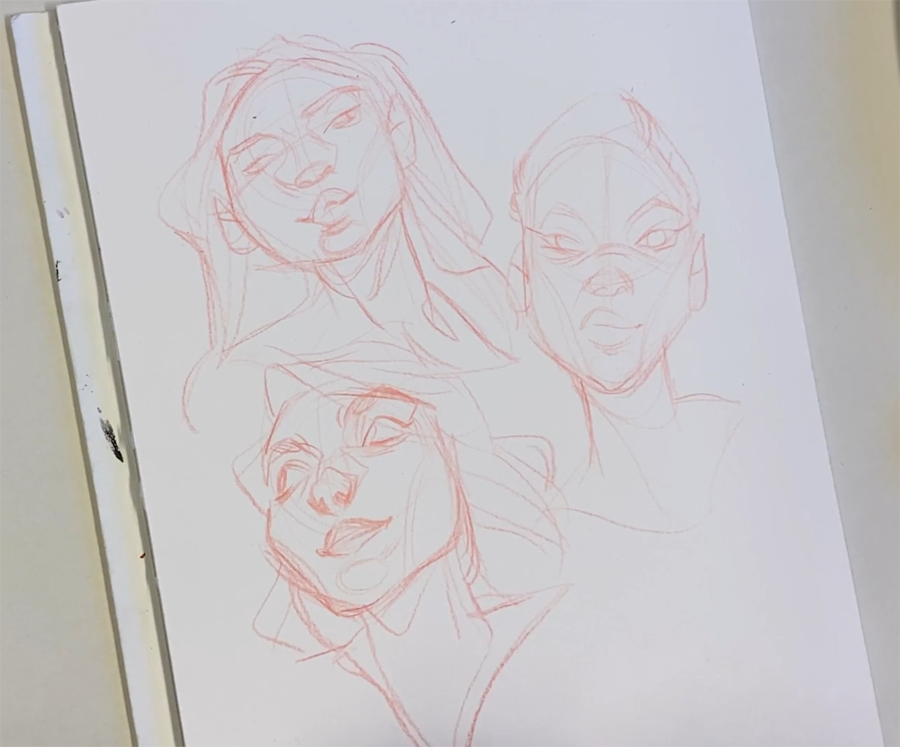
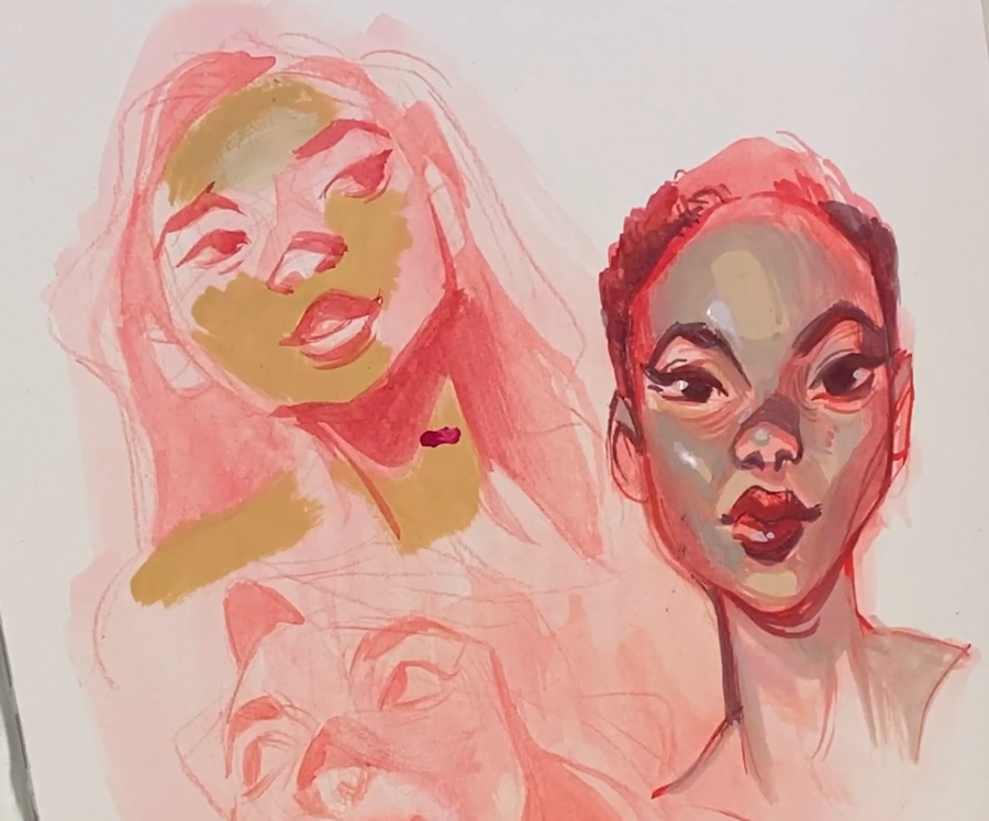
I made a process video for this one which I’m editing at the moment and will post tomorrow! Meanwhile, I included some process shots from the video above. 

Files

Comments

Anonymous

It's amazing how you keep your style so consistent between very different media

Anonymous

I have yet to use gouache, but it does look like such a cool medium to use. I love seeing you experiment.

Anonymous

Hi Loish! First of all just wanted to say thank you for always providing us such stunning content. I would like to ask, do you have any tips on overall developing as a painter? What I mean is that as an artist, I feel a heavier instinct to use lines, and concentrate on line work. But when it comes to painting I'm not nearly as comfortable, it doesn't come nearly as natural to me. I feel like I have always been like that. But yeah haha, any tips for just becoming more comfortable with painting in general would be greatly appreciated!! Thank you ❤️

Anonymous

It's wild how your traditional art even has some digital looking elements! I've only tried gouache once and it wad a muddy mess lol I don't think I waited long enough between layers 😅

Jo.Comics

You're saying you struggle with this but that just looks amazing! Also, happy New Year! Hope you started 2022 on the right foot 😊

Anonymous

I love how soft and creamy gouache looks when it's dried! Though I always feel like I'm battling the elements when I use it. If the room is too warm it dries too quickly. If it's too cold, it takes too long! 😅 Have you done any tutorials with it? I haven't been on your patreon for long.

Anonymous

Ooh this color is amazing! I'm actually thinking of picking up the Sibylline x Mossery gouache kit so I can learn about the medium a bit more. I have some, but it never really comes out right haha.

Loish

hey iva! well, first of all, if you're a line-based artist then it's totally fine to draw that way! there's really nothing wrong with that. if you want to break free from that technique and try it a different way, i'd suggest looking at things in terms of the overall color and lighting before defining the specific forms. here's a random example i picked up off of google - https://cdn.dribbble.com/users/3887019/screenshots/9874295/digital_painting.jpg - which shows how you can start really 'blurry' and define the features / forms from there! hope this helps in some way!

Loish

haha i've had that before too honestly, i think a lot about making gouache work is waiting long enough for the paint to dry. it tends to re-activate as well so overblending can be disasterous.

Loish

thank you! i haven't made a tutorial just yet. i just haven't figured it out enough to be able to make any kind of instructive content about it at the moment!

Loish

thank you! I loooooove sibylline's art, i wish i could handle gouache as neatly as she does.

Anonymous

Right??? Her precision with those tiny brushes blows my mind.

Anonymous

This is really cheery. I’ve been drowning my video game characters in these sorts of pinks so seeing them in art in another medium is nice. Also if you didn’t see, Max Ulicheny updated the gouache pack and I’ve been having a ton of fun with it, trying to figure out what all I like. He added a lot of brushes that remind me of things you used in your Procreate environments tutorial.

Anonymous

Hi Lois, these are gorgeous! Be careful with Opera pink, it's one of my fav colors but I can't use it in watercolors or gouache because it's a fugitive color, meaning it fades super quick. The lightfastness is crap. So if you're scanning it for commercial work, great, but avoid it for gallery work.

Anonymous

Always a pleasure to see your combinations of pinks and blues Loish 😊

Loish

ohhhh that's a really good tip, thanks so much! this is good to know, i won't sell this one and i'll be sure to scan it asap. how do you know that / what's your alternative for this color?

Loish

ohh thanks! definitely gonna play around with those soon!

Anonymous

The essentials pack also got updated. Not sure if you have that one, but the new version is something I maaaaaaay like as much as the gouache set.

Anonymous

I'm a watercolorist and have studied it for years. The tubes of paint have all the info you need, you just have to learn how to read them for each brand. They show lightfastness, transparency, and even a pigment code so you can match between brands. Here's the lightfastness info to look for: Winsor Newton - Lightfastness: I, II, III, IV (IV is worst) Daniel Smith - Lightfastness: I, II, III, IV (IV is worst) M. Graham - Lightfastness I, II, III, IV (IV is worst) Holbein - ***, **, * (* is worst) Please note, other known fugitives besides Opera Pink include Madder colors and Alizarin Crimson. Avoid ones marked "opera, bright, opus, brilliant, neon, or florescent" - they mix in fugitive dyes. My fav closest colors to Opera Pink is Quinacridone Rose and Quinacridone Pink. They have better lightfastness.

Anonymous

Your so inspiring 🥰🥰