Home
Home

 Artists
 Search
 Recent
 Random
 Posts
Posts
 DMs
DMs
 Tags
Tags
 Random
 Importer
 Import
 FAQ
FAQ
 Account
 Register
 Favorites
 Login
Login

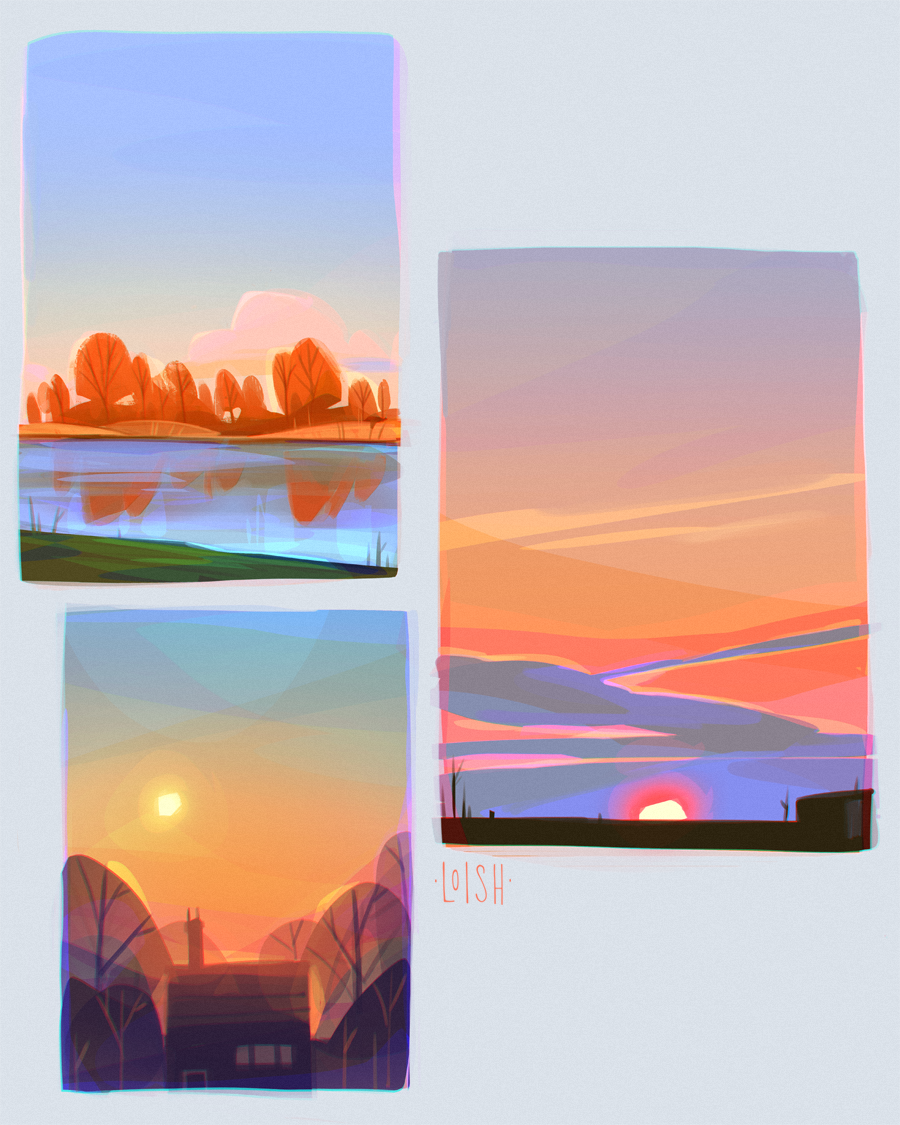
EARLY ACCESS // colorful skies (Patreon)
Published:
2021-06-15 09:00:03
Imported:
2022-04
Flagged
Content
The result of a sketching session where I tried to push the colors way further than they were in real life, to try and capture the same feeling that I had when I saw that moment in real life. I feel like photos are so dull in comparison to seeing the real thing! But then when I push the colors too far, it doesn’t look believable anymore. Trying to find the balance with sketches like these!
Files