Home
Home

 Artists
 Search
 Recent
 Random
 Posts
Posts
 DMs
DMs
 Tags
Tags
 Random
 Importer
 Import
 FAQ
FAQ
 Account
 Register
 Favorites
 Login
Login

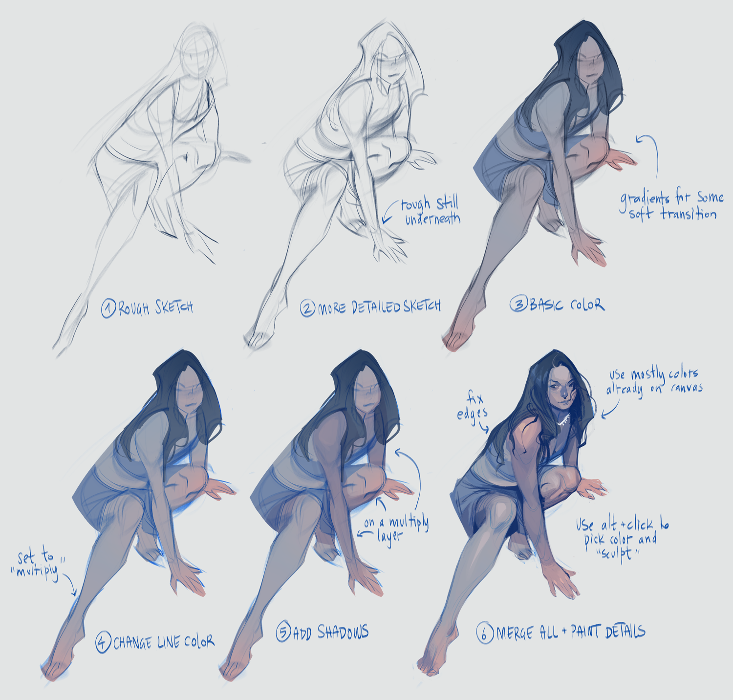
STEP BY STEP // Pose studies (Patreon)
Published:
2020-01-31 17:50:54
Edited:
2020-02-06 20:44:33
Imported:
2022-04
Flagged
Content
These are the basic steps that I use when I make studies from photo reference!
The most important thing for me is that the rough sketch is expressive and stylized. The further in the process I go, the more ‘realistic’ it starts to get and the more it loses the movement of the first sketch. So I always want the first sketch to be as expressive as possible - and as you can see, I don’t really sweat the details at step 1 (just look at her face!)
Step 4 is also an important one: changing the color of the linework gives so much depth to the color scheme. This is something I do in all my digital art pieces. It helps to give extra dimension and life to the art!
Files