Home
Home

 Artists
 Search
 Recent
 Random
 Posts
Posts
 DMs
DMs
 Tags
Tags
 Random
 Importer
 Import
 FAQ
FAQ
 Account
 Register
 Favorites
 Login
Login

96 - wips n' gifs 1 (Patreon)
Content
Here's a bunch of wip gifs that were made of the previous 2 posts' contents.
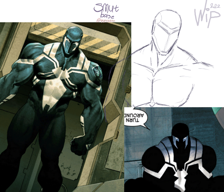
- As seen on the first 2 major parts of the first gif, I used comicbook references for this Venom Space Knight while sketching him. I've found a comic via google images and I was studying that design. The design wasn't constant on tiny details btw. xd
I use adblock so for me it was safe to check the website and all, but anyways, here's the comic I used: https://viewcomiconline.com/venom-space-knight-issue-1/
I bet the art took a lot to make, cuz the colouring looks really nice.
The gif doesn't show that much, at the end part I just kept making it more darker and added some thicker outlines that made it much more better.
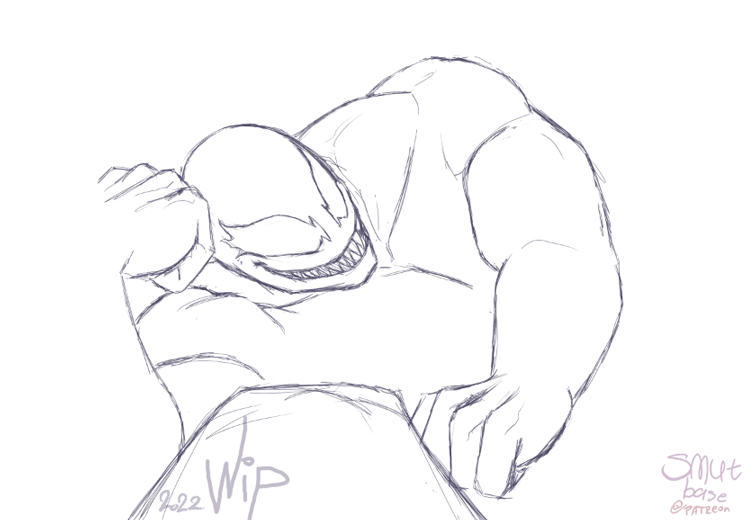
- The 2nd gif isn't showing much changes either, but it's something.
I most likely gonna go back to this sketch, cuz Venom's little finger is too long on the hand that supports his head..
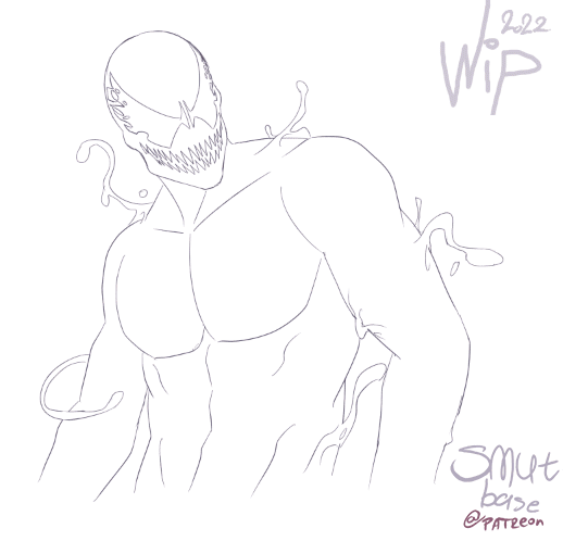
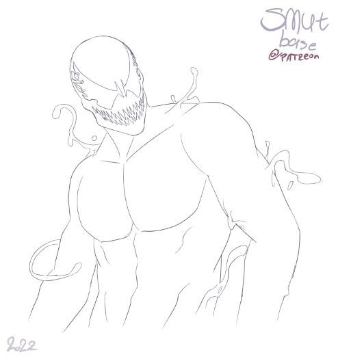
- 3rd picture was made when I've done the first 2 Carnage designs, mine and the old comic book variant. Found this one cool, in a way.
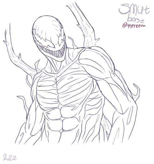
- The 4th submission is of the only drawing I kept making screenshots of while working on it. I had time for it, for sure. xd As shown in the gif, after the first part of making the pattern, where only the torso part has worked on, the belly/abs part wasn't polished, in the next frame the pattern is more detailed. Just pointing this out.
Also at first I've made his eyes stick really close in a strict, straight line together. At the very end in my work, I've bended the edges in the center, that was inspired by a few comic panels to do so. It doesn't look that "robotic" anymore this way. Also was a bit weird how close his eyes were drawn in all the old comics btw, but in that case, I guess it fit the style(?).
This action figure helped me decide to change his eyes a bit at the end: https://toysonejapan.com/products/medicom-toy-mafex-carnage-comic-ver-action-figure-japan-official
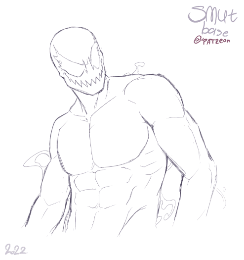
- The last 3 gifs are showing the same character with only their lineart and then with their fully coloured, final version. It's just a show off how their linearts look.
The first has more scratchy parts, cuz it was my first try. Then the 2nd has more cleaner lines, cuz I "wasn't trying that much" xd The lines just came out well for first tries... mostly.
Then the last one has more details. I think if I had done all these 3 designs on the same day, the lineart could have been much more alike. And my hand would be in much more pain (if I had coloured em at the same time), for sure. xd
All these drawings/sketches were made with a pencil brush for the lineart. Then all drawings got a thicker outline at the end with the same type of brush.
The basic colouring was with either a normal pen, or a marker brush. The patterns were made with a marker brush (that's why it looks flawed and not so intense with the colouring).
Because the marker brush fades instead of getting thinner when enabling the pen pressure option, I've used an eraser for Carnage's pattern and/or a smaller marker brush.
I was aiming to make all the Carnage's variations to show off their body details, that's why their pattern aren't that dark. Altho my version is the lightest in that matter, the other 2 are way darker.
Also all characters have textures applied to their basic colouring, that's why they look more detailed (or "sketchy" if I can say that).
Files