Home
Home

 Artists
 Search
 Recent
 Random
 Posts
Posts
 DMs
DMs
 Tags
Tags
 Random
 Importer
 Import
 FAQ
FAQ
 Account
 Register
 Favorites
 Login
Login

HSH2 Page 5 Progress (Patreon)
Content
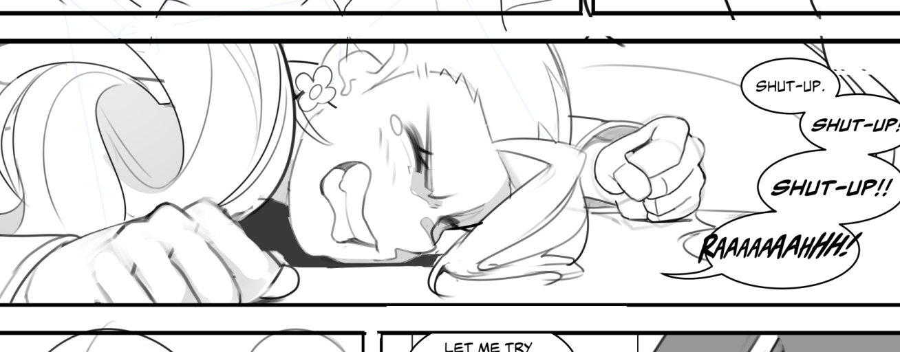
Anyways I thought this was a cool panel. In the last stream I was discussing paneling and page layouts and one of the things I noticed professional mangaka doing often is creating these long thin panels that are effectively cropped to show just what you need to see.
This one is still wider than most of the thinnest panels I've seen, but it was fun trying to figure out how to crop this image. I needed to show Sharlene on the floor and the most effective way to capture her emotion was to highlight her face and fists balled up in frustration. You can set yourself up for better visual story-telling and more interesting page layouts by understanding how to crop your images. This is something I think is really cool because when done correctly you won't notice it at all... and at its most effective allows you to become more immersed in the story.
I probably could have made this one thinner, but there's just enough vertical space for the bubble stack I wanted. That last bubble is gonna need some editing before it looks really good though.
Files