Home
Home

 Artists
 Search
 Recent
 Random
 Posts
Posts
 DMs
DMs
 Tags
Tags
 Random
 Importer
 Import
 FAQ
FAQ
 Account
 Register
 Favorites
 Login
Login

Creating a nice screen using Shoost. (Patreon)
Content
Hello everyone.
I would like to share with you some things I have noticed and tips I have learned when creating scenes using Shoost. When I use Shoost, I usually start with the characters and backgrounds already prepared. How to proceed from there is the theme of this issue.
There are two important points. Layout and Color balance.
- Layout
The first one is "layout".
The main points of layout are how to position and size the characters in relation to the screen, and how to set the position of the background accordingly.
There are various guides for determining the composition of the screen, so it is easy to use them as a reference for layout.

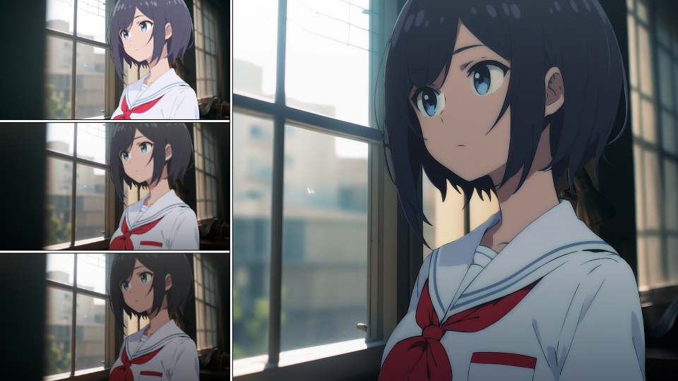
There are a number of guides for determining the composition of the screen, but the rule of thirds method is the easiest to use. For example, let's take a character in the center of the screen and adjust its position using the rule of thirds method.


The use of the rule of thirds is simple: simply bring the area you want to show to the point where the vertical and horizontal lines intersect.

In the case of this scene, the character is also acting slightly gazing toward the right side of the screen, so it is better to shift the character slightly than to place him in front of the screen for better balance in terms of screen layout.
It is not necessarily true that following the composition guide will definitely improve the scene, but it is advisable to use the guide appropriately according to the direction of the character's gaze and the intent of the production.
- Color Balance.
Next, we discuss "color balance".
In order for the characters and background to blend together, it is important to match the overall image and color scheme. Since it is difficult to change the pattern in Shoost, we will try to adjust the color balance instead.


This is with the Shoost Normal filter in place.
I think the colors are balanced to some extent even with this filter. From here, we will make further adjustments. First, we start by making the entire image black and white to check the balance of light and dark.

By making the image black and white, the hue information is eliminated, so we can concentrate only on the lightness and darkness. Checking the lightness and darkness of the background, we see that the outdoors is bright and the indoors is dark, so the characters indoors need to be of similar lightness.

The brightness of the characters has been lowered to match the brightness of the room. This increases the atmosphere of the character being in the room. You can also do the opposite, brightening the background to match the character.

We brightened the background image so that the brightness of the room matches that of the character. In this way, just by matching the lightness and darkness of the background and the character, a sense of unity is created throughout the entire image.
In this case, we will go in the direction of adjusting the lightness and darkness of the character to match the background.

Restore the saturation to its original level. To further unify the image, use ColorFilter to add a little common color to the entire image.

A comparison of the changes shows that they have changed.

Color adjustment alone is not enough to achieve a sense of overall unity. Other adjustments are also necessary, such as the touch of the picture and the direction of the light source. However, even just adjusting the color tones will improve the overall atmosphere, so please give it a try.
Shoost is being developed so that it can do more, so please look forward to future updates!
Files