Home
Home

 Artists
 Search
 Recent
 Random
 Posts
Posts
 DMs
DMs
 Tags
Tags
 Random
 Importer
 Import
 FAQ
FAQ
 Account
 Register
 Favorites
 Login
Login

Creating an atmosphere of 90's anime (Patreon)
Content
Introduction.
I love the atmosphere of anime videos from the 90's and so on.
So this time I'd like to try to recreate the atmosphere of anime images from those days.
When I thought about what is the difference between modern animation and the animation of the 90's, I came up with the difference in the shooting process.
Modern animation is all a shooting process done on a computer (digital processing), but originally, animation was shot one by one using an actual camera at a place called a shooting stand to shoot each celluloid (analog processing). In other words, they were shot on film.
This is where the difference in expression between digital and film comes into play.
The difference between digital and film
Digital is used directly on the computer, so there is no color change, but in the case of film photography, the camera is used to physically burn the image onto the film, and in that process, the film is affected. Colors will change.
Film Features
- Narrow color range (whites are a little darker, blacks are a little lighter)
- High contrast.
- Overly bright colors become less saturated.
- Highlight and shadow will be colored.
- The color of a subject with a large screen area will affect the overall color.
- A little detail is lost.
- Some grain.
These characteristics will be reproduced digitally.
Using Post Effects
This time, we will use Unity PostProcess to create it.

The following functions are used
- ColorGrading
- Overlay (I use Kejiro PostProcess)
- Grain
1. Color Grading
>Narrow color range (whites are a little darker and blacks are a little lighter)
> High contrast.
We will use GradingCurves to reproduce these two points.

Use GradingCurves to adjust a narrower range of colors. Make light areas a little darker and dark areas a little lighter. Make the curve S-shaped to increase contrast.

The narrower range of colors gives the overall image a slightly softer look.
Next.
>Colors that are too vivid will have low saturation.
To reproduce this, adjust Saturation.

Saturation allows you to change the overall saturation, while Sat Vs Sat allows you to adjust the saturation against the saturation. I created an S-curve so that the areas with strong saturation (the graph on the right) are lowered and the areas with weak saturation remain the same.

You can see that colors with too much saturation, such as red and blue, are changing.
Next.
> Color in the highlights and shadows
In order to reproduce this, we will adjust the RGB Curves.


I tried to get a little red in the highlights and a little blue in the shadows.
2. Grain
> There is a particle grain.
Grain is used to reproduce this.


Add a little grain of particles so that the screen does not look dirty.
3.Overlay
>The color of a subject with a large screen area will affect the overall color.
>Detail will be slightly lost.
Overlay is used to reproduce these two points.

Change the Source to Texture mode and use the image.

↑This is the image to be used for the Texture.
Prepare an image with a slightly bluish and blurred background, and prepare a separate camera for the RenderTexture from the MainCamera.
Overlay this image as an Overlay to get the following look.

It creates a soft atmosphere that seems to take in a bit of the surrounding colors.
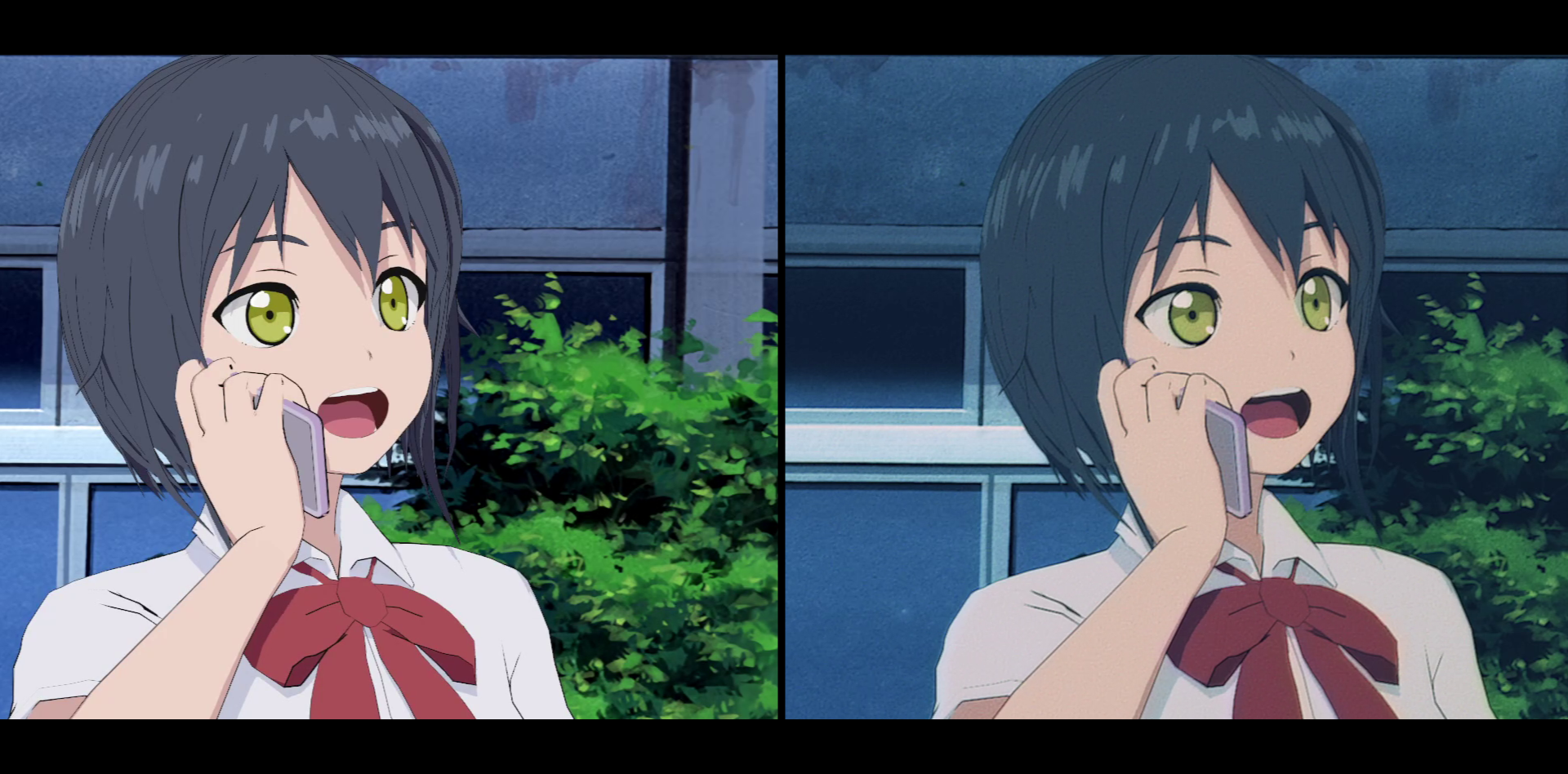
Result

↓It can be used universally in a variety of situations.

It's a slight difference, but I think it gave the image more depth.
I have tried this many times before, and this time I was satisfied with the results.
Files