Home Artists Posts Import Register

Content

I'm going to be up front with you: there are two things I don't like about this house. One is, of course, the shutters. The other is the brick veneer which I find unnecessary as it clashes with rather than compliments those amazing wood shingles. Limiting the house to (what I assume is) fibre cement siding and wood shingles would make the exterior seem much less busy. 

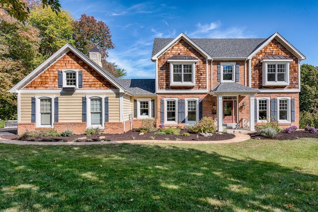
The main lesson to learn from this house is how important consistent window shape, size and placement is. Despite the somewhat chaotic mix of different materials, the windows manage to tie everything together into a cohesive whole. The windows on this house (shutters withstanding) are themselves gorgeous - high quality construction with real muntins that cast exterior shadows. They make what is obviously a new house have that much more authenticity.

Windows aside, the architectural composition of this house is also lovely. The little breezeway attaching the garage to the main house is charming and keeps the garage from swallowing up the main house. The matching oriels (second story bay windows) give the second story the visual weight it needs to balance the heavy portico on the first floor. The lines are simple and, importantly, the gables are all the same pitch. 

Link to Listing 

Files

Comments

Anonymous

I generally do not like windows that close to the floor in the interior, but the rooms are big enough that it seems to work. I do not like using windows for the garage attic. It just adds maintenance problems with no real benefit. Also, whoever uploaded those images changed the aspect ratio on some of them. It was difficult to get a sense of the proportions in some of the rooms, and it made it hard to judge the pictures as a set.

Anonymous

Are those working shutters on the inside? Pic 18 shows them away from the wall. If they are working shutters, you couldn’t place any furniture near them as they’d have to swing out so far and are so low to the ground. Looks odd to me. Ironic that there’s fake shutters on the outside. That darn “real estate” lens (10mm?) skews the perspective a bit much in these photos. Real estate photographer tips: If you use a wide angle lens, don’t have an object in the near foreground like the stove in pic 11. It looks ridiculous. And don’t shoot “down” into another room like in pic 23. The perspective gives me an uneasy feeling. What’s with the floating cabinets in pic 16? Is that a space for even more appliances? Looks like a good place to bonk your head. And speaking of pain, no doubt, someone’s going to get hurt on or around that tub in pics 19, 21, and 22. In pic 28, what is that protruding, angled, windowless, thingy with the zit in the middle of it? Weird. And the garage attic window is the only one with a window box? Why? I do like the porch in pic 26. The house is interesting. It would be fun to tour in person. I just Google Satellite/Street Viewed it. The landscaping looks more mature in the street view but there’s a giant tree right in front of the breezeway window. The satellite view shows almost no landscaping. Not sure which is most current. Beautiful view out the back.