Home
Home

 Artists
 Search
 Recent
 Random
 Posts
Posts
 DMs
DMs
 Tags
Tags
 Random
 Importer
 Import
 FAQ
FAQ
 Account
 Register
 Favorites
 Login
Login

SURVIVING PURGE update #10 (Patreon)
Content
Hello Orcs!
I'm cuming to give you some news about the development of the demo!
A lot has happened in the last few weeks. Chewy and I have continued to learn the software Spine (Chewy has even become better than me...). I've finished writing the whole part of the game that takes place in the goblin district, which is the first chapter of the 8 the game will contain. We've hired 2 animators to do some animation tests and see if we can work together in the near future. Vliir has been able to continue working on the characters and assets, which are now ready to be animated. I've also made good progress on the game's UI.
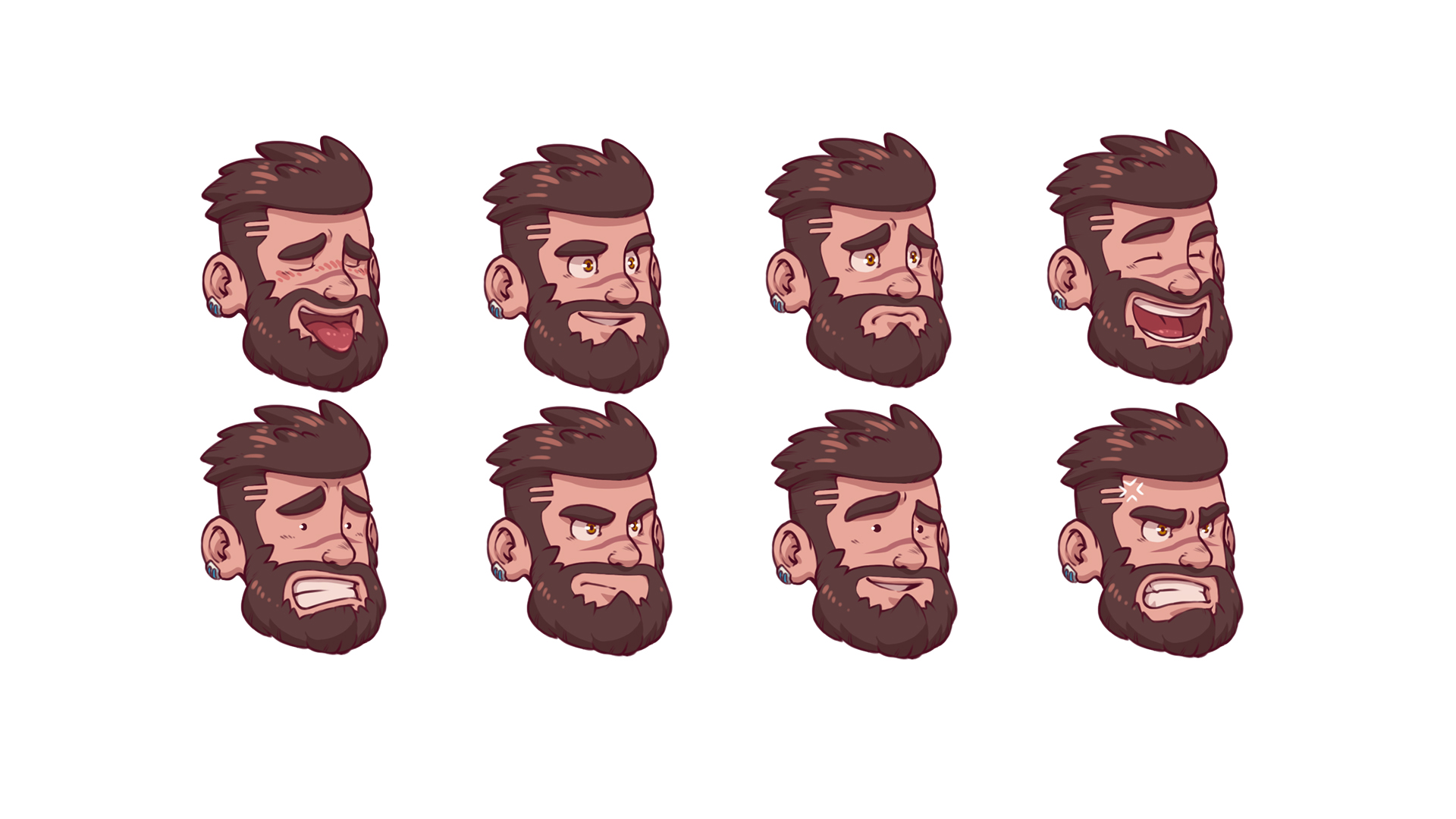
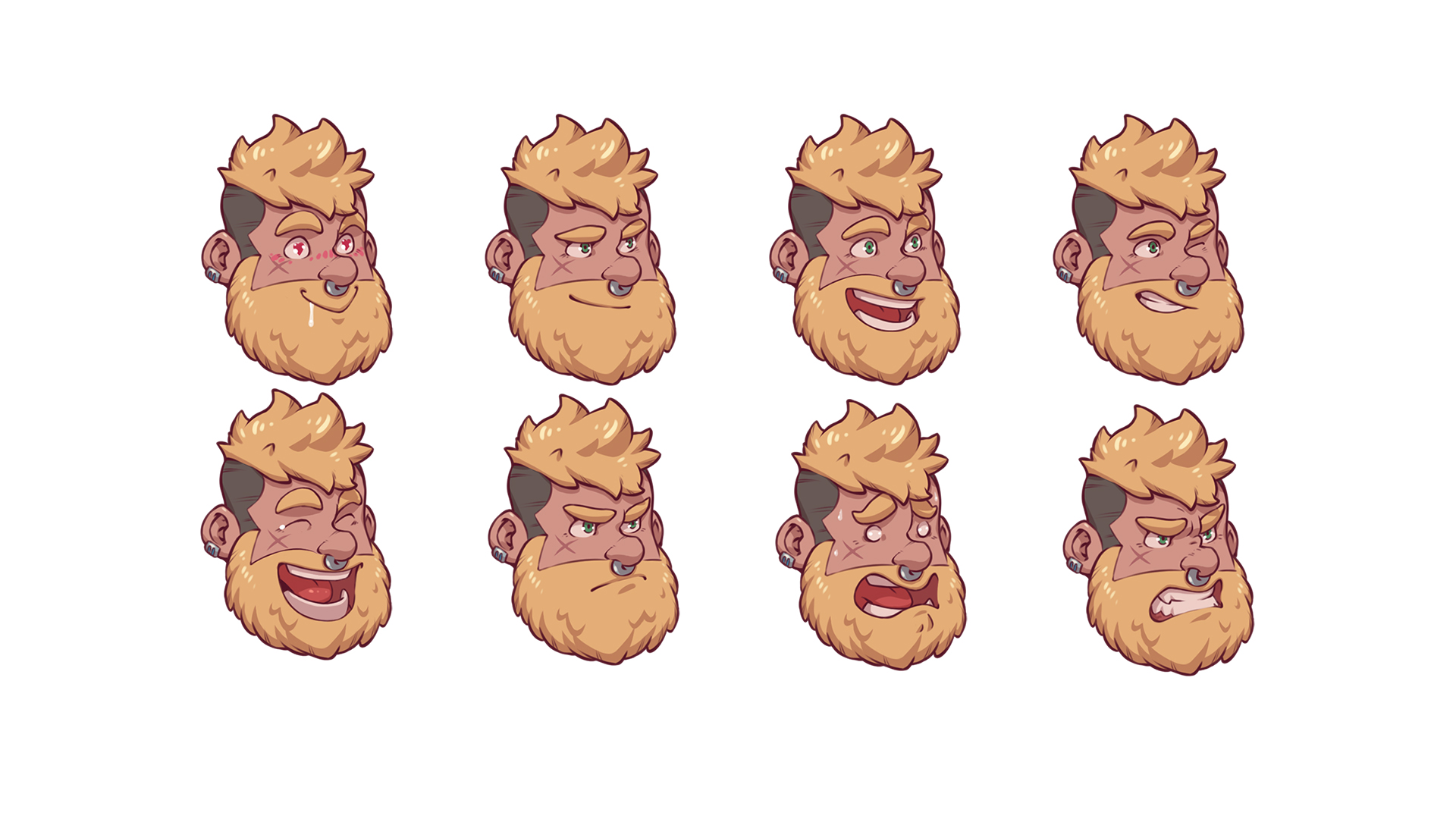
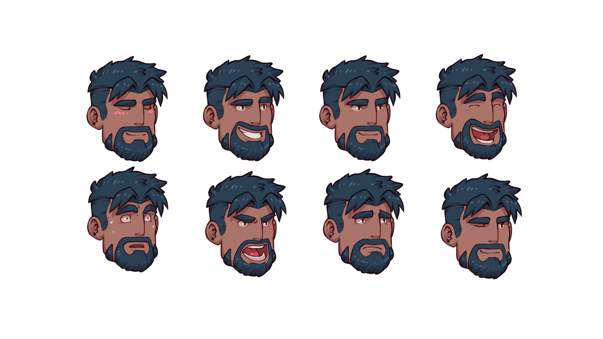
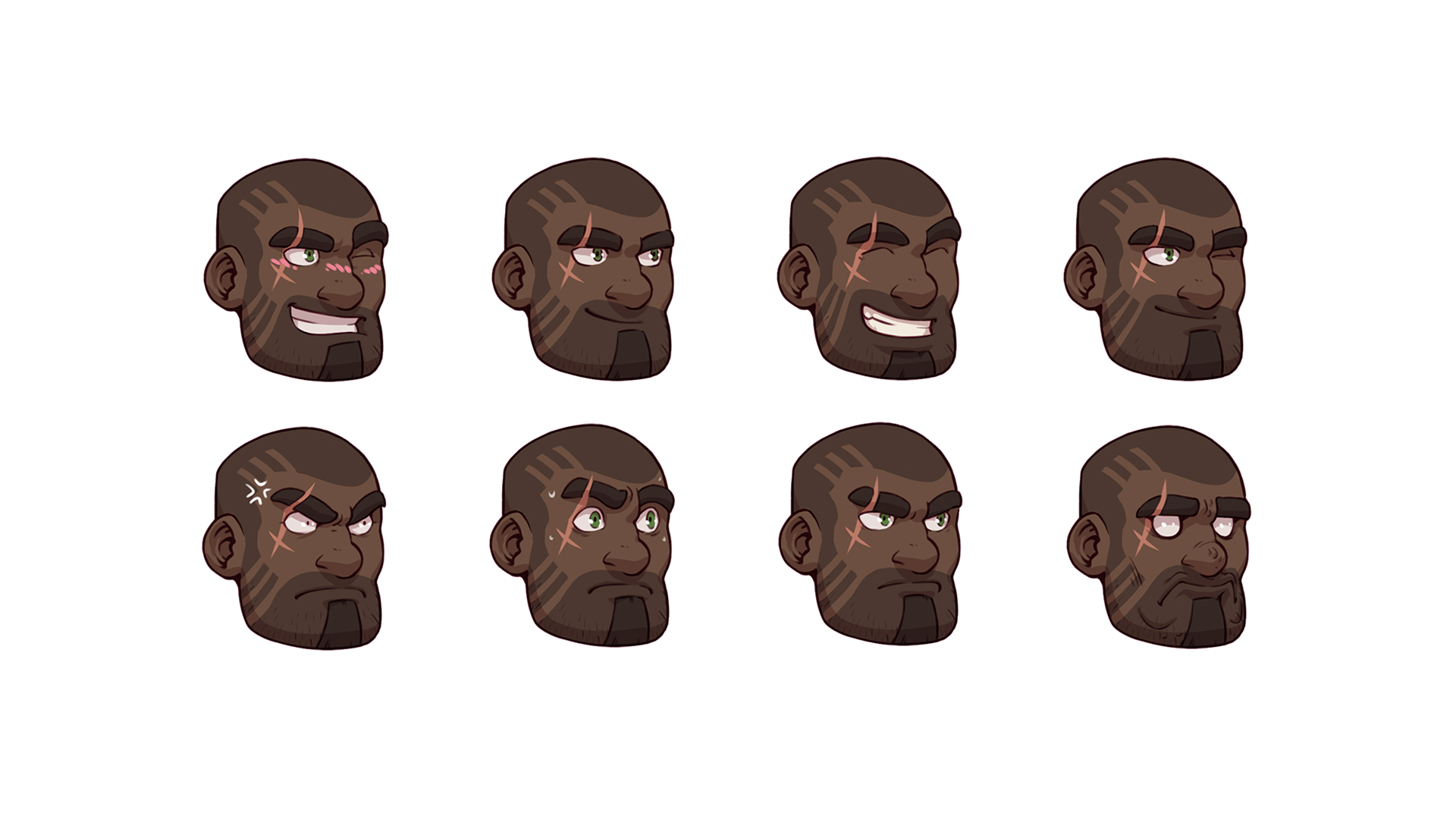
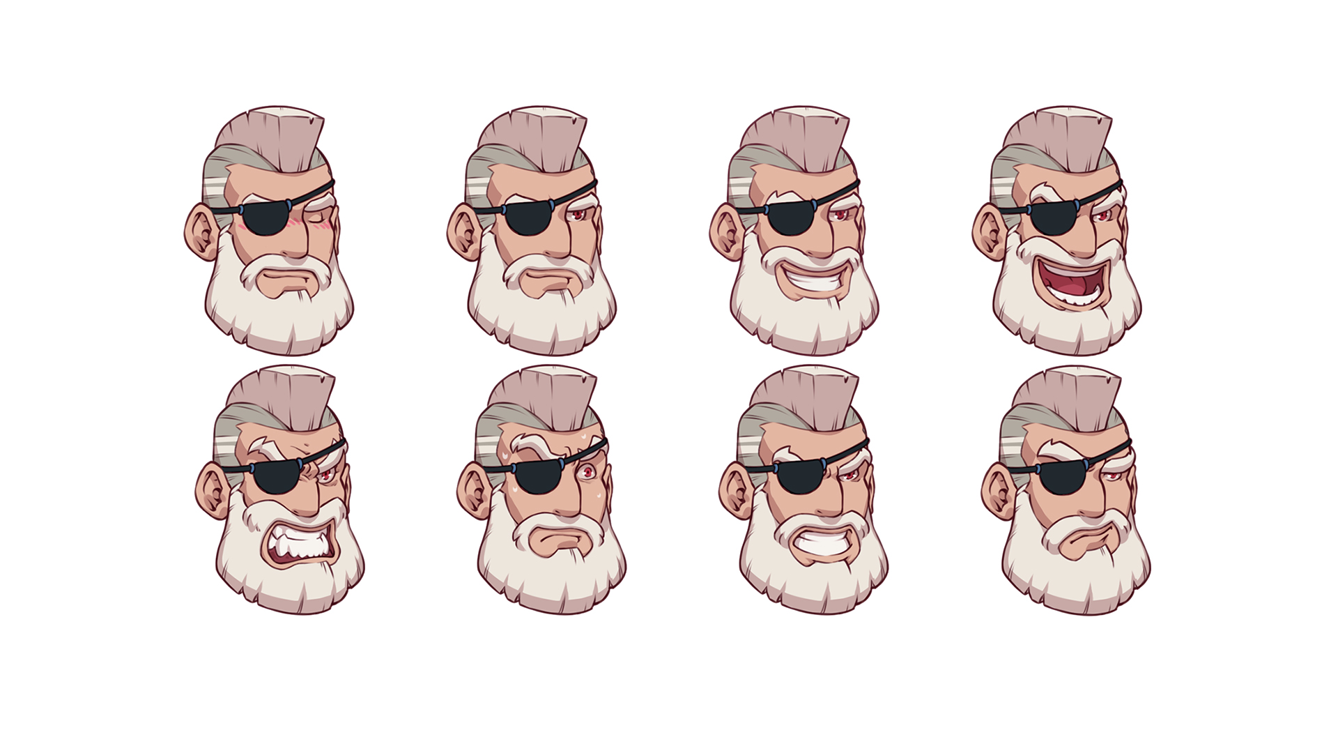
Facial expressions
I asked Vliir to create the different faces for the characters, and it wasn't as easy as I thought it would be! Probably because I was too used to the simplicity of Robin Morningwood's faces. Either the characters' expressions were too cartoony (and they sometimes looked like they'd stepped out of an asylum!), or they weren't expressive enough.


I realised as I progressed that certain characters needed to have more or less pronounced expressions to go with their character. Gladio and Rogan, for example, are much more expressive than Hiro, given their extroverted nature. In the end, Vliir did a marvellous job!
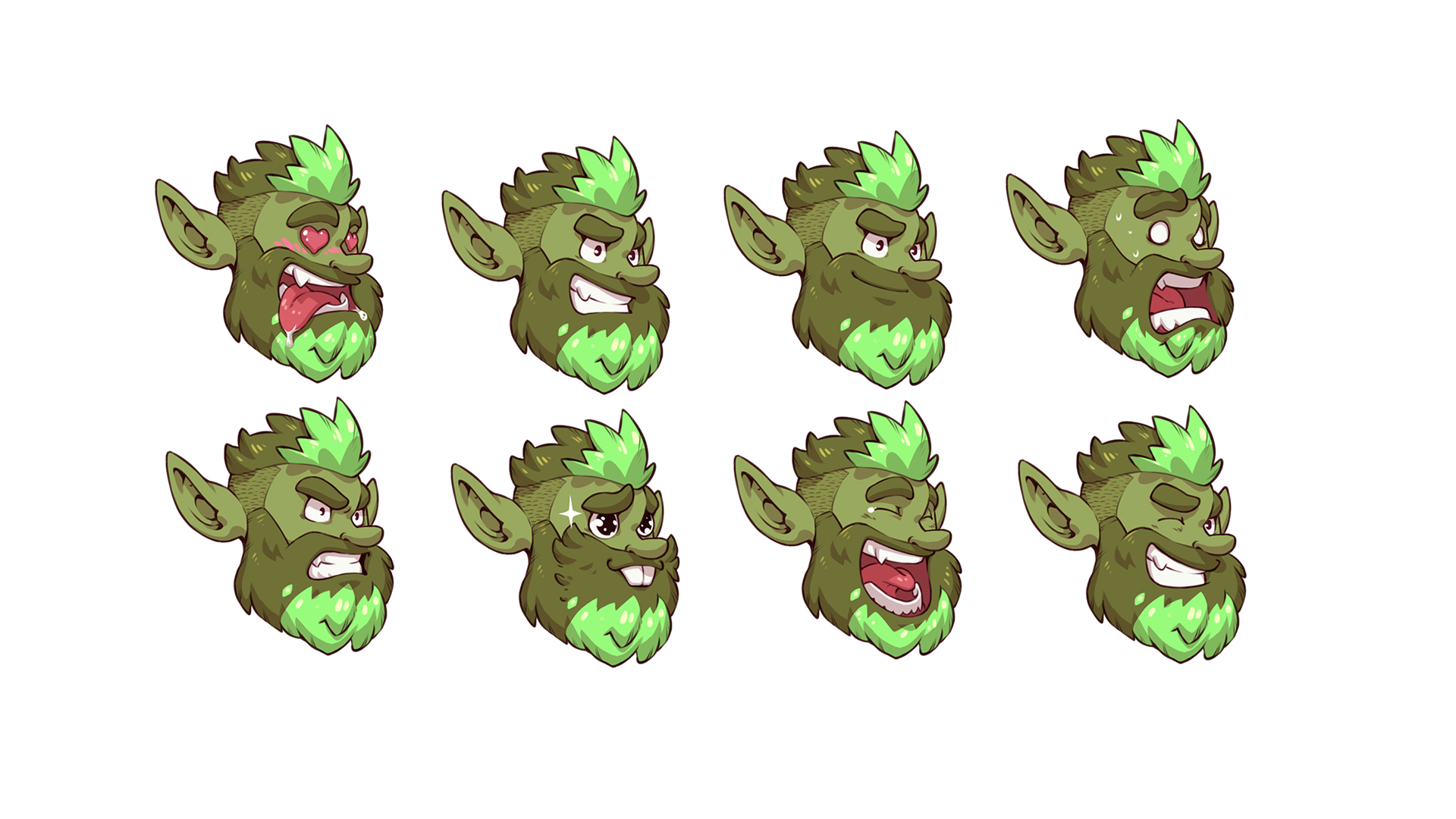
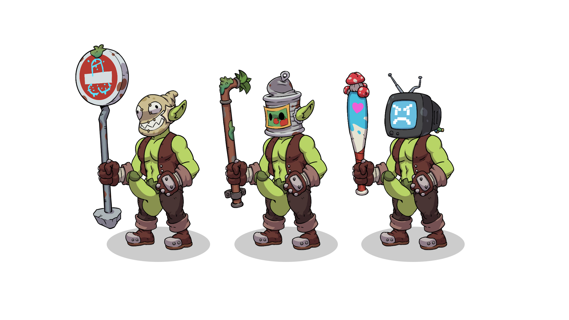
Redesign of the first goblins
Vliir had to redraw the goblins because when I imported them into Spine I realised that the old goblins weren't in a position that allowed them to be animated properly. So we took the opportunity to redesign them.

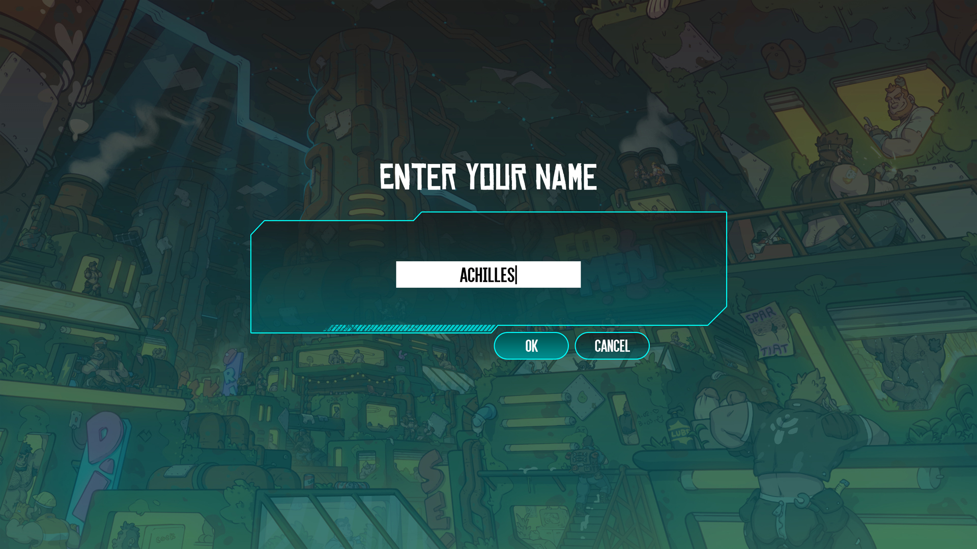
The UI
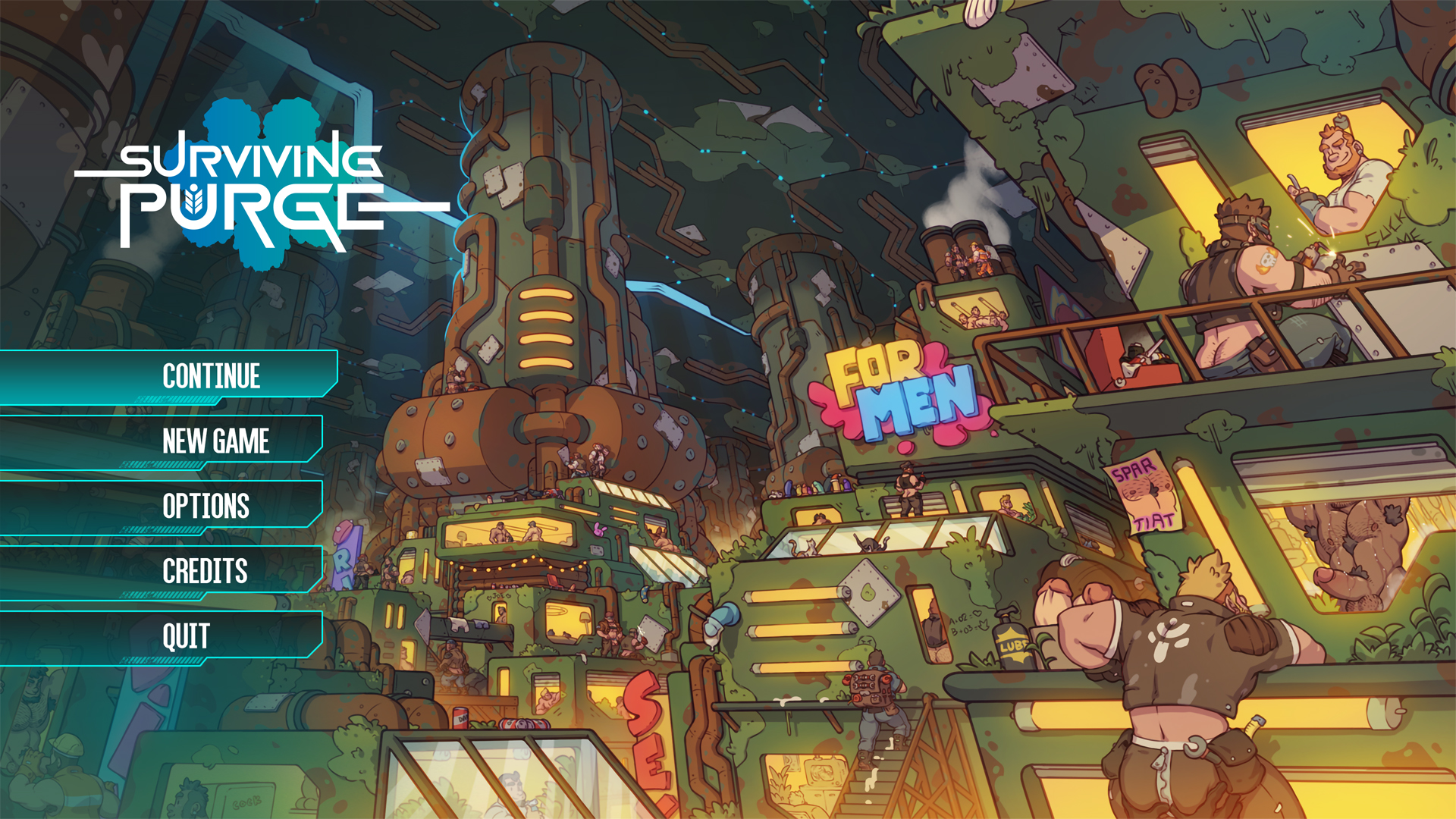
My first attempt at the home page, but I'm going to take the time to do some more tests, as it's not really representative of the general atmosphere of the game. At first I thought the game would take place mainly in the sewers of Purge, but as I was writing I realised I was wrong.


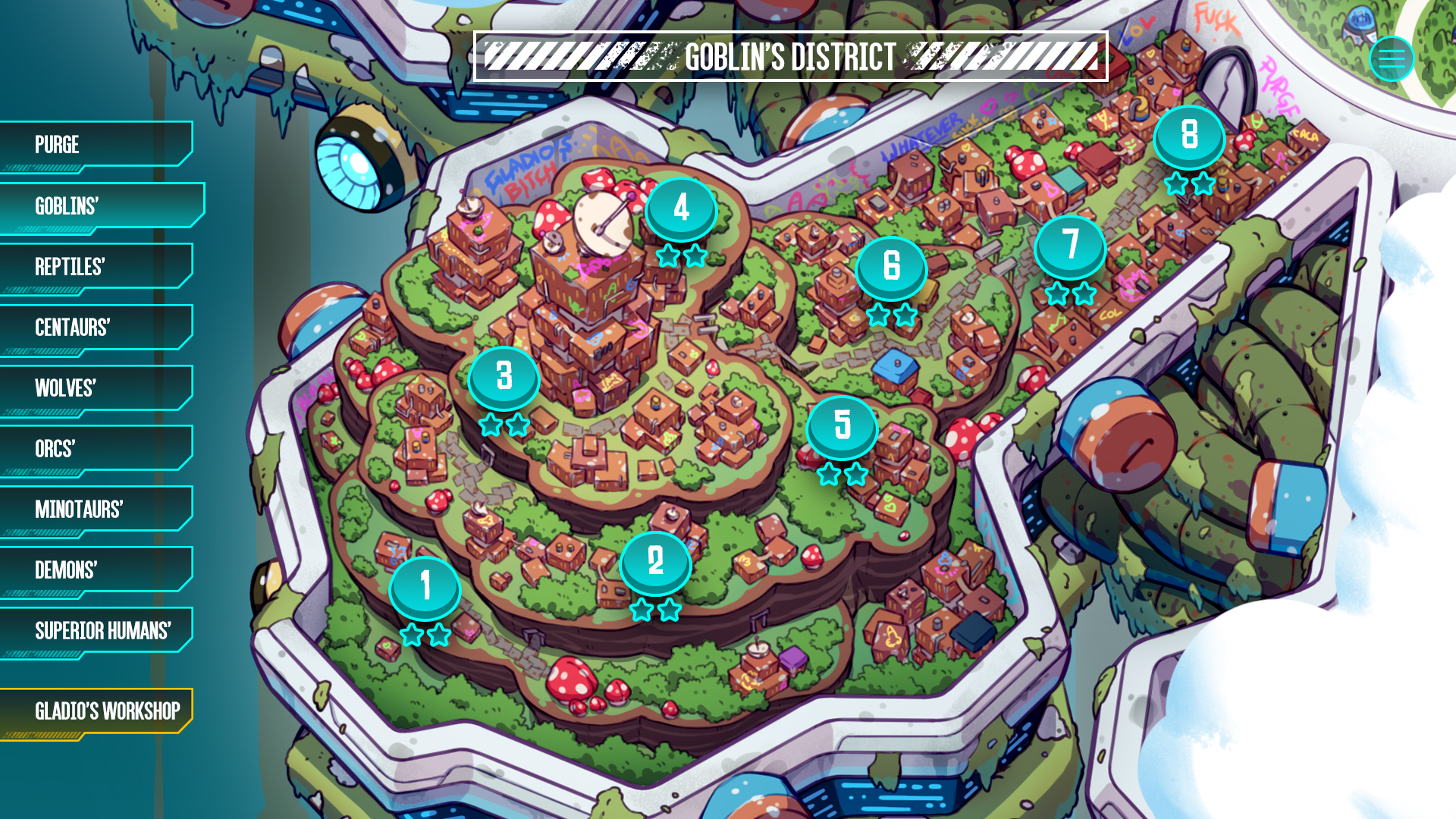
The UI when you're on the world map. The menu on the left will allow you to navigate from district to district.

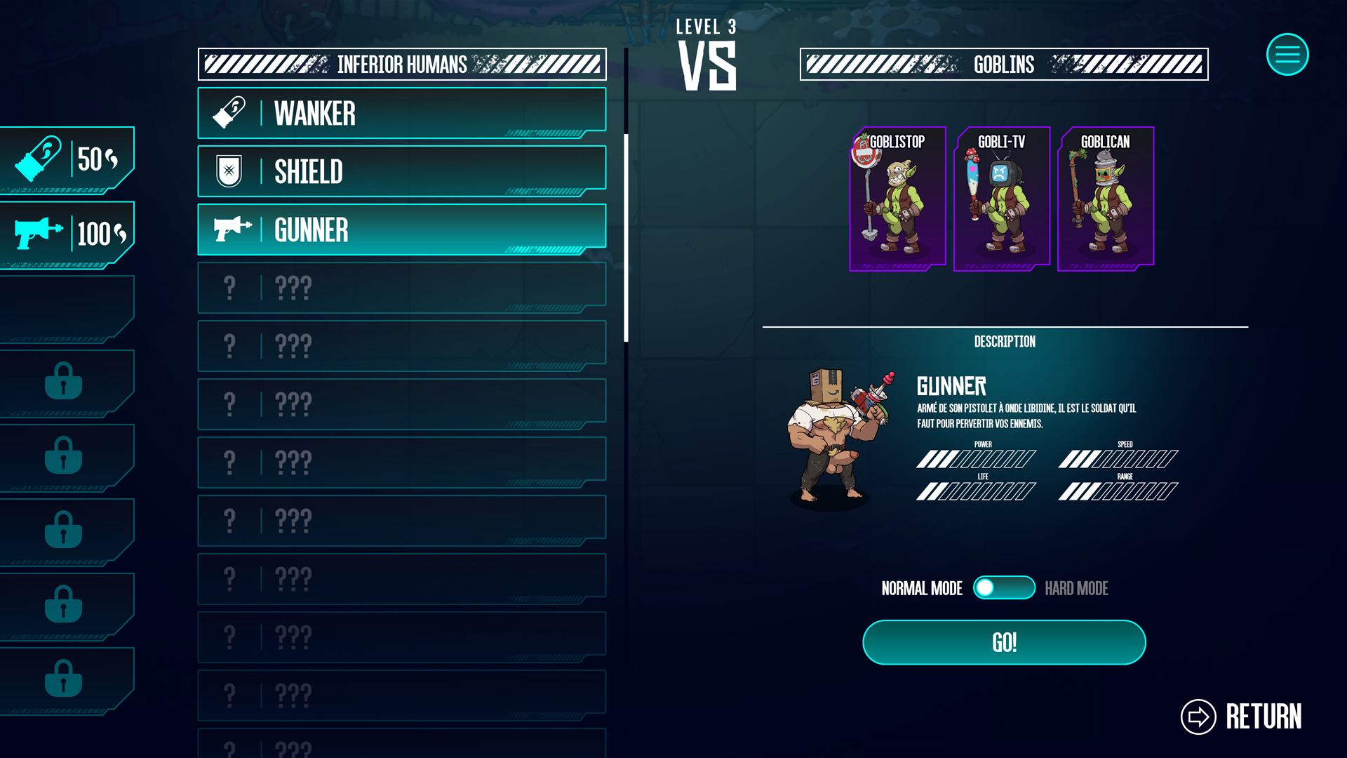
This is the menu that will appear before launching a game, allowing you to choose your recruits and see the enemies you're about to face.

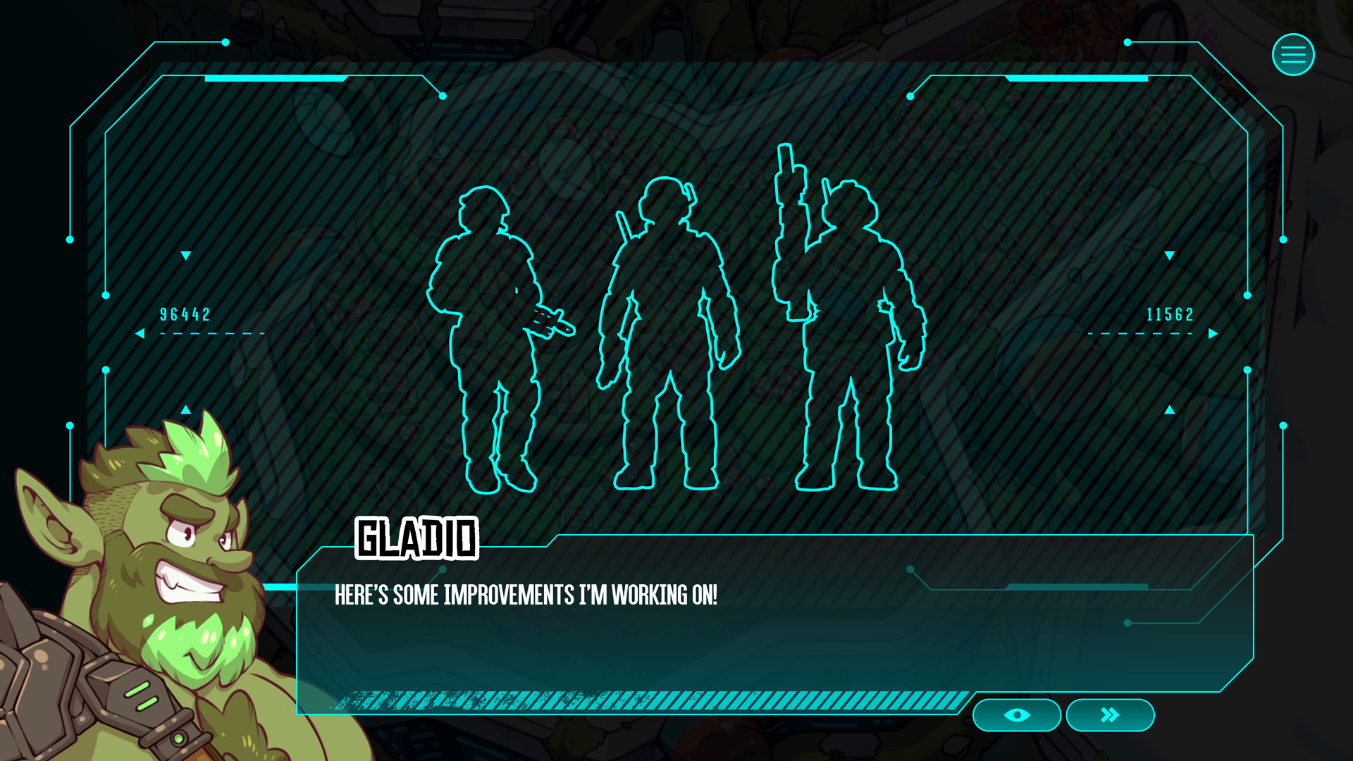
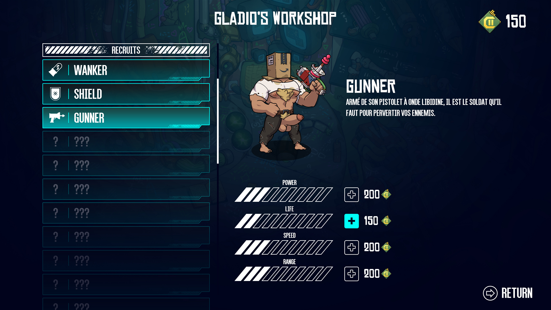
Here's the menu that will appear when you go into Gladio's workshop to upgrade your recruits.

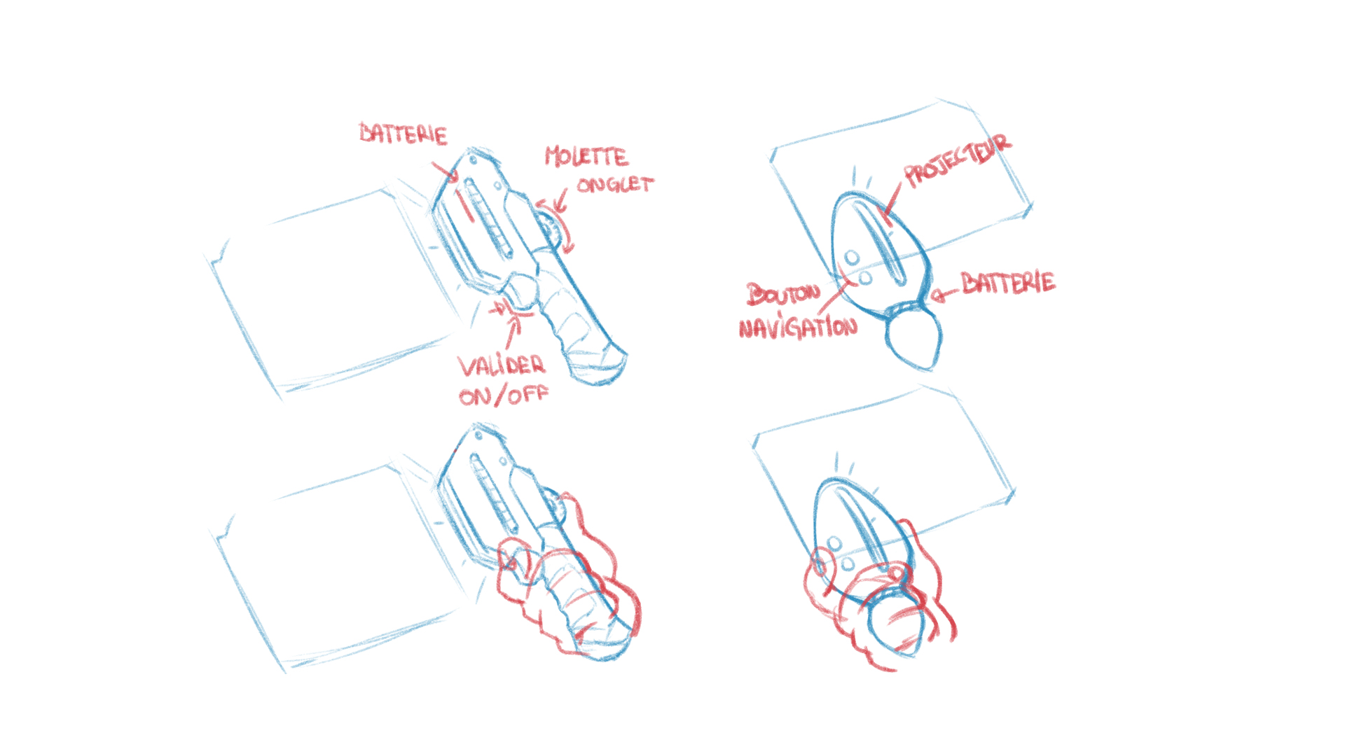
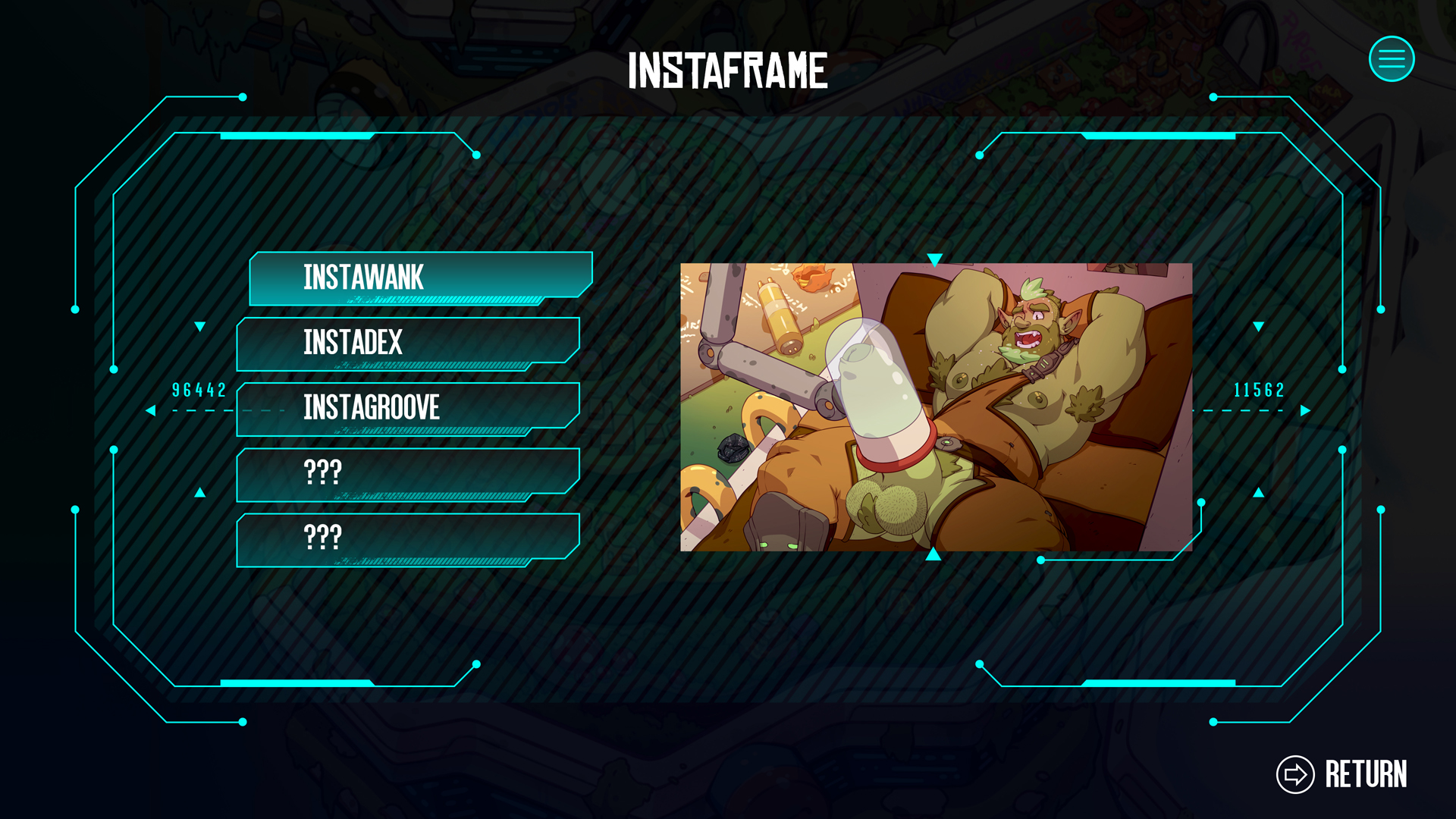
The instaframe
The instaframe is an object that you acquire at the start of the game, and that basically has the same functions as a smartphone but from future. Its design is still a work in progress, but I've made some progress on the UI.

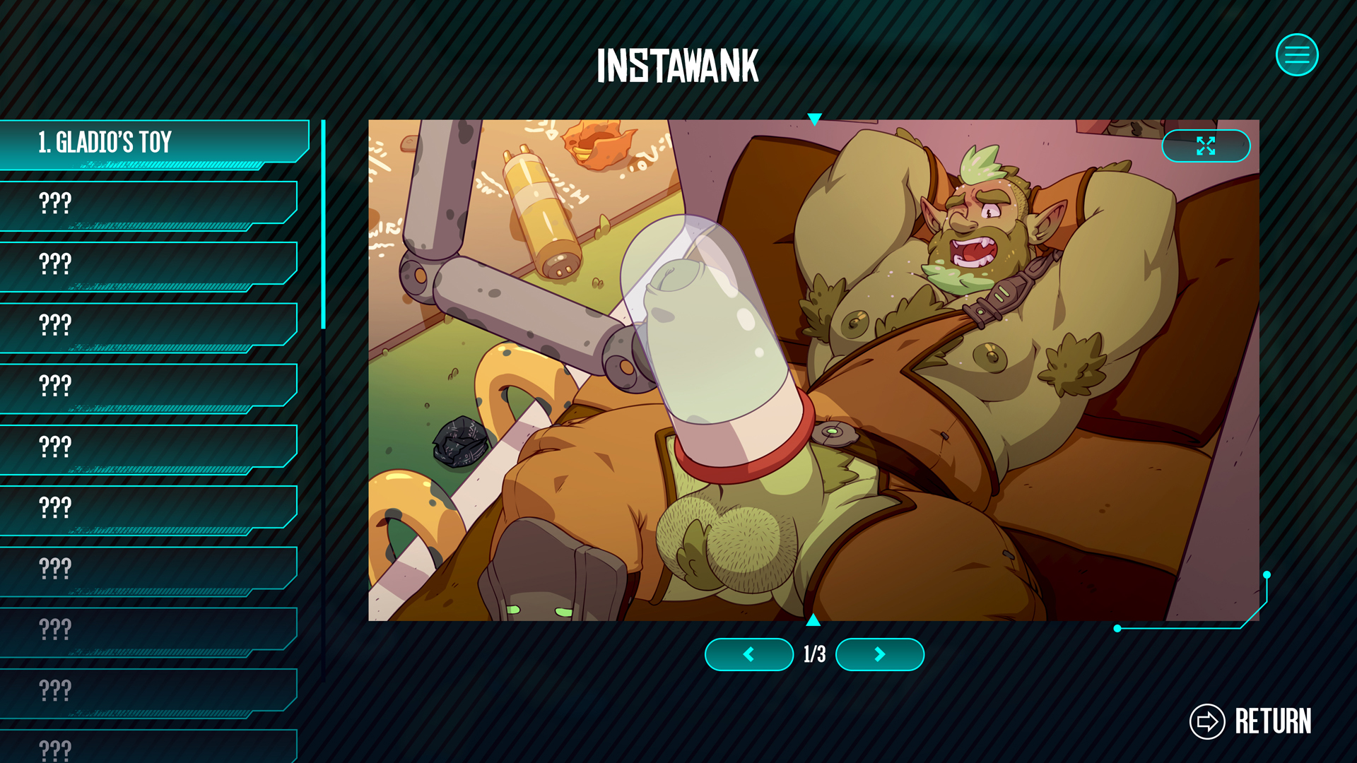
This is when the instaframe is used to display information.

The instaframe menu, allowing you to access the gallery to you to masturbate 💦💦


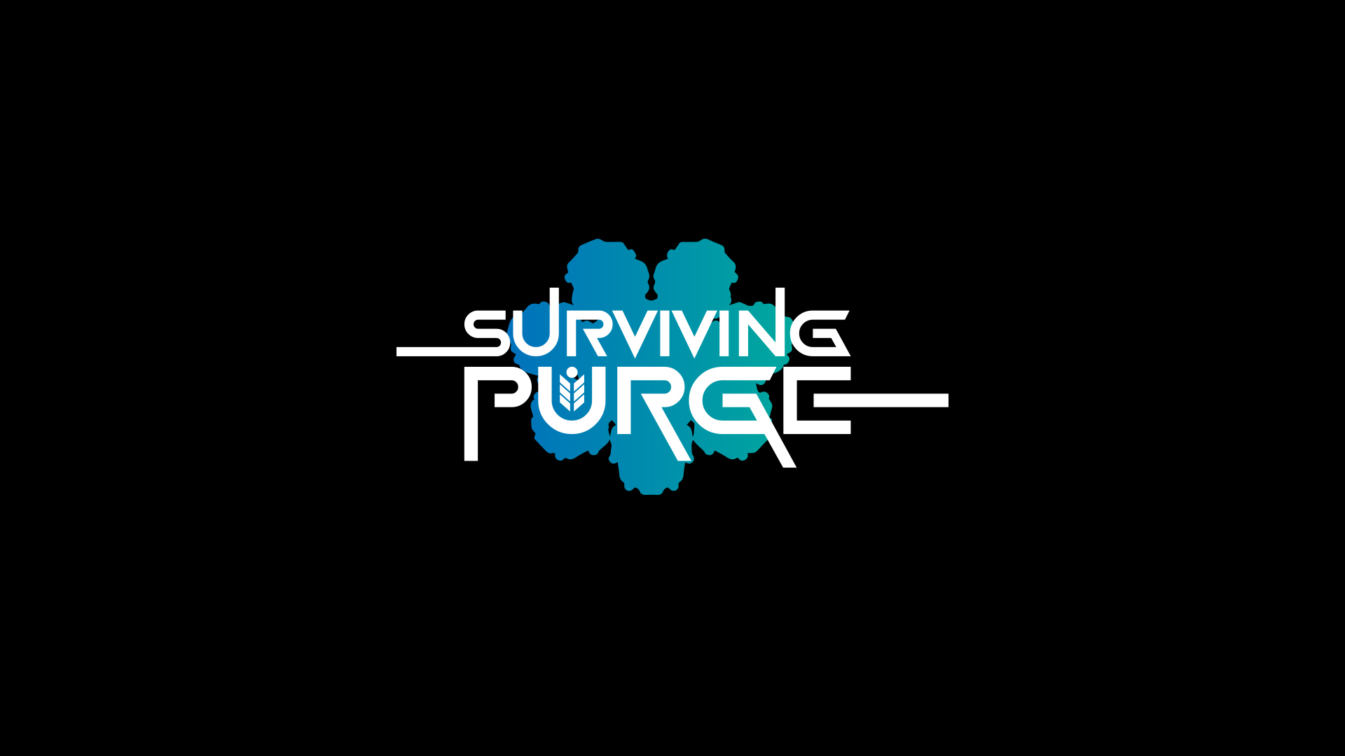
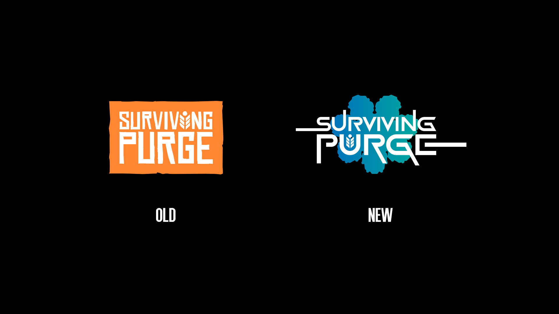
Logo redesign
The more time goes by, the more I realise that the current logo looks very 'farming simulator', lol. What's more, the further I got into the UI and the writing, the less sense the orange I'd chosen made. I ended up taking the shape of the Purge ship and using it as a background against the sky colours of the main map.


In short, I tried to create something else. Tell me what you think of this new logo, should I keep it or not? 🙂
Next month I'll come and show you the result of the animations and what we were able to do on Spine, I'm so looking forward to it!
Take care 🙂
Stewy
Files