Home
Home

 Artists
 Search
 Recent
 Random
 Posts
Posts
 DMs
DMs
 Tags
Tags
 Random
 Importer
 Import
 FAQ
FAQ
 Account
 Register
 Favorites
 Login
Login

Sneak Preview Sundays #1 (Patreon)
Published:
2015-01-18 21:09:23
Edited:
2016-08-17 03:57:59
Imported:
2021-11
Content
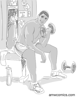
(click on the art above to embiggen)Howdy y'all!So here's our very first "monthly" Sneak Preview! (I put "monthly" in quotes because to celebrate our first month, I think I'll do this weekly to start, on Sundays in fact, hence: SNEAK PREVIEW SUNDAYS!)Our first sneak preview is of the thumbnail (rough sketch) and final pencils for the Romance Card art for Fluke. TYP V1 Kickstarter backers will be getting 4 packs of trading cards with their books, and one of those packs is for Romance Cards, which talks about each character's likes and dislikes when it comes to love.Every trading card gets its own special pin-up art that goes on the front of the card and for the Romance Cards, I wanted them to feel like the kind of pin-ups you might see in a mass-market sexy calendar or a teenager might have of a celebrity in their bedroom. A bit posed, eyes looking right at us, an engaging expression, with prop and background elements that connected them to who they are.All the linework for these Romance Cards is being created by TYP penciler, Adam DeKraker. Fluke is the most physically fit out of all the Young Protectors, so my original note to Adam was "I picture him sitting on a weight bench, shirtless, performing a one-armed bicep curl with a 50 lb dumbbell." This was the first card we worked on together and Fluke's luck-shaping powers can be difficult to capture visually. It was only after we had had also started the work on Kyle's thumbnail sketch that I decided how I wanted to depict that:"I'd definitely like Fluke smiling -- he should seem like he's having fun with this. But now seeing this with Kyle's, it really would be nice to have something that connected Fluke to his powers. Some fuzzy dice in the locker, perhaps?"Adam and I have a lot of back and forth during the creation of art and, as we went through revisions of the thumbnail sketch, Adam started adding even more symbols of luck to the background which I thought worked well: a horseshoe, the four-leaf clover, the Chinese symbol on the locker (although a rabbit's foot on the water bottle felt like one note too many to me, for whatever reason. :) )What you're seeing on the top of the image is the final approved thumbnail sketch. The one where I said "This looks great! Let's go to pencils!"One of the special treats of my job as writer-editor of this comic is that I get to see the art as it develops. "Thumbnail sketches" should give just enough info that I can give notes and approve the direction, without being so much heavy lifting that asking for big changes would be painful. A thumbnail sketch might look pretty rough, but when you've worked with an artist for a while (over 3 years for me and Adam) you learn how to see how the rough work gets translated into final, polished art—you learn to quickly see the potential awesomeness hidden in that unfinished work. And then you get the great pleasure of seeing the final, rendered pencils. A transition that hopefully you'll find as cool here as I did when I received the first pass of pencils.What you're seeing on the bottom part of the image is the final, approved pencils, but the truth is, I asked for almost no changes from the 1st Pass of the pencils that Adam sent me. (Since this was the first one finished, I just had to make sure we nailed down the sizing specs. Art-wise, we were there!)I hope you'll agree with me that Adam did an amazing job with this, totally nailing what I was looking for. It's evocative of other pin-up images I've seen like this, but it's still definitely our Fluke. Handsome and strong, like he is.The next step will be me getting these pencils colored by artist Alex Sollazzo (who did the coloring for the cover of TYP V1) and then sending it out to the Kickstarter backers as another digital reward. But I hope you've enjoyed getting this little "sneak peek" into some future art and our process. :)NEXT TIME: A sneak preview of Flyboy's Romance Card art!
Files