Home
Home

 Artists
 Search
 Recent
 Random
 Posts
Posts
 DMs
DMs
 Tags
Tags
 Random
 Importer
 Import
 FAQ
FAQ
 Account
 Register
 Favorites
 Login
Login

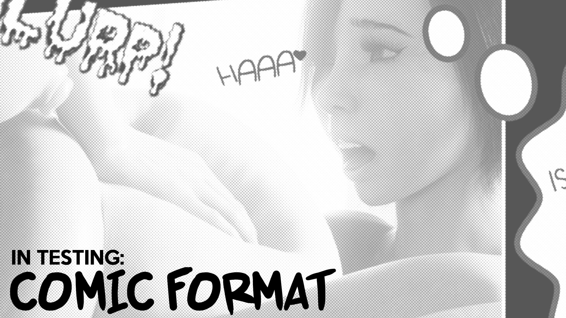
Production: Trying out comic format (Patreon)
Published:
2017-11-27 21:55:30
Imported:
2020-08
Content
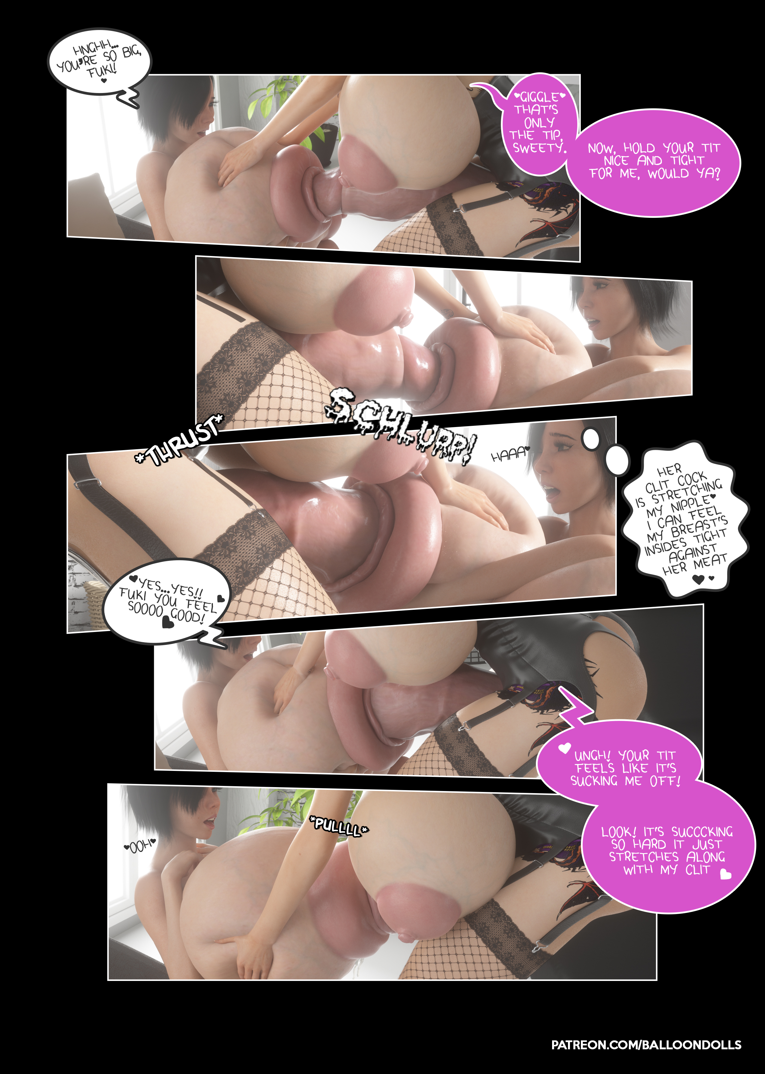
So with Unreal Desire's 3 production, I've been dabbling with formatting it in a manga/comic style over the usual images+wall ' text.
Sooo, here's a little sample! Whatcha think?
P.S. Also just keep in mind this is an addition to the regular production, the full images will still be available for more dedicated viewing. I just feel that adding a comic/manga element to the sets would give it a nice boost in the storytelling aspect.
Files