Home Artists Posts Import Register

Content

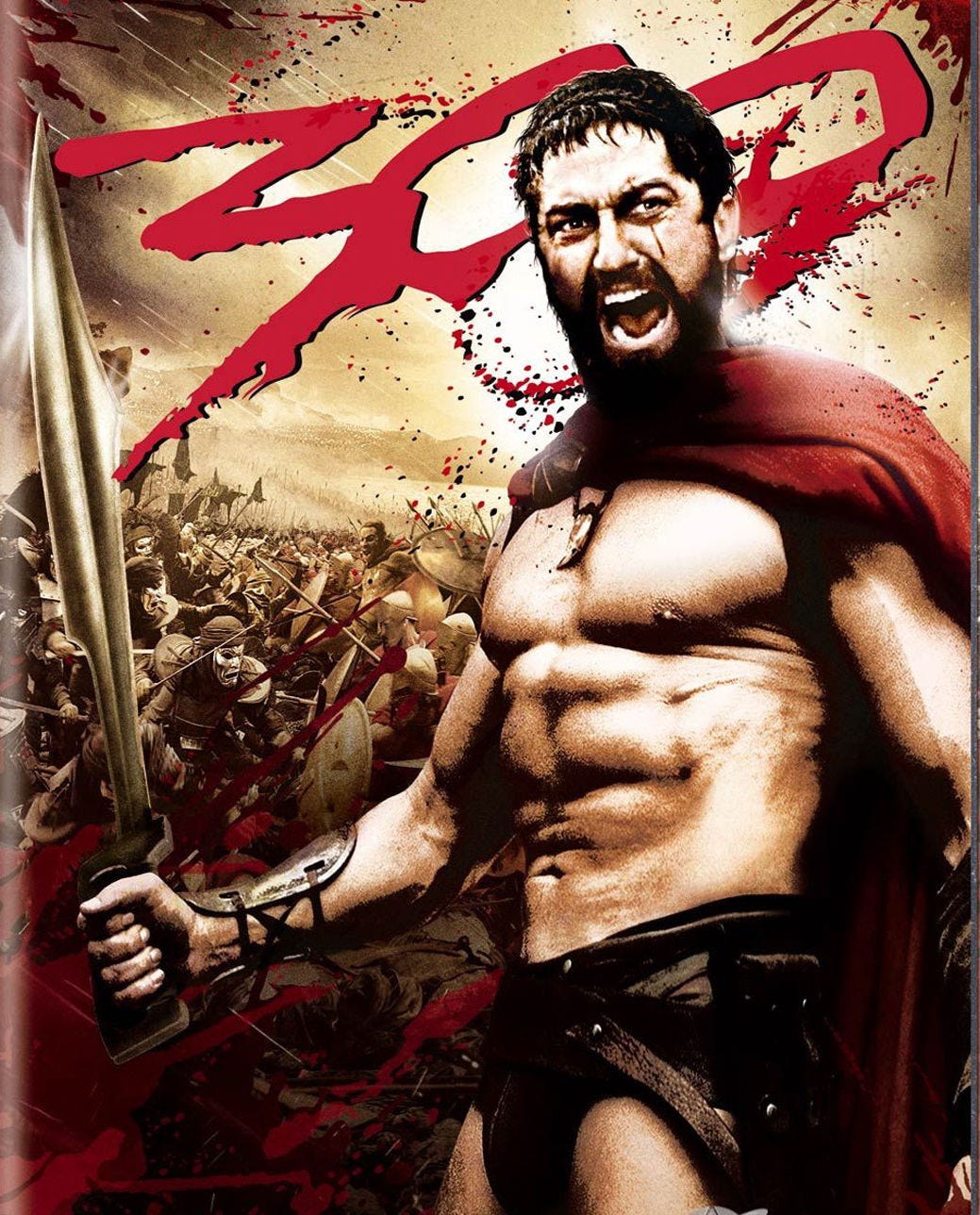
Howdy everybody! I'm preparing to unleash the first of many old stories to Amazon. One of the first is an old commission, The Roommate Agreement. In the course of the story, the young woman eventually is so obsessed with fulfilling her bargain that she even has the roommate agreement tattooed on her thigh. I've always kind of liked tattoos as a device, as there's something proprietary in marking what's yours, and something powerfully submissive in giving up that aspect of one's self-identity. For a cover, I like the idea of including it just a kind of preview of where the premise might go. However, I'm worried that I just can't pull the visual off well enough to work. But then, I always remind myself most people won't zoom in and stare/scrutinize it like I do. Or will they? After all, bet most of you never noticed the freaky floating sword gaffe in The 300 poster, right?

By no means am I a master of photoshoppery (as you've possibly noticed from previous covers), but I made a good faith effort to try to include the tattoo in the cover art, which features a whole heapin' helpin' of thigh to put it on. So my question is: do you like the cover better WITH the tattoo, or without?


Comments

Hugh Michelsen

I like the idea of the tattoo being shown, but it adds too much extra noise to the cover. Do you think adding the tattoo will increase sales? I suspect at best it will not affect them, and at worst, it will actually decrease them.

Hugh Michelsen

Keep in mind, the people you are asking on here are already invested in you and the story. Most of your Patreon followers aren’t going to look at this from the perspective of someone who wants to buy your book, since we’ve already read it and like you a lot. The cover is actually for people who haven’t read any of your work already, and don’t know if they like you as an author yet.

icebear

That's a great question, and I agree about the noise. The woman's pose, while perfect for the story, is not at all convenient for adding a title, so it does wind up clustered right alongside the tat. I even tried having the tattoo on her left inner thigh, but then you could see so little of it that I didn't think it would even be noticeable, and so what's the point. I don't know that sales-wise it will matter much either way - for instance, Kiss of the Succubus had no flesh on the cover at all, but sold significantly better than other stories where I sprung for actual models. So I think I'm just approaching this from a perspective of pure aesthetics.

Anonymous

I don't know about extra noise but I voted bare because as-is it looks a bit too much like a photoshop to me, due to it being slanted and not following the contour of her leg as it curves away. If the tat was aligned parallel with her leg instead of that (IMO at least) odd slant, which might also help with the curving, I'd probably vote the other way. TBH though, either way looks fine. Makes me want to re-read it; I quite like that story.

Dorian Alton

Voting for no tattoo. I like the concept, but I don't think it looks great here.

Nezumi

It's... a really bad rendition, yeah.

icebear

Tell me how you really feel. :) But yeah, the more I look at it, the more dissatisfied I am. I spent a while earlier tweaking a little, adjusting the tilt of the text, removing the solid left alignment, adjusting the color, but it still looks very Typed and not very Inked.