Home
Home

 Artists
 Search
 Recent
 Random
 Posts
Posts
 DMs
DMs
 Tags
Tags
 Random
 Importer
 Import
 FAQ
FAQ
 Account
 Register
 Favorites
 Login
Login

New Backdrops? (Patreon)
Content
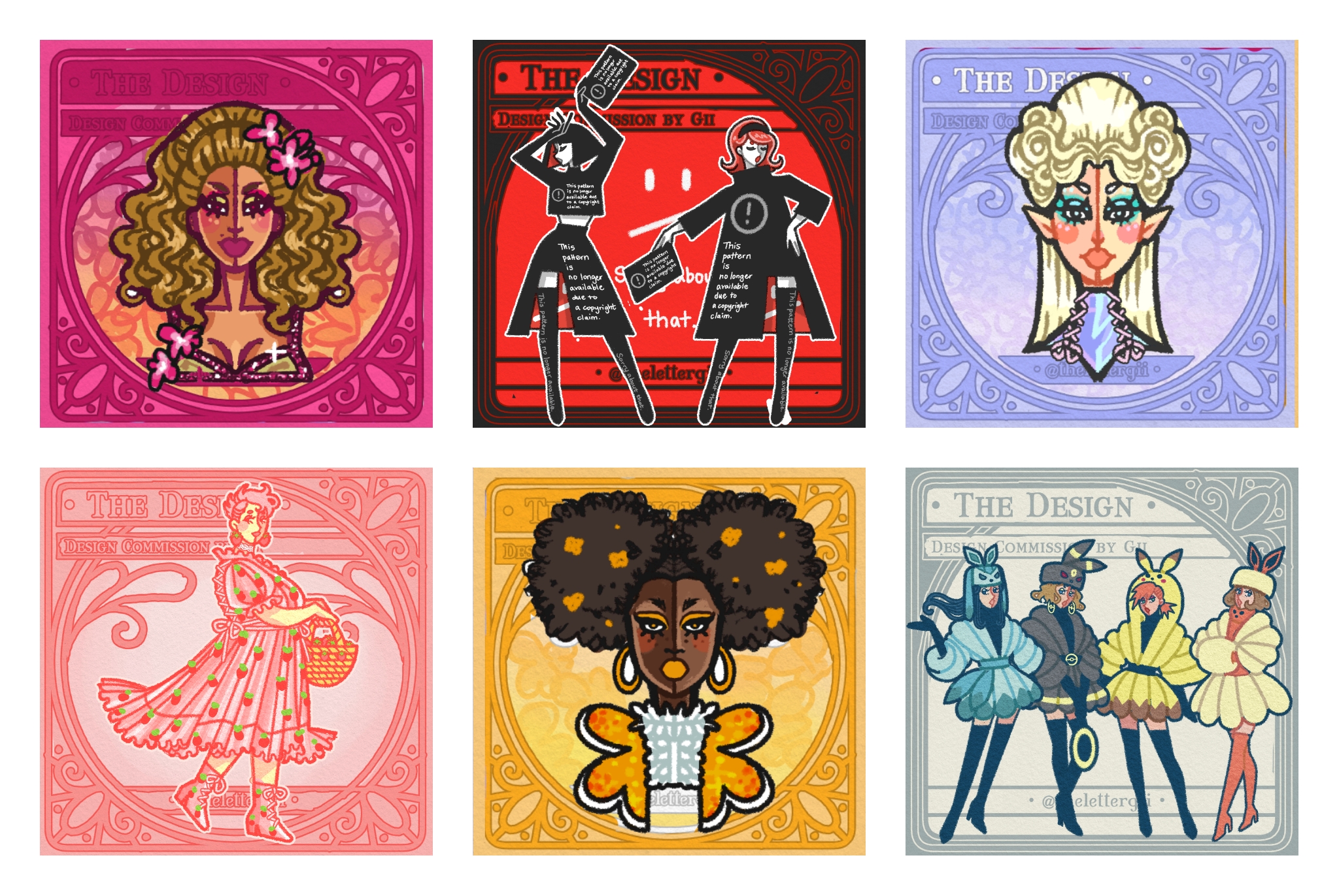
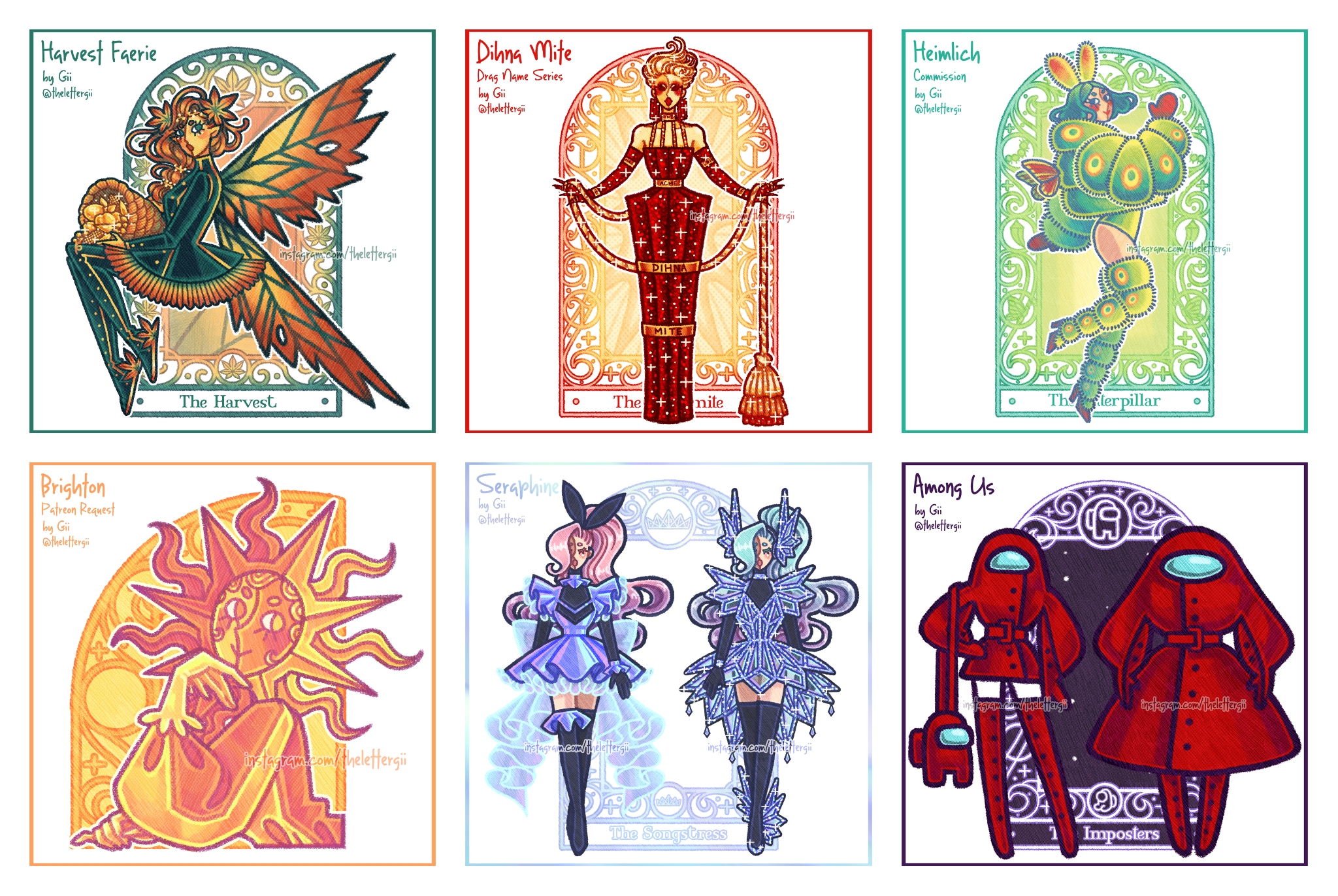
I think backdrops were a step in the right direction, but even after I introduced them something felt missing. Maybe it's another art crisis haha, but I did produce this new version more presentable for the square format and hopefully more professional looking because I've long felt that something about my work still felt amateur. This backdrop makes the leap to full color and is more closely inspired by Alphonse Mucha than the last backdrop, but hopefully still original.
The only issue is that there is less room for customization here - if someone commissions me they'll probably get a single or dual-colored circle by default and then more detail in the circle if they pay extra. Which is less work for me, but I don't know, maybe having a consistent "IG aesthetic" can get boring real quick?
I'm like 90% sure I'm converting to these at some point, but even so I'd love to get your thoughts - do you prefer this or the old version?
Files