Home
Home

 Artists
 Search
 Recent
 Random
 Posts
Posts
 DMs
DMs
 Tags
Tags
 Random
 Importer
 Import
 FAQ
FAQ
 Account
 Register
 Favorites
 Login
Login

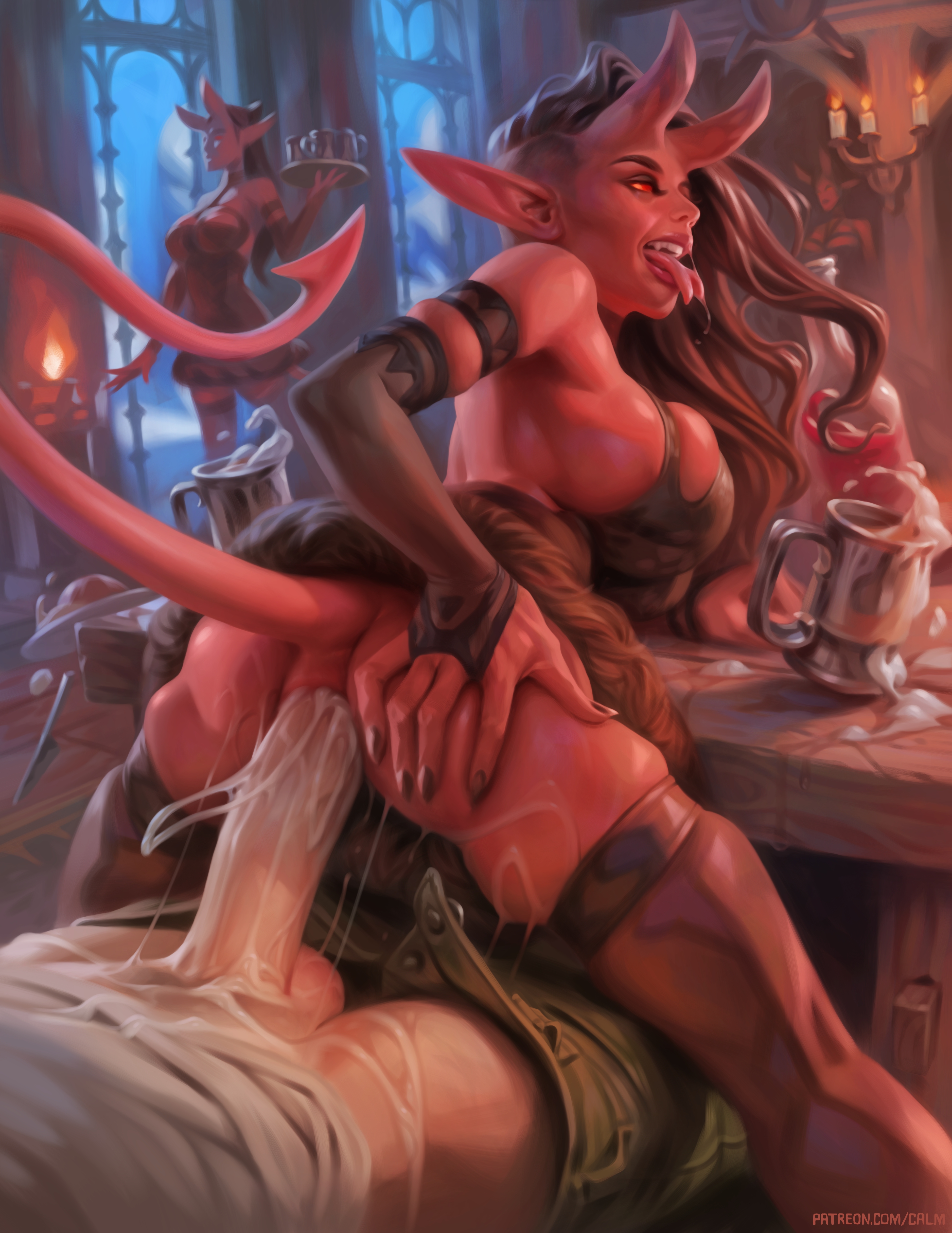
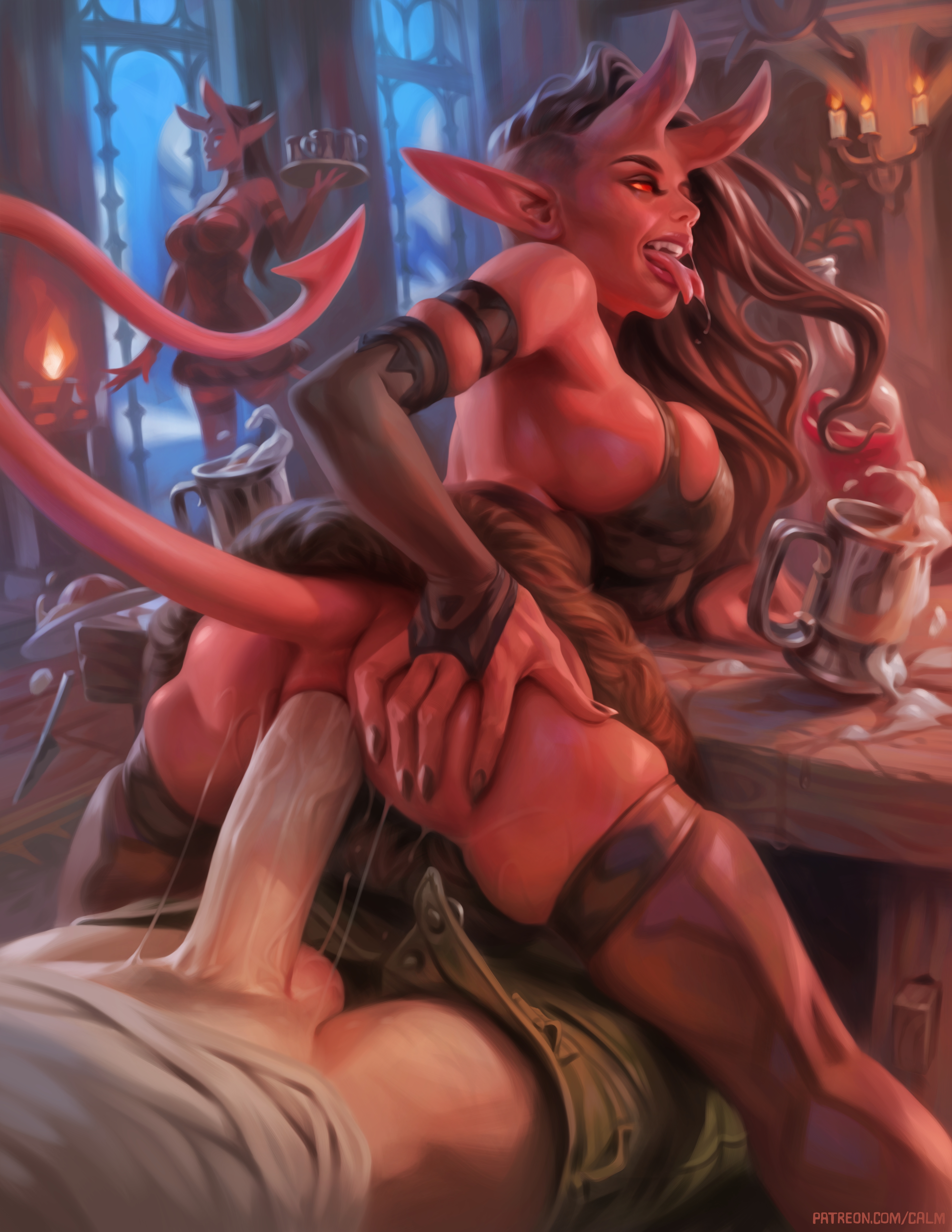
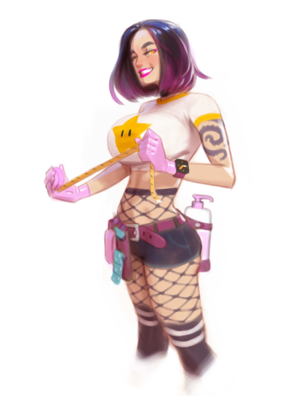
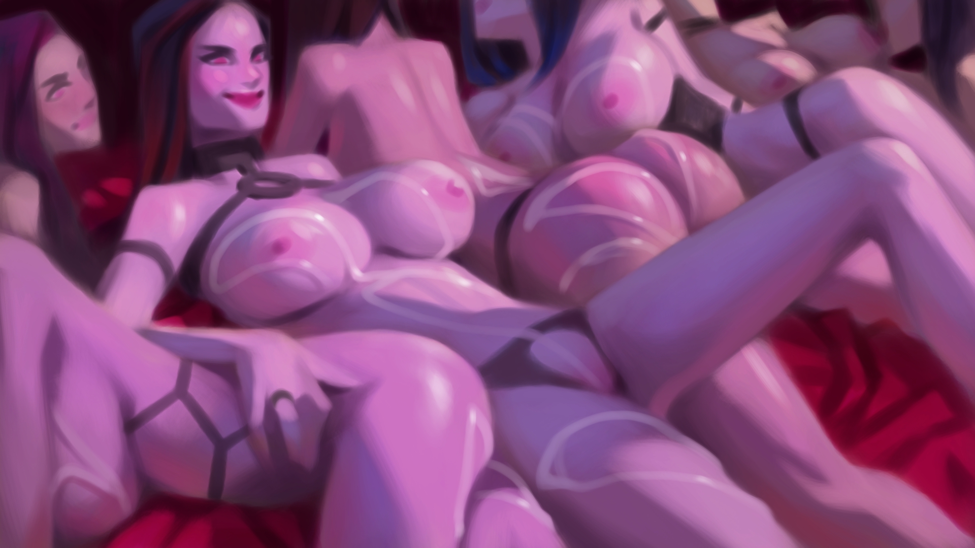
Illustration #117 + doodles and a thumbnail sketch! (Patreon)
Downloads
Content
Hey everyone, I hope April is going well for you! Here's my latest painting, I've continued having a lot of fun painting demons lately, so have some more of them!
Here are the download links for the rewards for this illustration so you can check out the process if you want:
WIP images
Short time lapse video
Long time lapse video
PSD files
While working on this painting I decided to try adding a lot of brush stroke stabilization to my main rendering brush. I'm a fan of applying different types of temporary limitations as a way to force good habits or prevent bad habits (for example limiting resolution when sketching to prevent me from drawing details too early), and the theory here is to use that brush stroke stabilization as a way to forcibly slow down my brush strokes and force me to have to think a bit more about how each stroke is placed.
I've had a bad habit of using hundreds and hundreds of fast tiny strokes when rendering, and those add up and take a lot of time. So, theoretically, if I use fewer more deliberate and slower strokes, that can be a faster way to reach a good result. In simpler terms just having good brush economy. The other big benefit to this is that fewer and more deliberate strokes also end up looking like more confident brush work.
After putting that theory into practice in this painting I'm pretty optimistic about how it's working. The effect felt pretty immediate, but I'm gonna have to do more paintings this way before I can properly judge it. I'm curious to hear what you guys think if you also try it out!
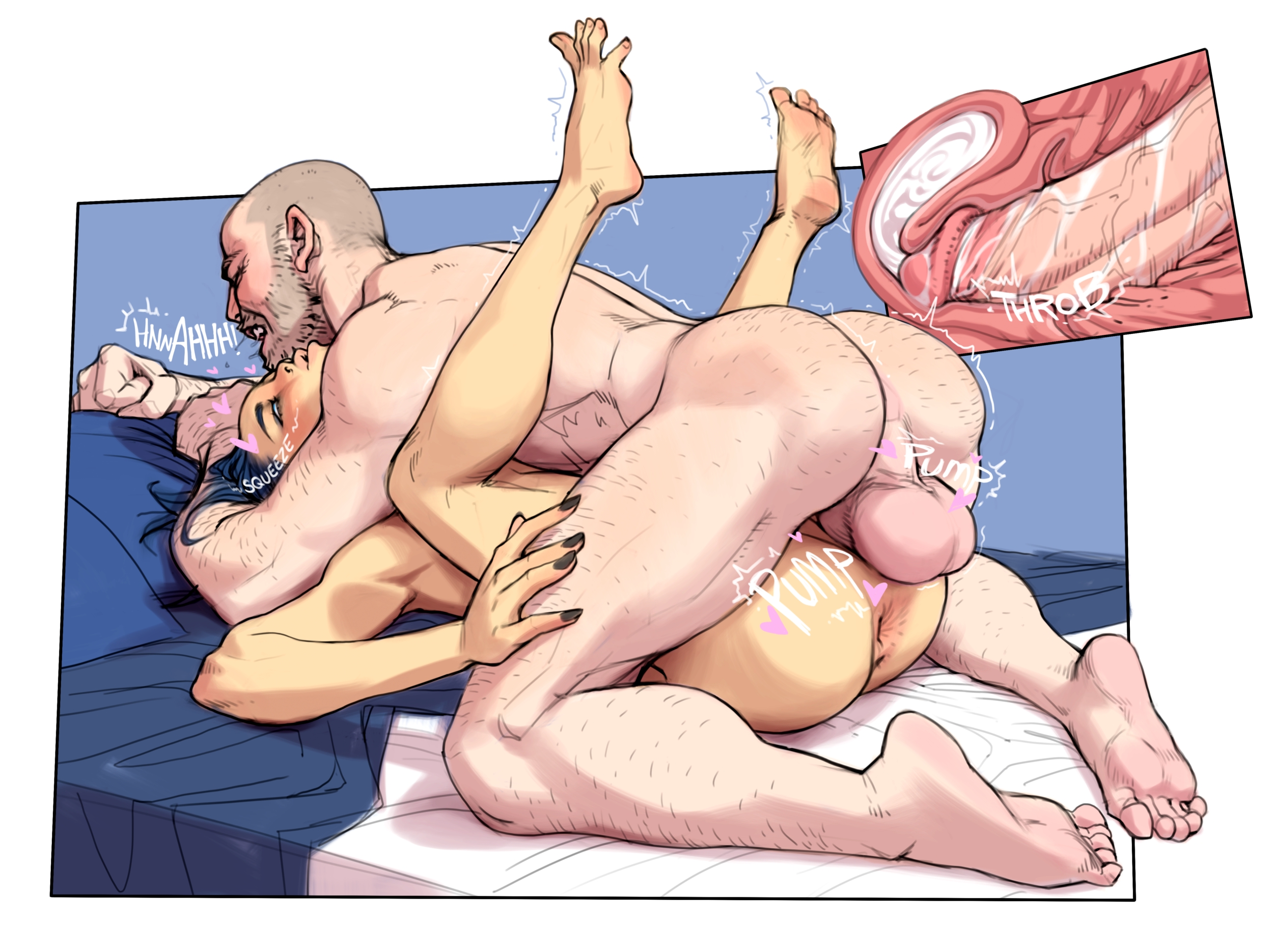
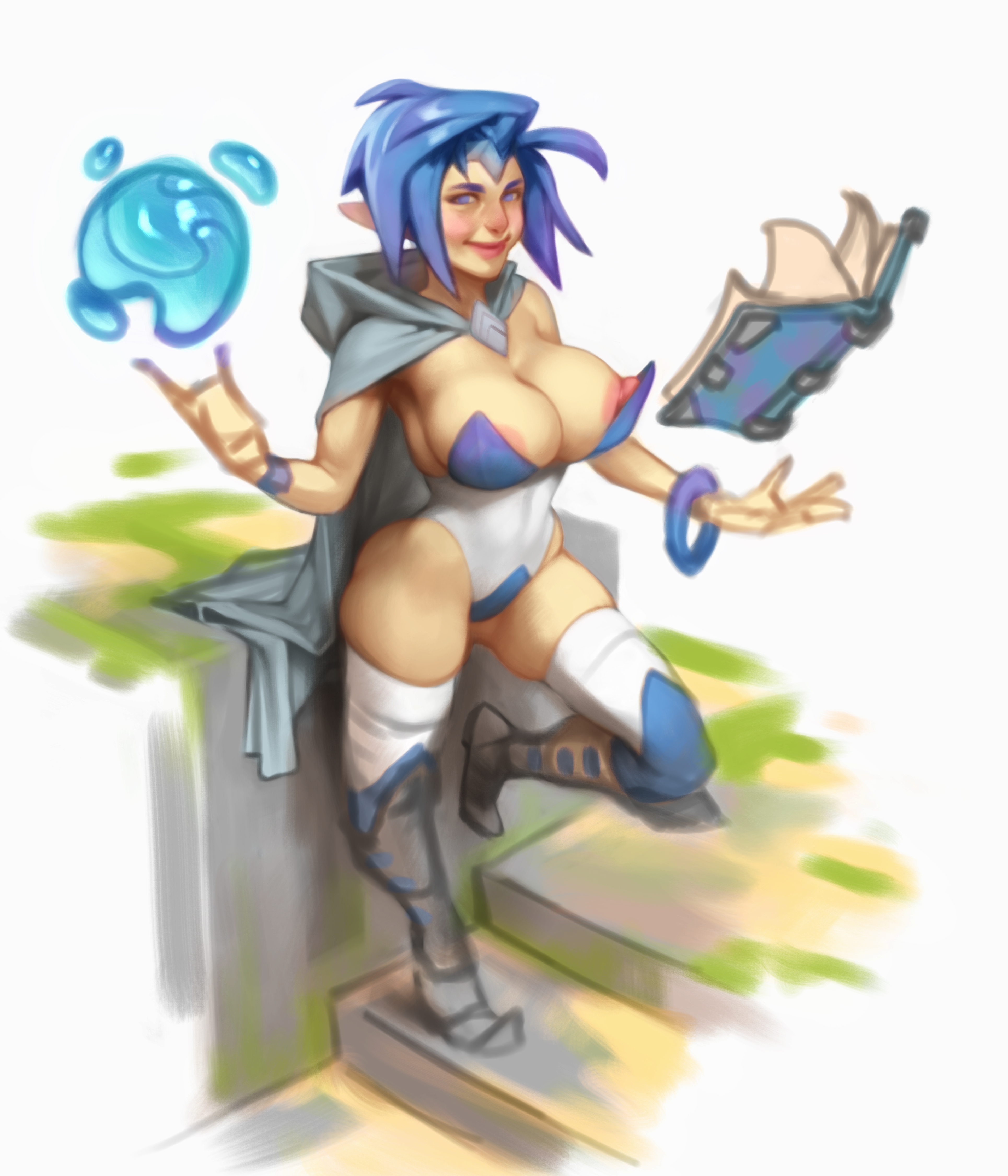
I've also added a thumbnail sketch and some doodles here that I thought you might like to see. They all have pretty different styles now that I look and compare them. Kind of an interesting result of experimenting with different approaches.
Anyway, I'm gonna go and treat myself to a good meal and watch the new Fallout series! I really like it! You guys should watch it too if you haven't. :)
Files