Home
Home

 Artists
 Search
 Recent
 Random
 Posts
Posts
 DMs
DMs
 Tags
Tags
 Random
 Importer
 Import
 FAQ
FAQ
 Account
 Register
 Favorites
 Login
Login

The Unseen Comics: Meanwhile (Feat. Kid Blastoff/Special Guests) (Patreon)
Content
Back in 1998 my friend Brian David-Marshall (the original publisher of Pirate Corp$!) was trying to put together a comics supplement project called Meanwhile, which would be a weekly comics package with continuing stories.
Brian was aiming to pitch the package as a supplement like Parade, or the Eisner Studios' Spirit magazine section. He put together a prototype featuring a number of creators, and the contents page was designed by David Mazzucchelli.
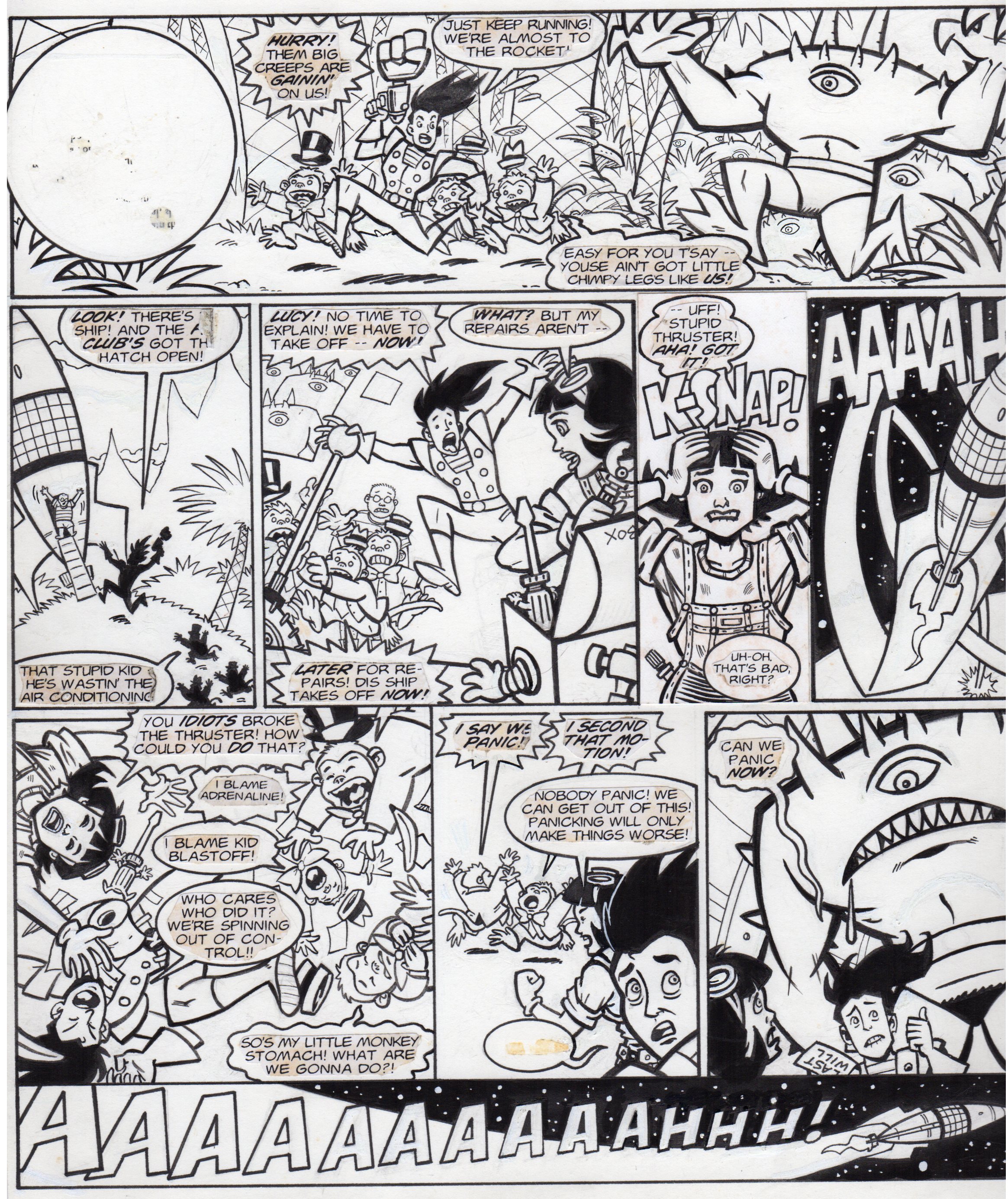
Brian asked Sarah and I to do one of the one-page strips and we thought Kid Blastoff would work well for a weekly continuity format. The characters first appeared in three issue of Disney Adventures and we thought it would be a good idea to go with a concept we already had some experience writing and drawing. I always liked (and still like) doing these comics and still have hopes (pipe dreams?) of doing some new material to round out a book collecting Kid Blastoff #1, Biff Bam Pow! #1 and all the comics and gag panels we did for Nickelodeon Magazine. There are a bunch more Kid Blastoff comics plotted, it's just another thing there's never any time to play around with.
For Meanwhile I came up with a pretty typical stab at a sample page that would show off the characters and get a sense of the shenanigans. The finished page was colored by Sarah, I have no idea where we have a saved version of the print file. It's very likely on a busted hard drive, we have several that will need to be reckoned with before too long.
And now some lettering talk, for the folks waiting for some more lettering talk. Sarah did the computer lettering, I couldn't tell you what the name of the font is. I'm pretty sure it isn't comics sans, I know everyone hated that pretty much from the get-go. But I'm not someone who is knowledgeable about fonts. Or lettering, for the most part, ha ha, as far as the technical angle goes.
I can discuss the process, though. We worked the same we had previously on the Disney Adventures appearances, where we felt a more streamlined and traditional lettering approach would work for the readers. It would also save me some time to make sure I hit my deadlines on the artwork. In both cases, Sarah set up the lettering and printed everything out to go with the hand-drawn balloons I laid out in the pencil stage. I tried to give the balloons some life with a variety of burst balloons and squiggly balloons to help punch up the computer lettering. And I drew the sound effects by hand so they'd be more expressive. My sound effects lettering isn't perfect, but I think it's effective and does the job. I'm much better at sound effects than basic text, in my opinion, because it's more like drawing and I don't stiffen up as much. There's more freedom with sound effects. And they're more fun to work with.
I cut and pasted the printed lettering down. As you can see in the color scan above, some of it's gone missing, including the logo that was pasted to the circle in the upper left-hand corner. Sarah designed the logo. She printed out, and I traced and inked it to make it less stiff. That might not have been necessary, that very well could have been my needing to do it because I felt weird about using computer lettering. It's quite possible. I don't know why Sarah couldn't have just dropped the logo onto the page, unless, again, it was a case of my being uptight and needing everything done on the page. I can't remember. All things are possible.

It's not a very good logo but we needed something done quickly and we didn't have access to too many lettering resources. I scanned the hand-drawn/traced version which I still have in my files, along with the two other logos we ended up using on various Kid Blastoff projects. I'll run those in another post.

OH, YOU LUCKY KIDS:
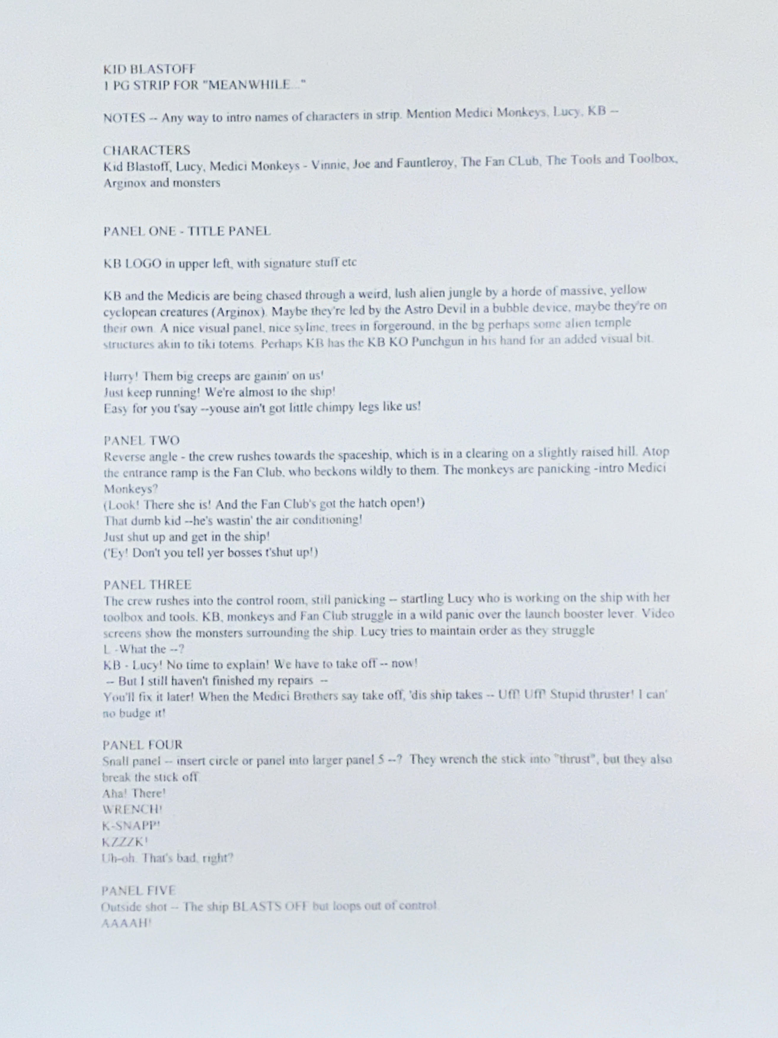
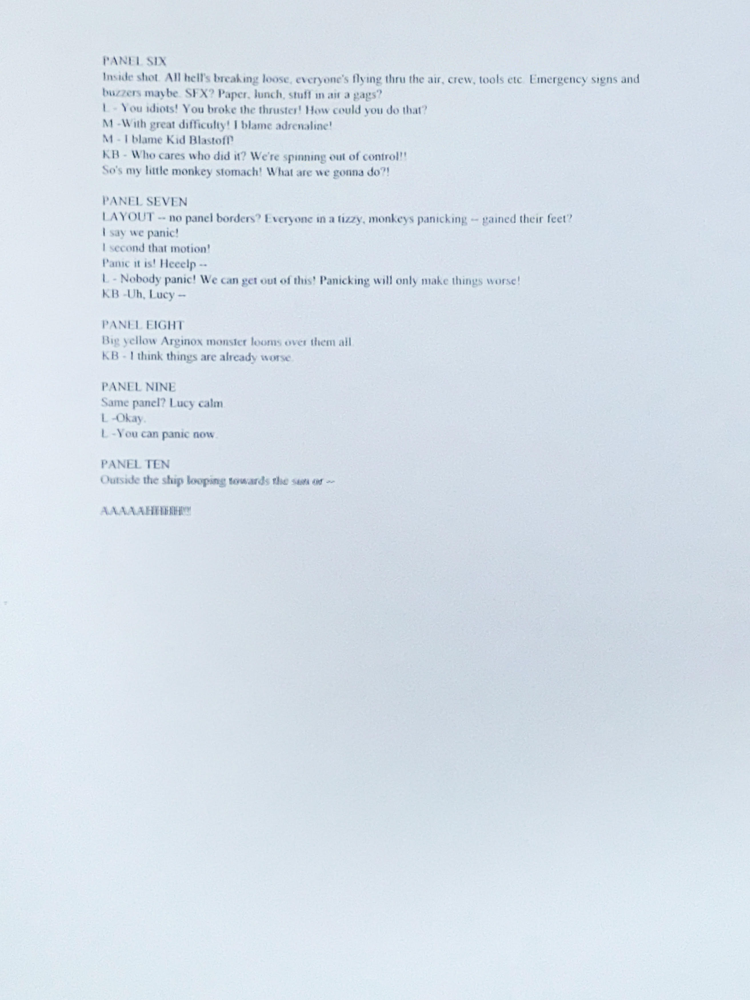
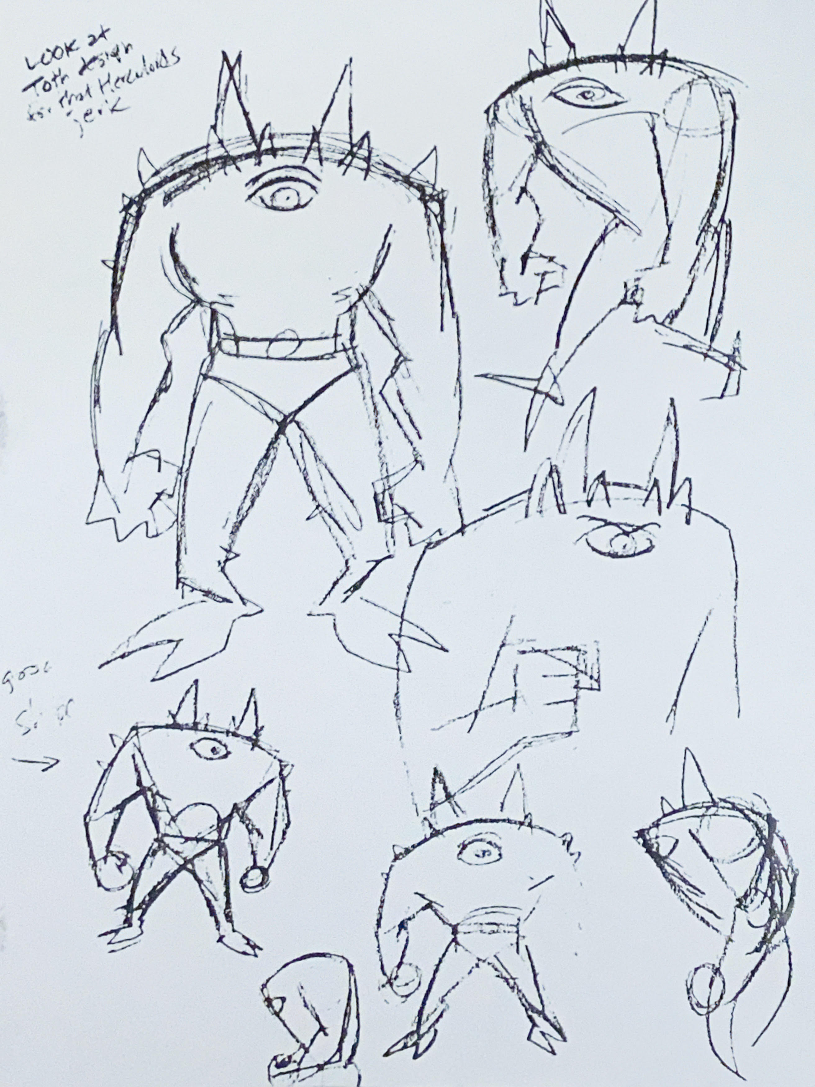
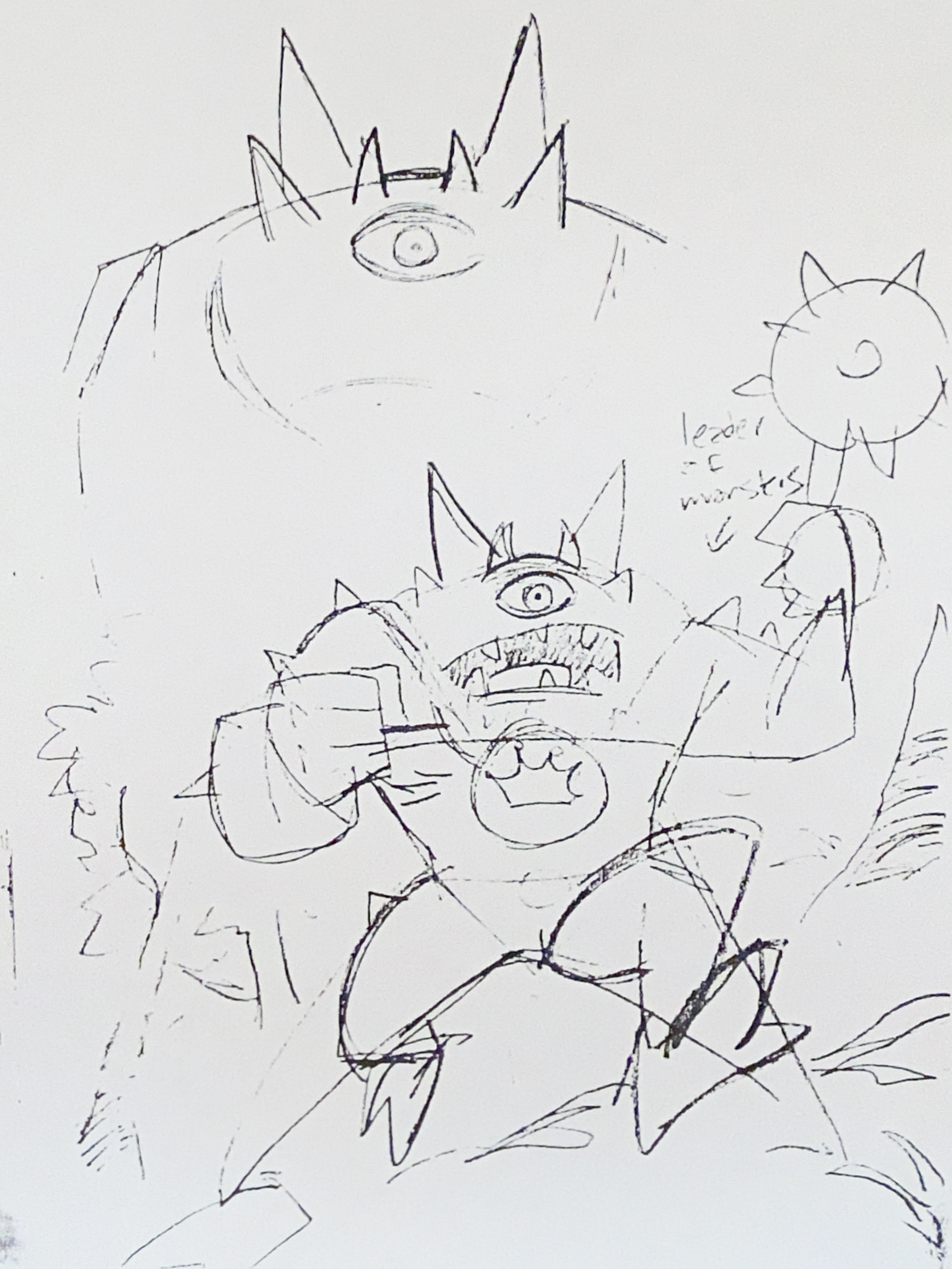
While working on this post I dropped Brian a line with some questions about Meanwhile, and he started sending me some old documents from the project, including some rough sketches of the monsters from the KB strip and the script pages. More importantly, some early layout designs by David Mazzucchelli which he is letting me show off. I had completely forgotten that Brian was working with Dwayne MacDuffie and Derek Dingle on this, which was a bit of a mindblower. And
Anyway, here's some of Mazzucchelli's designs. While some of the names here are obvious placeholders as more people were being recruited to do original work, I do believe Stephen DeStefano was up for contributing a strip as promised in the first image.


I'm glad I got to show you folks this stuff, it ended up being a surprise peek even to me, I haven't seen these design pages in decades.
Hope you enjoyed seeing everything.
More soon, later.
Files