Home
Home

 Artists
 Search
 Recent
 Random
 Posts
Posts
 DMs
DMs
 Tags
Tags
 Random
 Importer
 Import
 FAQ
FAQ
 Account
 Register
 Favorites
 Login
Login

MI403- comp and notes (Patreon)
Content
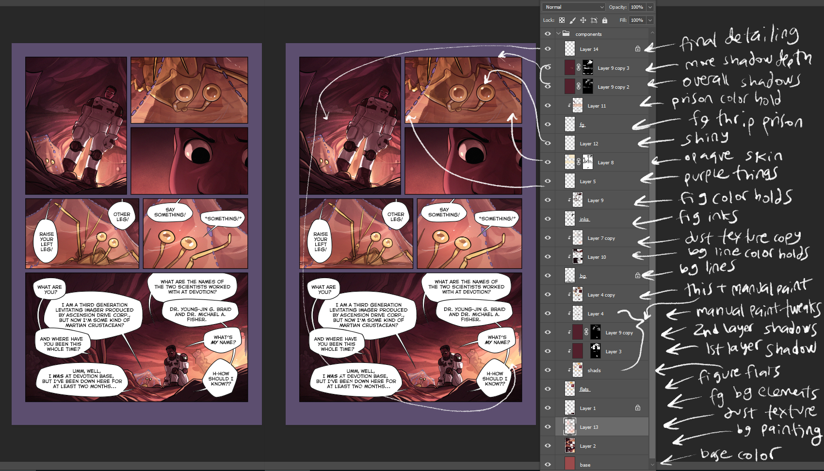
This looks like a ton of layers, but it really boils down to lineart (the base image I start with), colors which are filled in under the lineart, then small details and highlights that are added on top. I could have probably flattened stuff down a lot more, but it wouldn't have been as illustrative... part of my standard process for MI is to add in grain as I paint, this gives things a dusty feeling. The last step after this page that you see up here is to adjust the brightness and add another layer of noise. Every page you see is sort of built up around that imperfect grainy feeling, even the pages with water, that was just a design choice I made before starting, and is consistent from page 1 even if you don't notice! The goal is definitely to make this work feel cohesive and you can achieve that through the tone and writing and drawing/ coloring style of course, but also through small considerations like that.
I'm also excited to get into Thrip's character more, as stupid as that sounds. He's been an important character for a while, and I don't think the main crux of his personality has even been explained yet, so that should be fun! I don't think you'd even be able to guess from the narrative at this point, but I'm dropping breadcrumbs as I go like usual XD
Files