Home
Home

 Artists
 Search
 Recent
 Random
 Posts
Posts
 DMs
DMs
 Tags
Tags
 Random
 Importer
 Import
 FAQ
FAQ
 Account
 Register
 Favorites
 Login
Login

MI401- comp and notes (Patreon)
Content
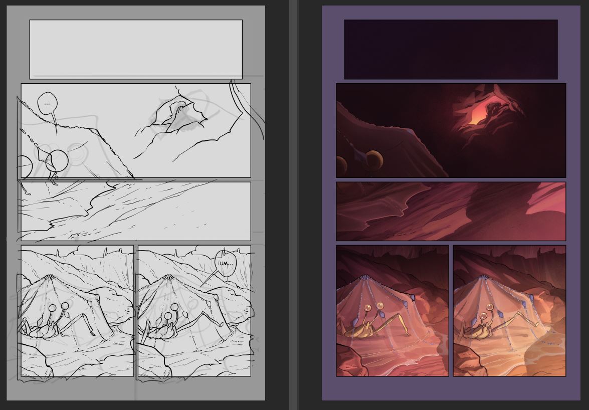
A new thing I'm going to be doing for relevant pages is post a comparison of the sketch file and the final color file, as well as extended page notes, just for fun.
Beginning pages are always the most important ones to me, as they set the tone for the chapter. The first page post explained my decisions for opening up the entire comic, but the individual chapter openers are important too... You'll notice if you glance through the archive that I usually open scenes with a long horizontal panel, both for cohesion and for the sense of panning over a scene. When two panels are seated in the row (like in row 4 of the above page) it gives a sense of anticipation, flow, and active movement, which isn't really the feel I want to begin my scenes with... I like that feeling in the morning when you wake up and take a moment to get your bearings; it's nice to have a panel or two to ease back into the story before getting down to business. Long vertical panels like these are also not great (imo) to start with unless you want a dropping, choppy, bam-bam-bam feeling. And giant impact panels are a bit too punch-in-the-face, though they could work (it just doesn't work for the vibe I want for this work though).
Anyways, the point is, gotta set the tone in the first page. In previous chapters I focused more on the feeling of imbalance and helplessness and feeling threatened, but now we're back in my wheelhouse of feeling like a talking crab who is hoping we can all be friends.
Files