Home
Home

 Artists
 Search
 Recent
 Random
 Posts
Posts
 DMs
DMs
 Tags
Tags
 Random
 Importer
 Import
 FAQ
FAQ
 Account
 Register
 Favorites
 Login
Login

Shoptalk- flexible styles (Patreon)
Content
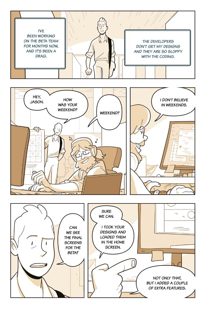
In 2014 while this project was getting of the ground I realized that Q1 and Q2 of 2015 would be primarily composed of suffering, and that I could minimize it a bit through choosing an appropriate style for this project that would serve the content well and also not take me a billion years to execute. A big part of being a professional who sometimes does have to crunch through, say, 200 pages of illustrated business jargon, is knowing how to maximize your art efficacy so you can actually make a living from the work.
For this project, that meant doing all the stuff I mentioned in my proportion tutorial ahead of time: deciding on all my relative page proportions, line proportions and text sizes and treatments before I ever started thumbnailing a page. It also meant doing a mock page and deciding on a treatment for shading and colors that could be carried out very quickly and cleanly. In this page, some of the time-saving measures are a stroke around all of the speaking characters, all shading for all body parts is a consistent shade that was easily available to grab from a saved swatch file, all of the colors are simply overlays that affect only the grays, and all of word balloons and tails are a pre-made vector shape that I turned into a symbol, assembled inside of a folder, to which one final stroke was applied. I also did some finagling so that all intersections with the borders automatically sheared off the bubbles so you get that open panel look (vs having to manually erase them)... and for the art, because this book is aimed at business-types and not artsy-types, an open and "corporate" style with simple expressions and clear shapes seemed to be a good way to go. The end result is a very clean and readable style that has some visual interest and depth, but which actually only takes about 1.5-2 hours per page to assemble on top of the thumbnails.
I ended up dropping this project because, despite my best attempts at staying on schedule for the client, he decided to do a complete rewrite on an entire 40-page chapter and have me rethumbnail the pages I'd already laid out T__T Having to stay on meant that I'd be in for about 2 more months of working on 3 comics at once while moving and launching a Patreon (this very patreon!!!), which was not sustainable. It was a good learning experience though, helped me learn to flex my style a bit, streamline my process for a different need, and taught me the limits of my own flexibility~
TLDR: plan for what you can!
Files