Quick coloring tutorial (Patreon)
Content
In my humble opinion, the best way to pick colors and to color (especially for comics), is to emphasize relationships, especially
contrast
. A lot of amateur colorists end up making stuff with very little color or value (light and dark) variation.
Ideally in art you want certain parts of the picture to 'pop', or be visually interesting. The best way to do this is to use opposites when coloring different parts of the image, such as foreground/background. What do I mean by opposites?
When in doubt
, go by the color wheel!
Purple <----> yellow
Green <------> Red
Blue <--------> orange
Here are some more:
More saturated (colorful) <---------> less saturated (grey)
Darker <-----------> lighter
Cool colors (blue, green, purple) <-------------> warm colors (Red, Yellow, Orange)
Go back and look at any of my pages and you'll see a LOT of green/red and blue/orange. This is completely intentional. I even shade in complements (for example, using a darker blue when the surface I'm coloring is bright orange) sometimes for visual effect.
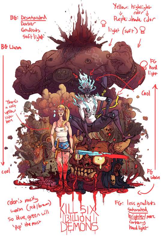
Have a look at the image up there.
I started with the presumption that I wanted the foreground to 'pop' pretty heavily. This is probably the first question you should ask in an image - what part do you want to show up the most? Where should the reader's eye be drawn? For example, something that is colored a bright blue on a dark orange background will almost immediately command the attention of the viewer.
The background in the above image is:
- Darker
- Less saturated (the lines have actually had a filter done over then so they're red)
- Lit with a softer light
- Uses warm colors at the top and goes down to slightly cooler colors at the bottom
- Uses purple as a shade color (I do this a lot)
Therefore the foreground is:
- Lighter
- Brighter/more saturated
- Lit with a harder light/has highlights and edge lights
- Has more flats
- Goes from very warm colors at the bottom (bright red) to slightly cooler at the top
Since the composition is mostly a darker purple/reddish/brown warm
color, the colors that will pop the most are yellow and brighter, cool
colors, hence Allison's hair/face popping out a lot, the blade of the
sword, the eyes of the ogre, and the blue fire around 82's head in the
middle there being the central focus of the piece.
I'll also add that I like flats to be a little more complex and I like
large areas of flat color to have a direction to them, so I'll often
slap a simple gradient on them for no good reason, hence the slight
pink/red gradient on 82's boots there. And I've also tried to make a kind of gradient with the foreground going from warm > cool while the background does the opposite, so it pops out even more!
So to summarize, it's about contrast! Once you create contrast in a piece it's not only visually pleasing but also helps the eye pick out forms more and separate the foreground/background, which is very relevant for comics!
Here are some extra mental rules of mine:
1. Where is (are) the light source(s)? What color is the light? How
strong is it, is it a softer light, like something I can use a gradient
for, or a harder light that might require some highlights or edge
lights?
2. How close or far away are the objects I'm coloring? Objects that are further away will be flatter and less saturated.
3. What kind of material am I coloring? For example, skin is awesome, it
has all kinds of warm undertones and reflects light and so you're going to
end up putting a lot of highlights and soft lights and stuff when
coloring it. Metal behaves very differently and tends to reflect harder
light. Really experiment and look at examples of this stuff. Skin, for example, often has very saturated shadows!
Hope that helps! Post if you have any questions!

