Home
Home

 Artists
 Search
 Recent
 Random
 Posts
Posts
 DMs
DMs
 Tags
Tags
 Random
 Importer
 Import
 FAQ
FAQ
 Account
 Register
 Favorites
 Login
Login

質感表現について(About texture expression) (Pixiv Fanbox)
Content
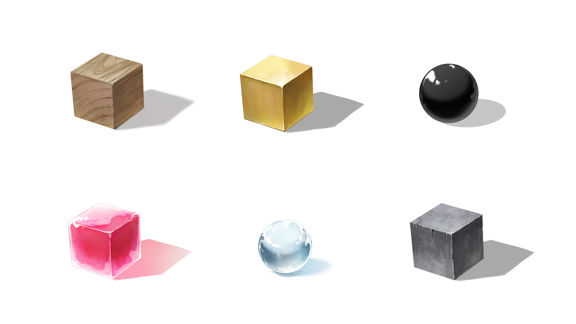
主な内容は以下の通りです。
・描き始める前に考えること
・木、金属、エナメル、石、ガラス、ゼリーのチュートリアル
・球体の反射
・色の反射
The main contents are as follows
-Things to think about before you start drawing
-Wood, metal, enamel, stone, glass, and jelly tutorials
-Reflections of spheres
-Reflections of colors
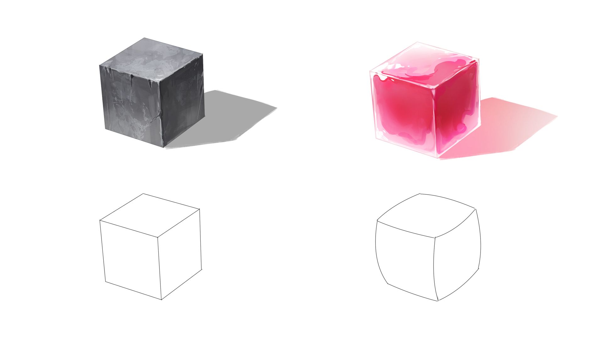
質感表現で大切なのは、描き始める前に「重量・表面の粗さ・硬度・透明度」を考えておくことです。
What is important in texture expression is to consider "weight, surface roughness, hardness, transparency" before starting to draw.
・重量 weight
重いか軽いかです。
鉄、石といったような固有のモチーフであれば重量が分かりやすいですが、色の選び方を工夫することでも表現できます。
濃くて暗い色を使うと、重く見え、薄くて明るい色を使うと、軽く見えます。
It can be heavy or light.
Weight is easy to recognize with inherent motifs such as iron and stone, but it can also be expressed through the choice of colors.
Darker and darker colors make the motif appear heavier, while lighter and lighter colors make it appear lighter.
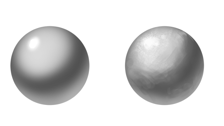
・表面の粗さ surface roughness
ツルツルとしているのか、それともザラザラしているのかという表面の状態です。
筆致を残したりテクスチャブラシを使ったりして、描き分けることができます。
ハイライトや陰影の形状で印象が変わります。
It is the state of the surface, whether it is smooth or rough.
It can be painted differently by leaving brushstrokes or using a texture brush.
The shape of the highlights and shading can change the impression.
また、ツルツルとした物体程、光が反射しやすいです。
そのためハイライトや反射光が強く現れ、明暗差が大きいです。
最たる例としては金属でしょうか。
Also, the more slippery an object is, the more light is reflected.
Therefore, highlights and reflected light appear stronger, and there is a large difference between light and dark.
The best example would be metal.
・硬度 hardness
硬いか軟らかいかです。
着彩では、ぼかしがあると軟らかく、筆致がそのままだと硬く見えやすいです。
直線が多いと硬く見え、曲線が多いと軟らかく見えます。
It can be hard or soft.
In coloring, blurring tends to make the painting look softer, while an unmodified brushstroke tends to make it look harder.
If there are many straight lines, it looks hard, and if there are many curved lines, it looks soft.
・透明度 transparency
透けている物体かどうかです。
透明度が高い程、光が物体を通過しやすくなります。
光が物体を通過しているため、影の色は物体の色に影響されます。
It is whether the object is transparent or not.
The higher the transparency, the easier it is for light to pass through the object.
Since light is passing through the object, the color of the shadow is affected by the color of the object.
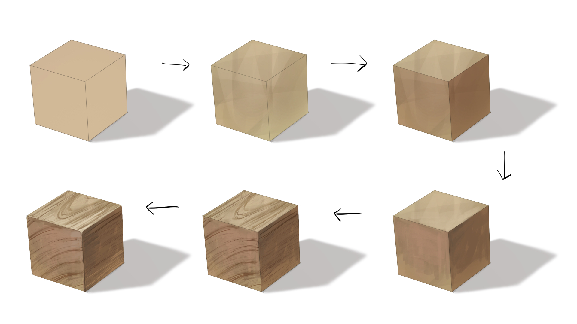
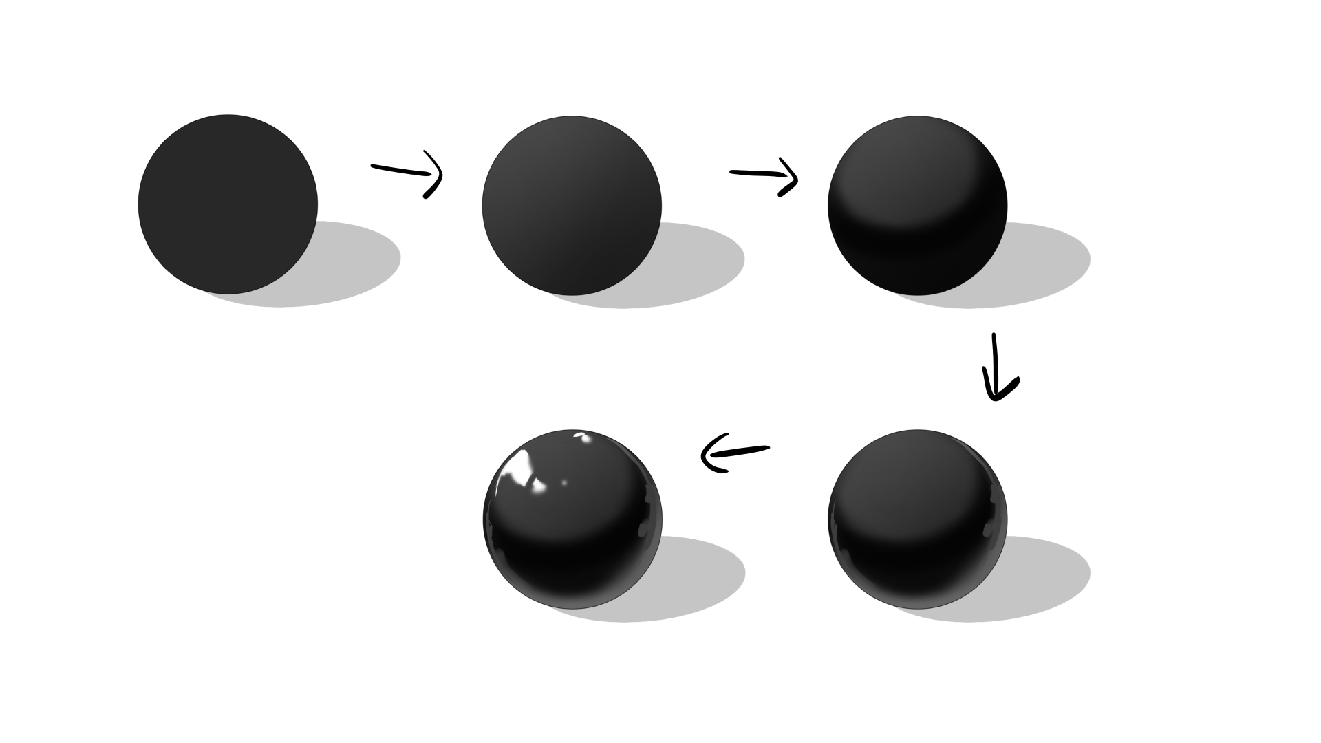
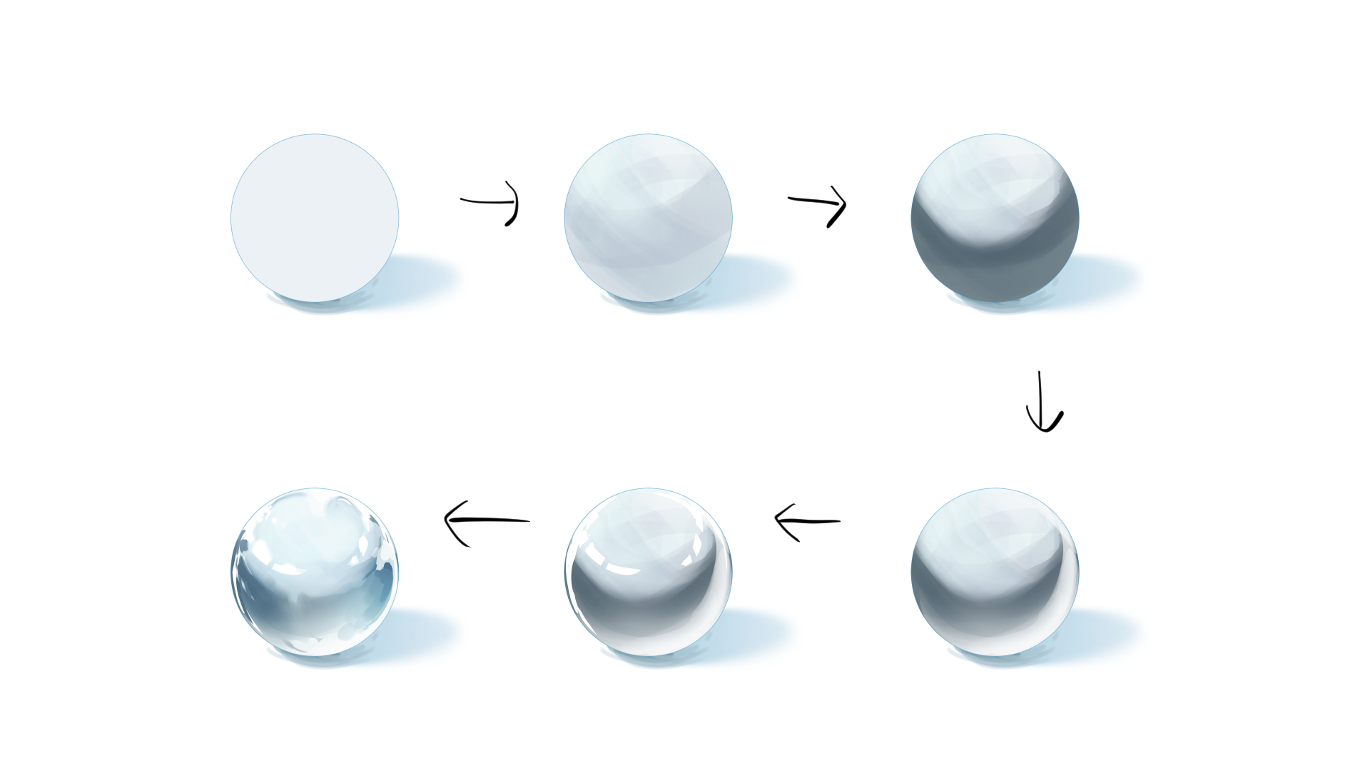
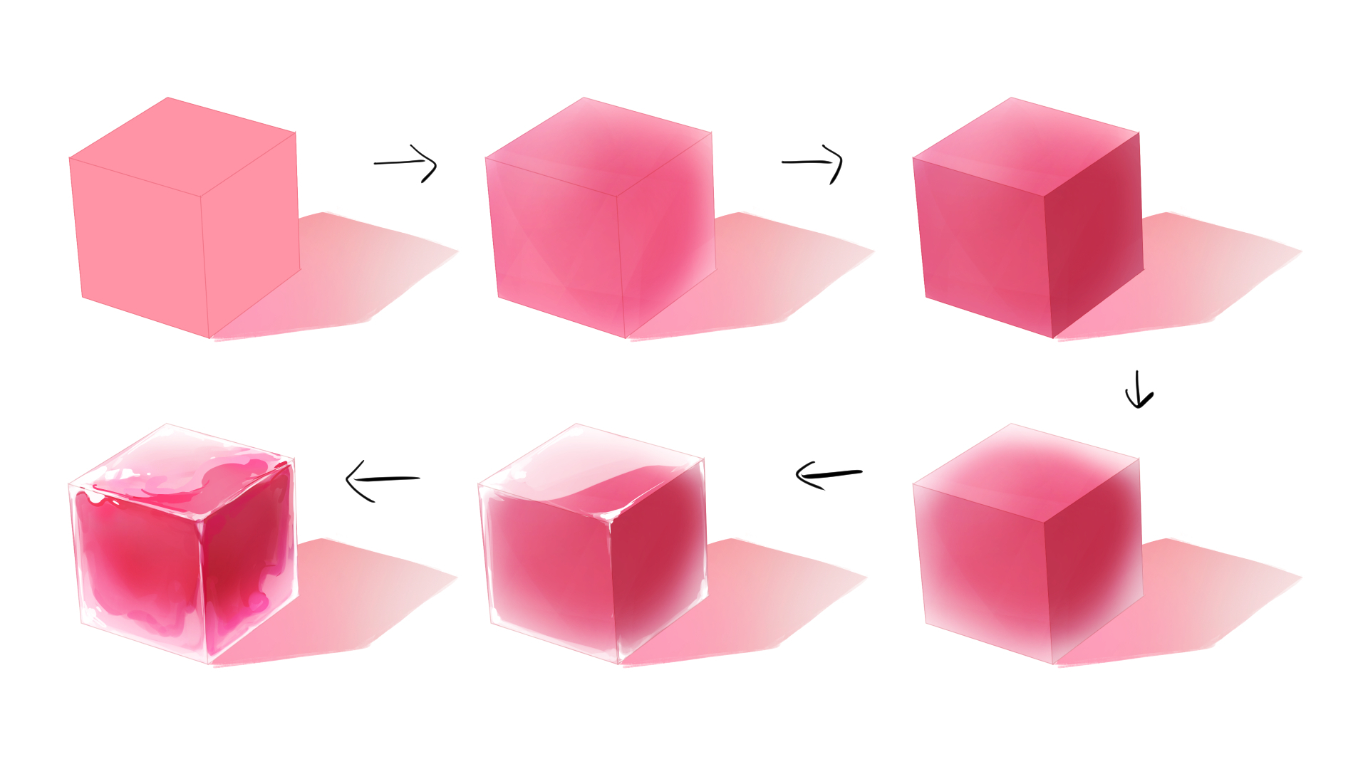
木、金属、エナメル、石、ガラス、ゼリーのチュートリアルを以下に載せます
どれも「ベースカラー→下地塗り→陰影→反射光→ハイライト→形を整える」という手順となっています。
硬い物の下地を塗るときは、不透明度を下げた硬いブラシで筆致を残すように塗るのがコツです。
軟らかい物の場合は、エアブラシなどの軟らかいブラシでふんわりと塗るのがコツです。
最後の形を整える作業は、明暗の境界をくっきりさせたり、物によっては輪郭に凹凸をつけています。
Tutorials for wood, metal, enamel, stone, glass, jelly are included below.
The steps for all of them are "base color→base coat→shade→reflected light→highlight→shape"
When priming hard objects, the trick is to use a stiff brush with reduced opacity to leave brushstrokes.
For soft objects, the trick is to apply softly with a soft brush, such as an airbrush.
The final shaping process involves sharpening the boundaries between light and dark, and, for some objects, making the contour uneven.
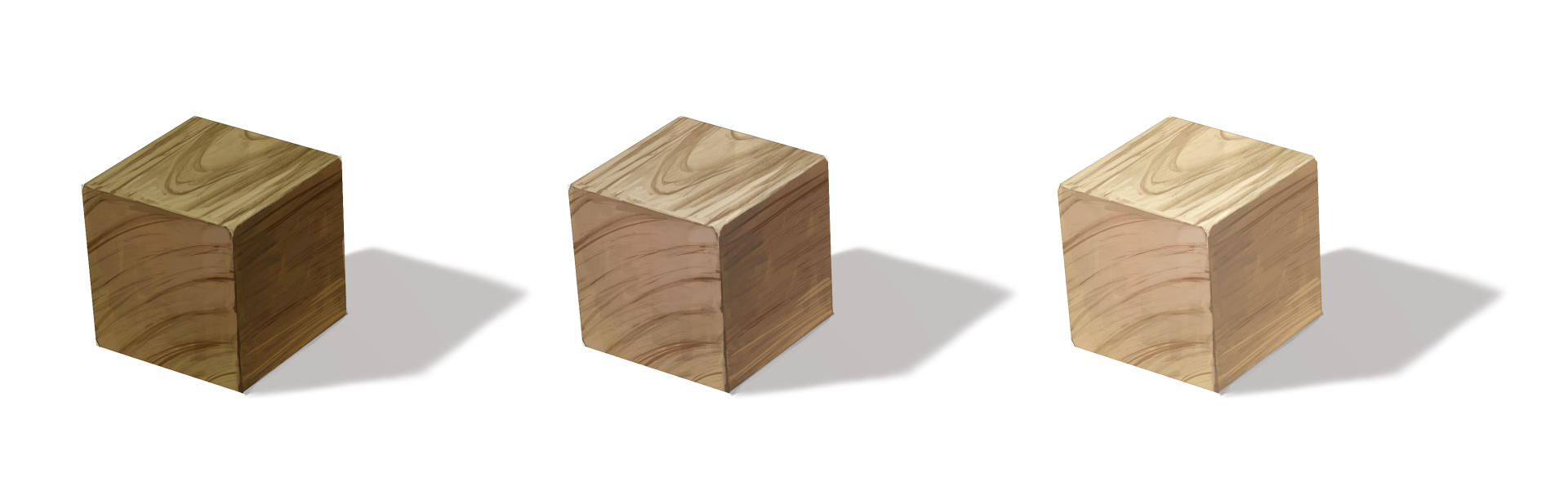
・木 wood
色を暗くするとどっしりとした古い木材に見え、明るい色だと軽やかな新品の木材に見えます。
Darker colors make it look like heavy, old wood, while lighter colors make it look like light, new wood.
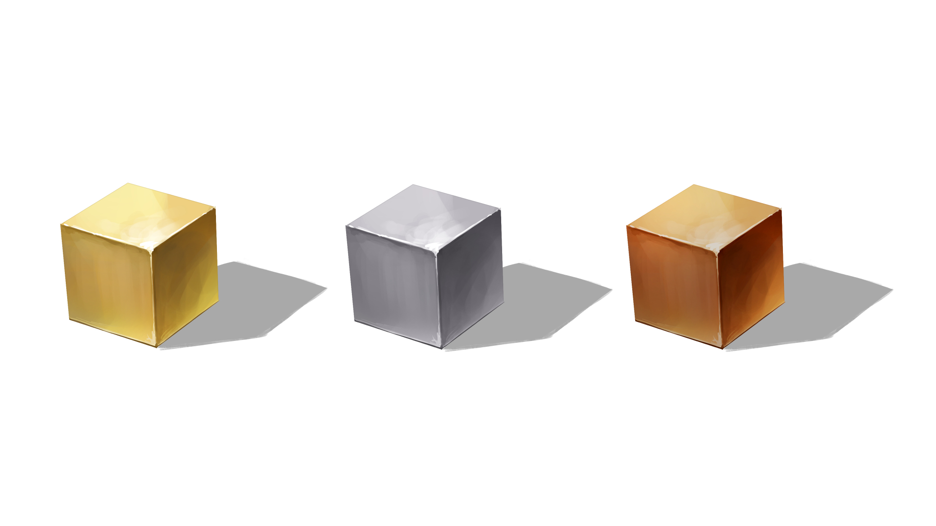
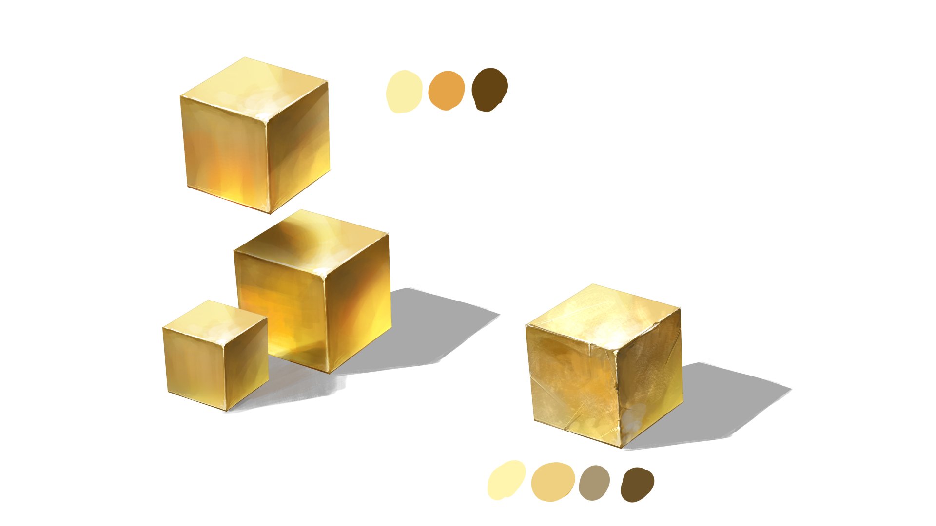
・金属 metal
金属は表面が滑らかなので、周囲にある物体を反射します。
落ち影と反射の違いを明確にするのがコツです。
落ち影部分は暗く、反射は明るくなります。
古びた金属を描く時は、傷や錆の描写に加えて、通常よりも彩度を落としてコントラストを弱めにします。
表面の粗さによって、反射しづらくなっているためです。
Because of its smooth surface, metal reflects objects in its surroundings.
The trick is to make the difference between shadows and reflections clear.
Shadow areas are darker and reflections are lighter.
When depicting old metal, in addition to depicting scratches and rust, the saturation should be reduced and contrast weakened more than usual.
This is because the roughness of the surface makes reflections more difficult to see.
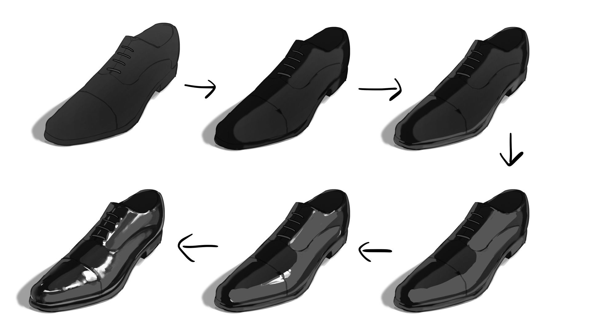
・エナメル enamel
形状的に少し分かりづらかったため、靴を描きました。
表面がツルツルしているため、金属同様に反射しやすいです。
違いとしては金属程光らないということでしょうか。
Since it was a little confusing in terms of shape, we drew a shoe.
Because the surface is smooth, it is easily reflective, just like metal.
The difference is that it does not shine as brightly as metal.
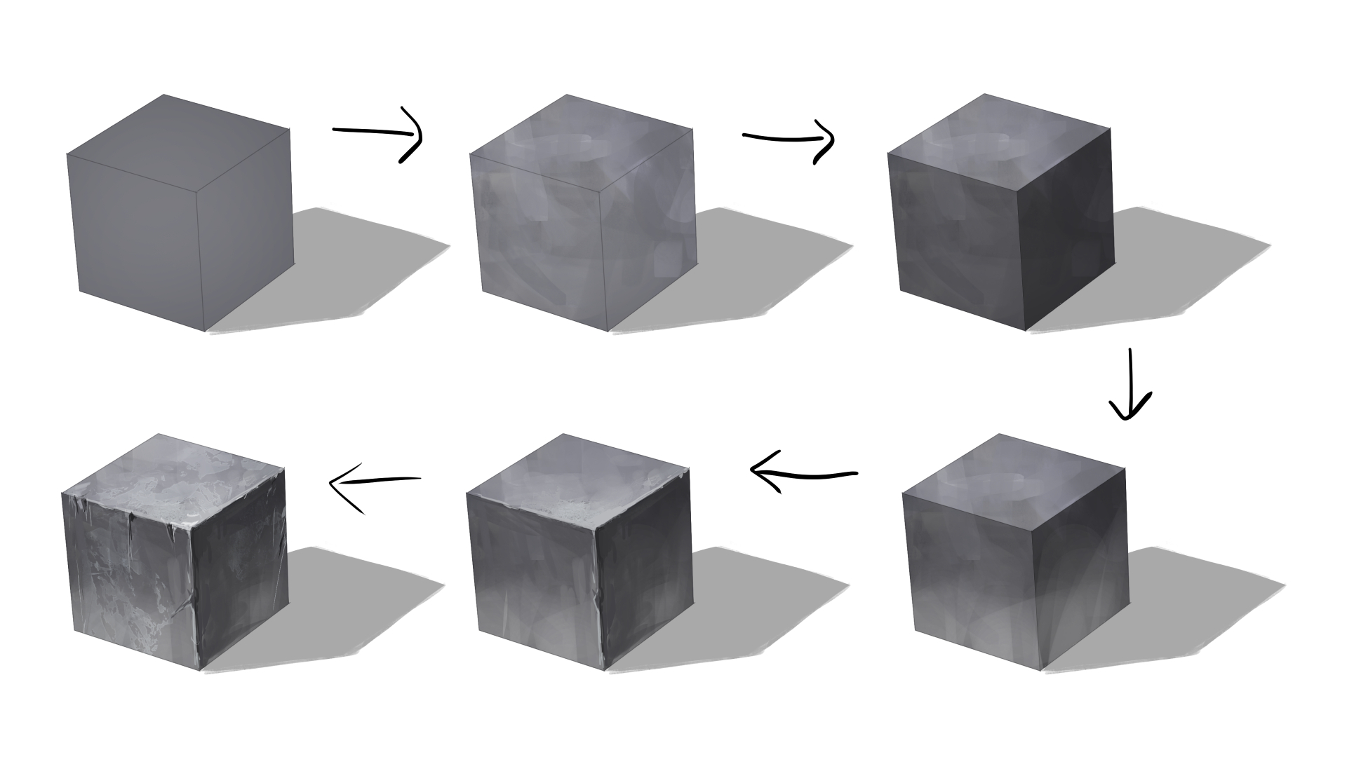
・石 stone
・ガラス glass
・ゼリー jelly
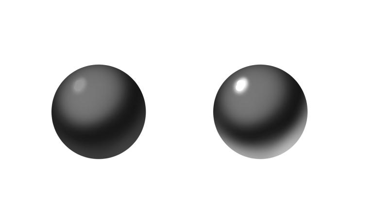
・球体の反射
平らな鏡とは違って、球体の場合は周囲の風景が歪んだ状態で反射します。
魚眼パースを意識すると描きやすいです。
Unlike a flat mirror, a sphere reflects the surrounding landscape in a distorted manner.
It is easier to draw if you are aware of the fisheye perspective.
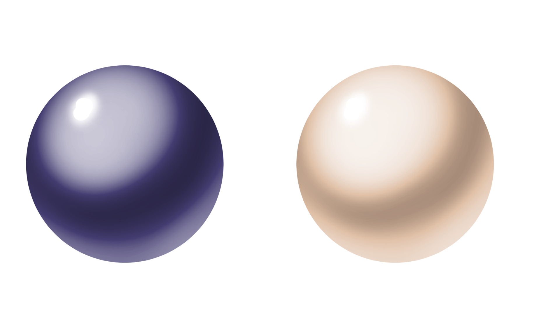
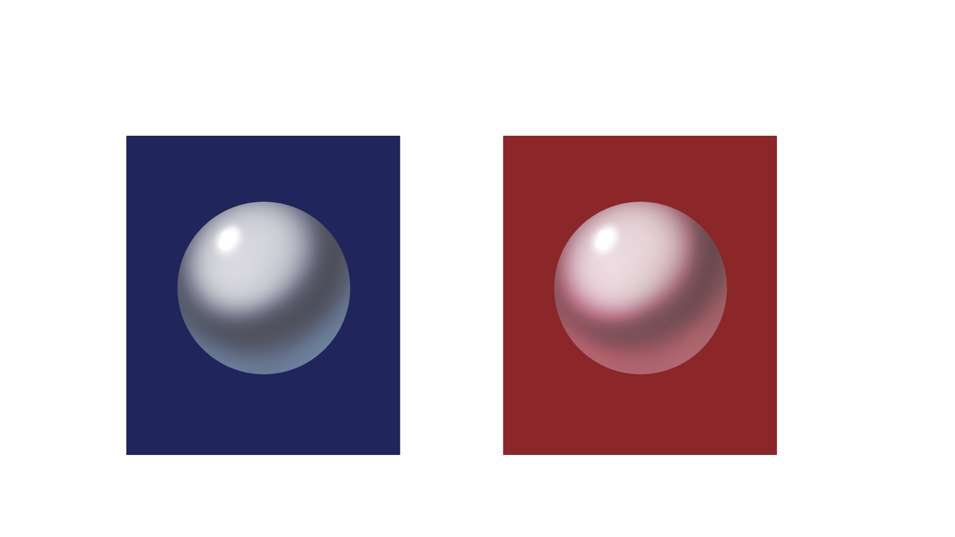
・色の反射
上記のチュートリアルは全て白地の背景ですが、色がある場合はそれも考慮する必要があります。
滑らかな物体や透明な物体は周囲の色の影響を受けやすいです。
All of the above tutorials are on white backgrounds, but if there is a color, that should be taken into account as well.
Smooth or transparent objects are easily affected by surrounding colors.
解説は以上です。
他に解説してほしい内容などあれば、遠慮なくコメントください!
That's all for the explanation.
If there is anything else you would like to see explained, feel free to comment!
コメント欄で伝えづらい方は質問箱でも構いません。
If you have difficulty communicating in the comments section, you can use my question box.
(https://peing.net/ja/d6759df3bc79d7)
Files