Home
Home

 Artists
 Search
 Recent
 Random
 Posts
Posts
 DMs
DMs
 Tags
Tags
 Random
 Importer
 Import
 FAQ
FAQ
 Account
 Register
 Favorites
 Login
Login

レミリア(PSD and Process) (Pixiv Fanbox)
Videos
-
remilia.mp4
Downloads
Content
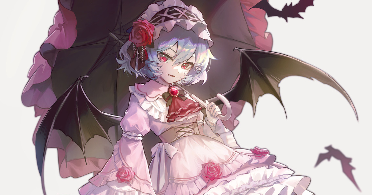
描写・加工:Clip Studio Paint
今回は特殊な加工はないので、photoshopは使用していません。
Since there is no special processing in this case, photoshop was not used.
タイムラプス↓
過程画像
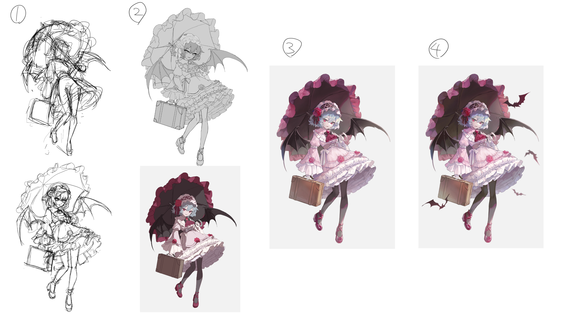
・各過程のポイント Points of each process
支援者の方から過程ごとに解説が欲しいと要望があったので今回から書いていこうと思います。
One of my supporters requested that I provide an explanation for each process, so I will start writing this time.
1,ラフ sketch
最初はポーズや構図、状況が分かる程度に描きます。
次に衣装デザインなどの詳細な部分を決めたラフを描きます。
この段階でポーズや構図に違和感がある場合、次の段階へ無理に進んでも良くならないので納得がいくまで直します。
今回はおでかけをテーマに活動的なイラストにしたかったので、少し躍動感のあるポーズにしました。
シルエット感については、逆三角形ほどの躍動感は求めていないものの、ある程度動きが欲しかったので、ひし形のシルエットを意識しました。
At first, draw just enough to show the pose, composition, and situation.
Next, a rough sketch is drawn to determine the costume design and other details.
If there is something wrong with the pose or the composition at this stage, my work will not improve it by forcing it to the next stage, so I fix it until I'm satisfied with it.
In this case, I wanted to create an active illustration based on the theme of going out, so I decided on a pose with a little more dynamism.
As for the silhouette, I didn't want it to be as strong dynamism as an inverted triangle, however I wanted it to have some movement, so I was conscious of the diamond shape of the silhouette.
2,線画・下塗り line drawing and base color
最終的に厚塗りで完成させるので、線画はそこまで丁寧には描きません。
が、後の工程で苦労を減らすために曖昧な部分はできる限り残さないようにしています。
ラフを見ると、思ったより等身が高い印象だったのでもう少し低くなるよう調整しました。
幼さを出すため、顔パーツの位置や脚の細さをこだわっています。
また、傘を大きめにすることでキャラクターの小ささを引き立てています。
下塗りでは光源を決め、大体の影を塗っています。
影はまだ大まかで大丈夫ですが、ベース色はこの段階で確定させておきます。
Since the final product will be completed with a thick coat of paint, the line drawings are not that carefully drawn.
However, in order to reduce the difficulty in later processes, I try not to leave any ambiguous parts as much as possible.
When I looked at the rough sketch, the figure seemed taller than I expected, so I adjusted it to be a little lower.
In order to create a childlike appearance, I focused on the position of the face parts and the slenderness of the legs.
I also made the umbrella larger to enhance the smallness of this character.
In the primer, I decided on the light source and painted the general shadow.
The shadows can still be rough, but the base color should be finalized at this stage.
3,着彩 coloring
最初は大まかに陰影をつけて徐々に詳細を追求していきます。
なるべく全体に手を付けることを意識すると、効率的にバランス良く制作できます。
一部分だけ塗り進めてしまうと、全体のバランスが悪くなって結局修正が増えることになり、時間がかかることが多いです。
時々あまり上手く塗れない箇所がでできますが、そういう場合は一旦置いておいて他の箇所を塗っていきます。
そうすると、他の箇所との比較でどのように塗るべきかが分かったり、そもそもそこまで違和感がないことに気づきます。
今回はある程度落ち着いた配色にしたかったので、彩度は低めにしています。
全体的に彩度が高くないので、目や薔薇、宝石の鮮やかな赤を引き立てることができます。
Start with rough shading and gradually pursue details.
If you are conscious of working on the entire piece as much as possible, you can create an efficient and well-balanced work.
If you proceed to paint only one part of the image, the entire image will become unbalanced and you will end up having to make more revisions, which is often time-consuming.
Sometimes, there are areas that cannot be painted very well, but in such cases, I leave them aside and paint other areas.
Then I will know how it should be painted in comparison to other areas, or realize that it is not that uncomfortable in the first place.
In this case, I wanted to create a somewhat subdued color scheme, so I kept the saturation low.
The overall saturation is not too high, so the bright red of the eyes, roses, and jewelry can be enhanced.
4,仕上げ finishing
仕上げの加工はあくまで「味付けの調味料」なので元が悪かった場合、大きく改善されることはありません。
なので着彩を終えた段階で違和感が残っている場合は面倒くさがらず修正します。
画面が少々寂しかったのでコウモリを追加しています。
今回はこの程度の追加で済んだのであまり問題はなかったのですが、できるだけラフの段階でキャラだけでなく背景やエフェクトについても決めておくことが大切です。
着彩完了後に凝った背景を追加しようとすると、色味や描き込み具合などの全体の調整が面倒になります。
全体の色を整えるため、グラデーションマップを追加しています。
ソフトライトで黄色~橙色を明るい部分に塗って、暖かい日差しが差し込んでいる印象にします。
全体的に色味が薄い印象だったので、最後にトーンカーブを追加して調整しました。
The final finishing stage is only "seasoning," so if the original is bad, it will not be greatly improved.
Therefore, if there is still a sense of discomfort at the stage of coloring, you need to correct it without hassle.
The screen was a little lonely, so I added bats.
This was not a problem this time, but it is important to decide not only the character but also the background and effects at the rough sketch stage.
If you try to add elaborate backgrounds after the coloring is complete, it will be troublesome to adjust the overall coloring and drawing.
To adjust the overall color, a gradient map is added.
Soft light is used to apply yellow-orange color to the bright areas to give the impression of warm sunlight.
Since the overall impression was that the colors were light, a tone curve was added at the end to adjust the colors.
何か至らない点があればコメントにてお伝えください。
その他要望や感想、質問等もお気軽にコメントへどうぞ!
If you have any requests, impressions, or questions, please feel free to comment!
Files