Home
Home

 Artists
 Search
 Recent
 Random
 Posts
Posts
 DMs
DMs
 Tags
Tags
 Random
 Importer
 Import
 FAQ
FAQ
 Account
 Register
 Favorites
 Login
Login

【Tips】服や布について(About clothes) (Pixiv Fanbox)
Content
今回は服や布のシワや陰影に関するtipsを解説していきます。
主な内容は以下の通りです。
・シワの始点、種類
・胸と服の関係
・服の構造
・シワの陰影
In this issue, I will introduce tips on shading and wrinkling of clothes.
The main contents are as follows
-Starting points and types of wrinkles
-The relationship between the chest and clothing
-Structure of clothes
-Shading of wrinkles
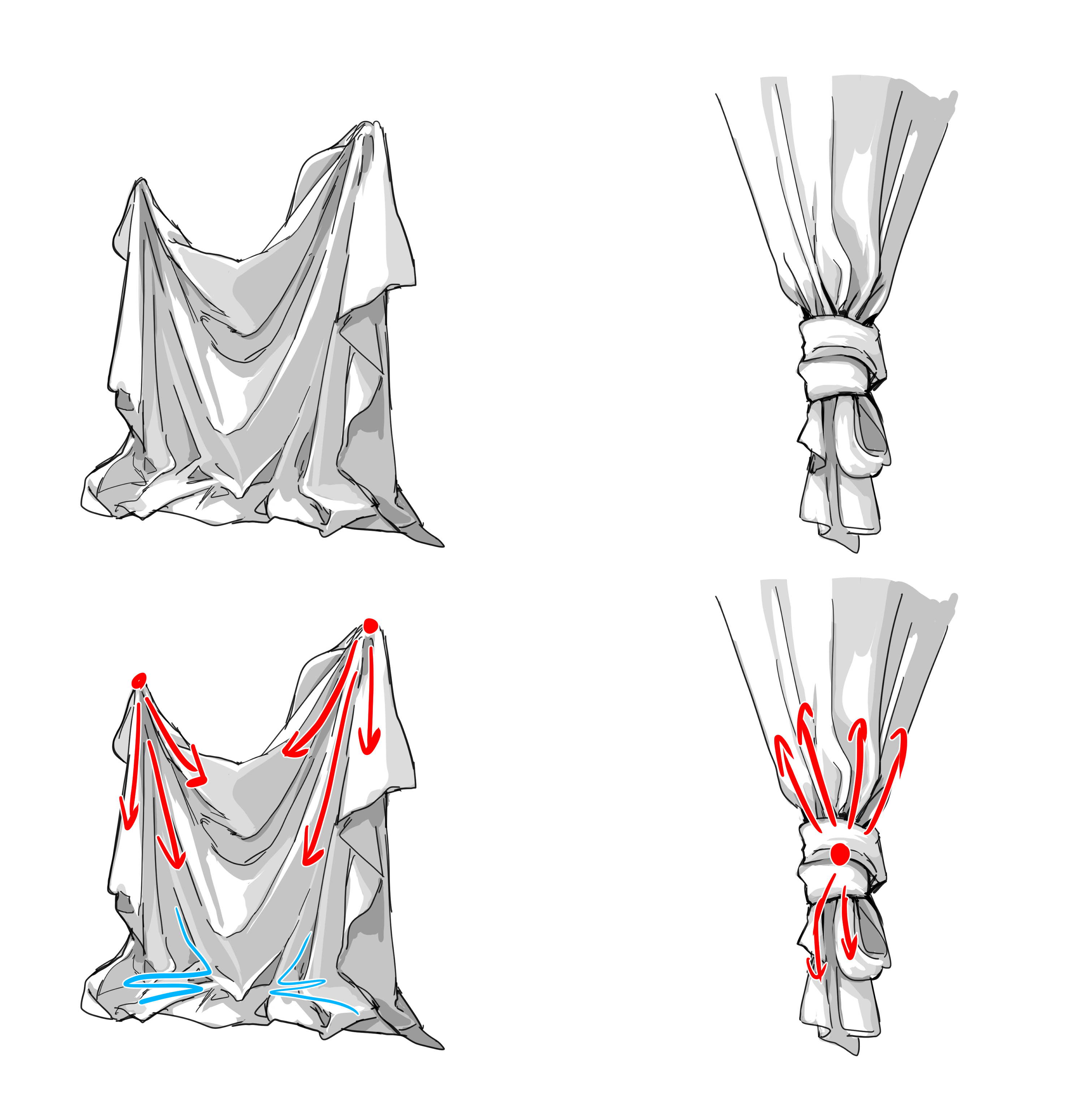
・シワの始点、種類
シワを描く時、どこから発生しているのかを探すと描きやすくなります。
始点から広がるようにシワの流れができることが多いです。
布が引っ掛かっている部分や縛られている部分など、力が集中しているような部分が始点になりやすいです。
Starting point and type of wrinkles
When drawing wrinkles, it is easier to draw them if you look for where they originate.
the stream of wrinkles often forms as it spreads out from the starting point.
The starting point tends to be an area where force is concentrated, such as where the cloth is caught or bound.
シワというものは一見複雑で厄介に見えますが、大まかに2種類に分けると比較的理解しやすくなるのではないかと思います。
・一本線型
→布が引っ張られている時にできるシワ
・稲妻型
→腕を曲げた時にできるシワなど、布が折り重なっている時に発生するシワ
Wrinkles may seem complicated and troublesome at first glance, but if we divide them roughly into two types, they become relatively easy to understand.
Single line type
→A wrinkle that forms when the cloth is pulled.
Lightning bolt type
→A wrinkle that occurs when the cloth is folded over, such as when an arm is bent.
生地によってもシワのつき方が変わります。
・ブラウスやTシャツなど、柔らかくて薄めの生地
→細かいシワが付きやすく、シワの凹凸はそこまで大きくない
・トレーナーやパーカーなど厚みのあるゆったりとした生地
→大きいシワが付きやすく、シワの凹凸が大きい
・ブレザーやコートなど固めの生地
→シワが付きづらく、シワの凹凸が緩やか
The wrinkling process varies depending on the fabric.
-Soft and thin fabrics such as blouses and T-shirts
Easy to get fine wrinkles, and the unevenness of the wrinkles is not that large
-Thick and loose fabrics such as sweatshirts and hoodies
Large wrinkles are easily formed, and the unevenness of the wrinkles is large.
-Stiff fabrics such as blazers and coats
Harder to wrinkle, and the unevenness of the wrinkles is gentle.
服のシワはある程度パターン化できるので、写真を観察して形状を覚えていくのがおすすめです。
Since wrinkles in clothes can be patterned to some extent, it is recommended to memorize the shape by observing photos.
・胸と服の関係
肌に密着している服など特殊な服を着ていない限り、布は胸のラインにぴったり張り付くのではなく、テントのように張ります。(ボールに布をかぶせている状態を想像すると分かりやすいです。)
NG例としている右側も、大きな胸を強調したいなどの狙いがあれば悪くないとは思うのですが、そういった狙いがない場合は不自然になりがちなのでおすすめしません。
The relationship between the breasts and clothing
Unless you are wearing special clothing, such as skin-tight clothing, the cloth does not stick snugly to the chest line, but rather tautly, like a tent. (It is easier to understand if you imagine a ball covered with cloth.)
The right side, which is used as an example of NG, is not bad if the aim is to emphasize large breasts, etc. However, if there is no such aim, it tends to look unnatural and is not recommended.
・服の構造について
基本的な服の構造を知っておくと、どのような服を着ていても服の境界線やどこにシワができるのかが大体分かるようになります。
よくある構造としては、大まかに以下の3つで分かれていることが多いです。
・袖口(筒状で下部に接合部あり)
・前面
・背面
これらの接合部分は細かいシワができたり、シワの始点となりやすいです。
The Structure of Clothing
Knowing the basic structure of clothing will give you a general idea of the borders of any piece of clothing and where wrinkles can occur.
Common structures are often roughly divided into the following three categories.
-Cuffs (tubular with a joint at the bottom)
-Front
-Back
These joints tend to form fine wrinkles or be the starting point of wrinkles.
服装によって、襟が付いたりフリルが付いたりなど様々ですが、基本はこの構造を覚えておくとオリジナル衣装にも応用が利くかと思います。
服の構造が特殊だったり細かい部分がよく分からない場合は、その都度資料を見て構造を把握してから描くのが良いです。
Depending on the garment, there may be a collar, frills, etc., but if you keep this basic structure in mind, you can apply it to your original costume.
If the structure of the clothing is unique or if you are not familiar with the details, it is best to refer to the materials to understand the structure before drawing.
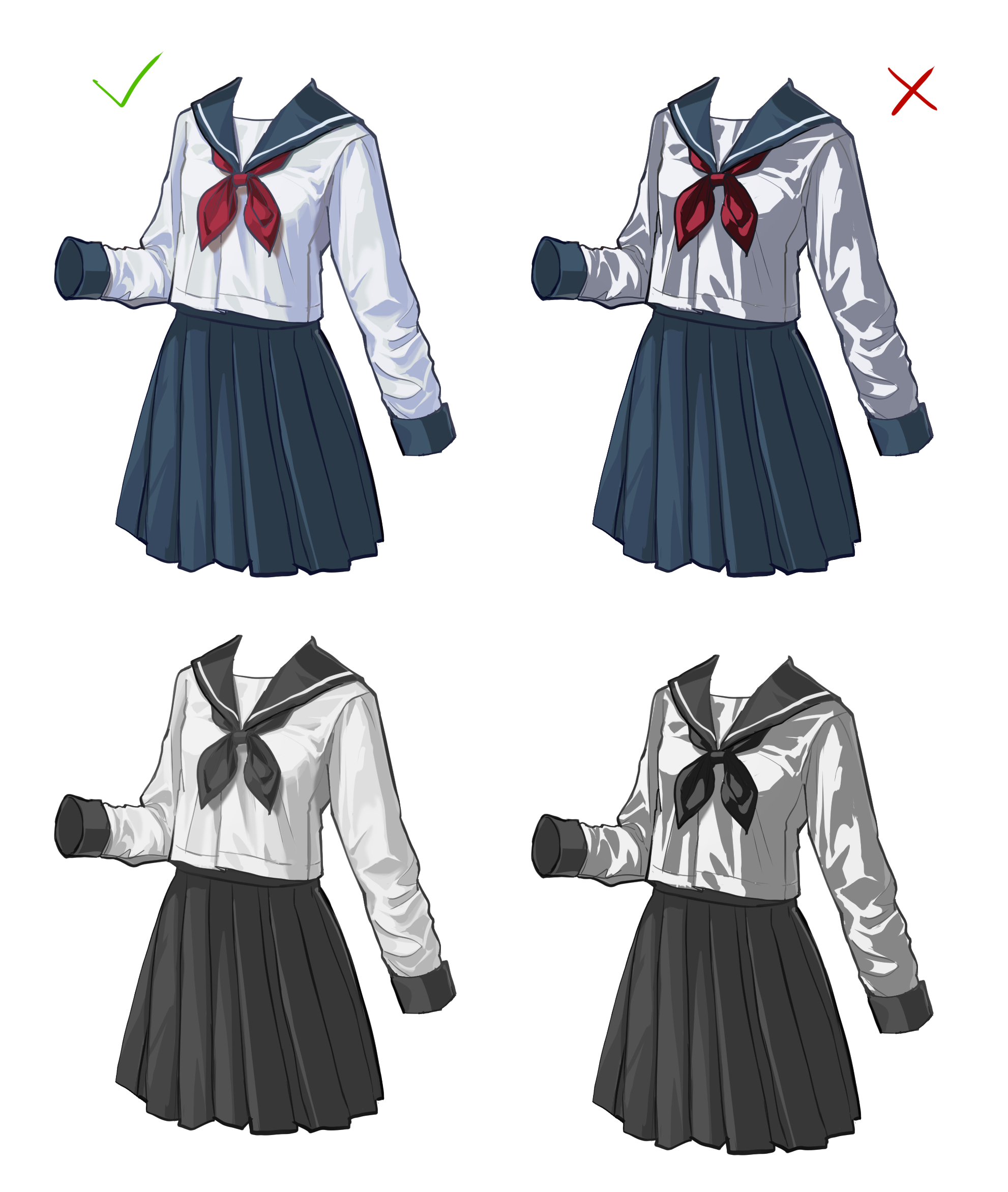
・シワの陰影
昔自分がやらかしていた間違いとして「シワの陰影が濃すぎる」というものがあります。
Wrinkle Shading
One mistake I used to make is "shading wrinkles too dark".
ライティング設定は順光です。↓
The lighting setting is forward light. ↓
左上から強い光が当たっている設定だったらこの影の色の濃さでもあまり違和感はないのですが…(それにしては影の付け方が散漫でシワの凹凸感が均一すぎますが)
If the setting is strongly lit from the upper left, even this color of shadow is not so strange...(Although the shadows are too diffuse and the wrinkles are too uneven.)
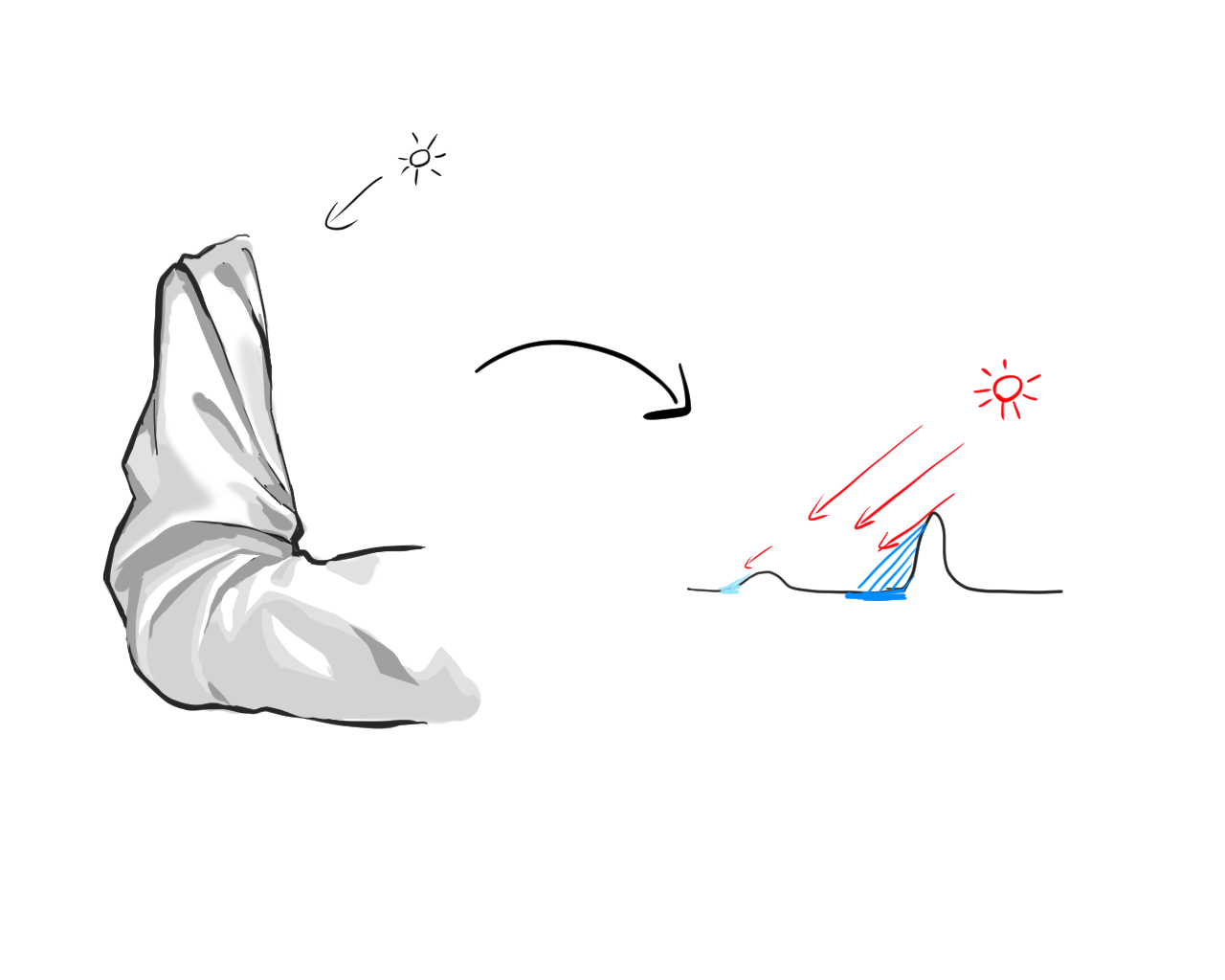
これはどうして陰影ができるのかを理解できていないが故の間違いなのではないかと思います。
光の当たり具合(遮断具合)というものを考えないと、やたらと陰影の色が濃くなったり散漫とした塗り方になりがちです。
I think this is a mistake that is caused by a lack of understanding of why shading is created.
If we do not consider how light hits (or is blocked out), we tend to end up with darker colors in the shadows and a diffuse painting style.
突起部分の角度が大きいと、それよって光が遮断され、濃い影(落ち影)ができます。
反対に面の凹凸が少なければ、光が当たりやすくなるので濃い影はできません。
光が遮断されている程、影は濃くなるということです。
キャラクターイラストでよく首元が暗くなっているのを見るかと思いますが、あれが落ち影です。
頭があることで首元に当たる光が遮断されるので、暗くなります。
光の遮断の体感としてはこのような感じでしょうか。
落ち影:光が70~80%程度遮断
その他の凹凸による影:光が20~50%程度遮断
(ちなみに完全に光が遮断されると真っ黒になります。物と物の接地面が黒くなるのはそのためです。)
If the protruding part is large, light is thereby blocked, creating dark shadows (cast shadows).
Conversely, if the surface is less uneven, light is more likely to hit the surface, so dark shadows are not created.
The more light is blocked, the darker the shadow.
In character illustrations, you may often see a darkened neck, which is a falling shadow.
The head blocks the light from hitting the neck, making it darker.
This is what the blockage of light feels like.
Falling shadow: light is blocked by 70-80%.
Shadows cast by other irregularities: light is blocked by 20-50%.
(Incidentally, when light is completely blocked out, it turns completely black. That's why the ground contact area between objects turns black.)
落ち影=濃い影、それ以外=薄い影という安直な覚え方をするのも応用が利かなくなるのでおすすめしません。
「光の当たり具合」を基準に考えることが大切です。
It is not recommended to remember that "falling shadow = a dark shadow", "other = a light shadow", because it will not be applied in a straightforward manner.
It is important to think in terms of "how the light hits the subject".
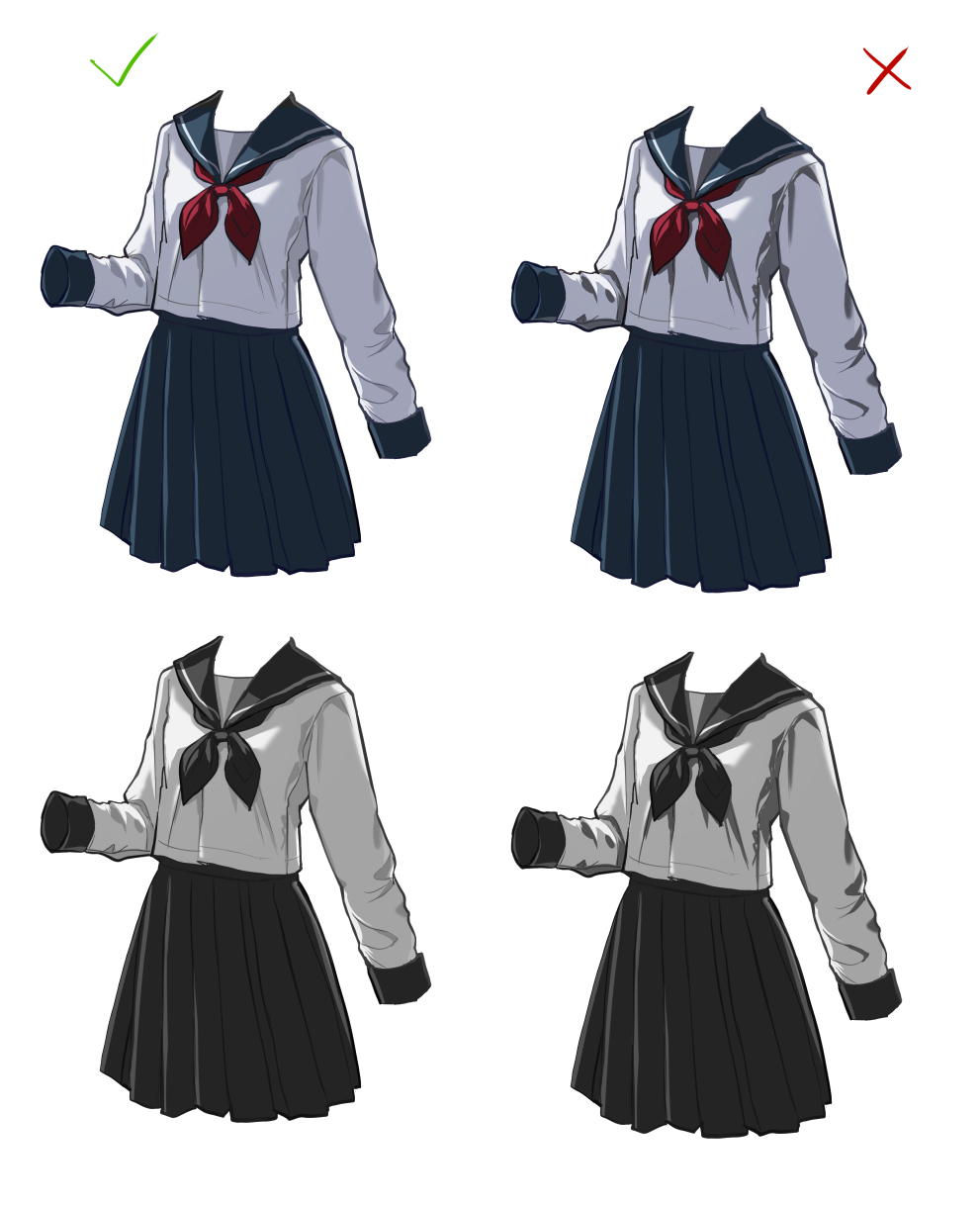
これはライティング設定を右上からの逆光にしたものです↓
This is a shot with the lighting setting set to backlight from the upper right↓
右側が良くない点は、光がそれなりに遮断されているのにもかかわらず更に濃い影が入っているという点です。
確かに濃い影が出来ている部分は布が重なっている部分や角度の変化が大きい部分であり、順光であれば濃い目の影になるのですがこれは逆光です。
光があるから影ができるのですが、既に大きい影は逆光によってできています。
もうその部分は光の当たり具合が悪いので、布の凹凸による「濃い影」はできません。
光が遮断されているといっても弱い光は当たっているので、布と布の重なり部分や凹凸のある部分には「薄い影」ができます。(左側)
What is not good about the right side is that the light is blocked to a certain extent, but there are even darker shadows.
Indeed, the areas where dark shadows are created are those where the cloth overlaps or where the angle changes greatly, and if the light is forward, this shadows would be correct, but this is backlit.
Shadows are created because there is light, but already large shadows are created by backlighting.
Since the light is already poor in that area, "dark shadows" caused by the unevenness of the cloth are not possible.
Even though the light is blocked, weak light still shines through, so "light shadows" are created in the overlapping areas of the cloth and in the uneven areas. (left side)
光の当たり具合を考えていても陰影の色を選ぶのは難しいと思うので、時々グレースケール化して明度バランスを確かめるのが良いです。
グレースケール化についてはこの前の色に関する記事に書いています。↓
Since it is difficult to choose the color of the shading even when considering the light exposure, it is better to convert the image to grayscale to ascertain the lightness balance.
I wrote about grayscaling in this previous article on color.↓
(https://www.fanbox.cc/manage/posts/4613118)
これで布のシワに関する解説は終了です。
今後は以下の記事を更新予定です。
・髪の毛を描くコツ
・ディティールを描き込むコツ
・仕上げについて
This concludes our explanation of fabric wrinkles.
The following articles will be updated in the future.
-about drawing hair
-about drawing details
-about final touches for the illustration
何か至らない点があればコメントにてお伝えください。
その他要望や感想、質問等もお気軽にコメントへどうぞ!
If you have any requests, impressions, or questions, please feel free to comment!
Files