Home
Home

 Artists
 Search
 Recent
 Random
 Posts
Posts
 DMs
DMs
 Tags
Tags
 Random
 Importer
 Import
 FAQ
FAQ
 Account
 Register
 Favorites
 Login
Login

【Tips】色について(About colors) (Pixiv Fanbox)
Content
今回は色彩関係のtipsを軽く解説していこうかと思います。
主な内容は以下の通りです。
・グレースケール化
・色相ずらし
・配色の割合
・色の影響
・色の強調
・色に慣れる練習方法
In this time, I would like to give explanation of color-related tips.
The main contents are as follows
-Grayscaling
-Hue shift
-Color scheme ratio
-Influence of color
-Color enhancement
-How to practice getting used to colors
・時々グレースケール状態にしてみる
グレースケールに変換した時にコントラストや遠近感が失われていないかを確認するのが重要です。
毎回作業データ内の一番上に「カラー」レイヤーを置いているのはこれが理由です。
以下のように白黒状態でもコントラストや遠近感が成立するような状態を目指します。↓
Sometimes convert the image to a grayscale state.
It is important to check for loss of contrast and perspective after converting to grayscale.
This is the reason why we place a "color" layer at the top of the working data every time.
The goal is to achieve a state where contrast and perspective are established even in the black and white state, as shown below.↓
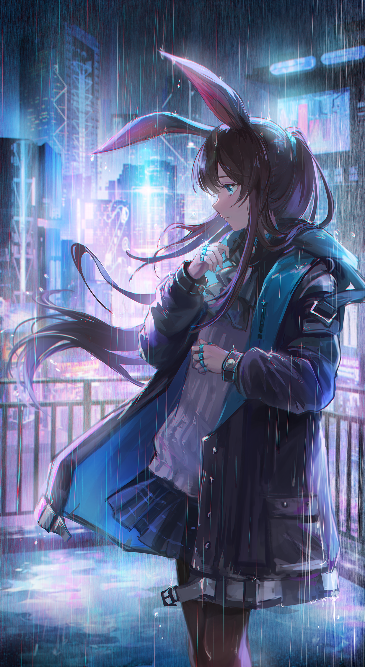
白黒で見た時に、やたらと暗すぎたり明るすぎたり、コントラスト不足だったりする場合は配色を調整する必要があります。
今振り返ってみると、一番上のスルトのイラストは少しコントラストが足りていませんね。
髪の毛と水着部分はもう少し濃い色にしても良かったかもしれません。
この3枚だと、真ん中の魔理沙が一番バランスが良いかなと思います。
If the image is too dark, too light, or lacks contrast when viewed in grayscale, the color scheme needs to be adjusted.
In retrospect, the top illustration is a little lacking in contrast.
The hair and swimsuit areas could have been a little darker.
I think the middle illustration is the most balanced of the three.
※注意
白黒にする時は、
新規レイヤーを作成し、レイヤー効果「カラー」にして真っ白or真っ黒に塗りつぶす
或いは、レイヤープロパティの表現色の項目を「グレー」に変更する
決して「色彩・彩度調整レイヤー」を使って彩度を落としてはいけません
違いは以下のようになります↓
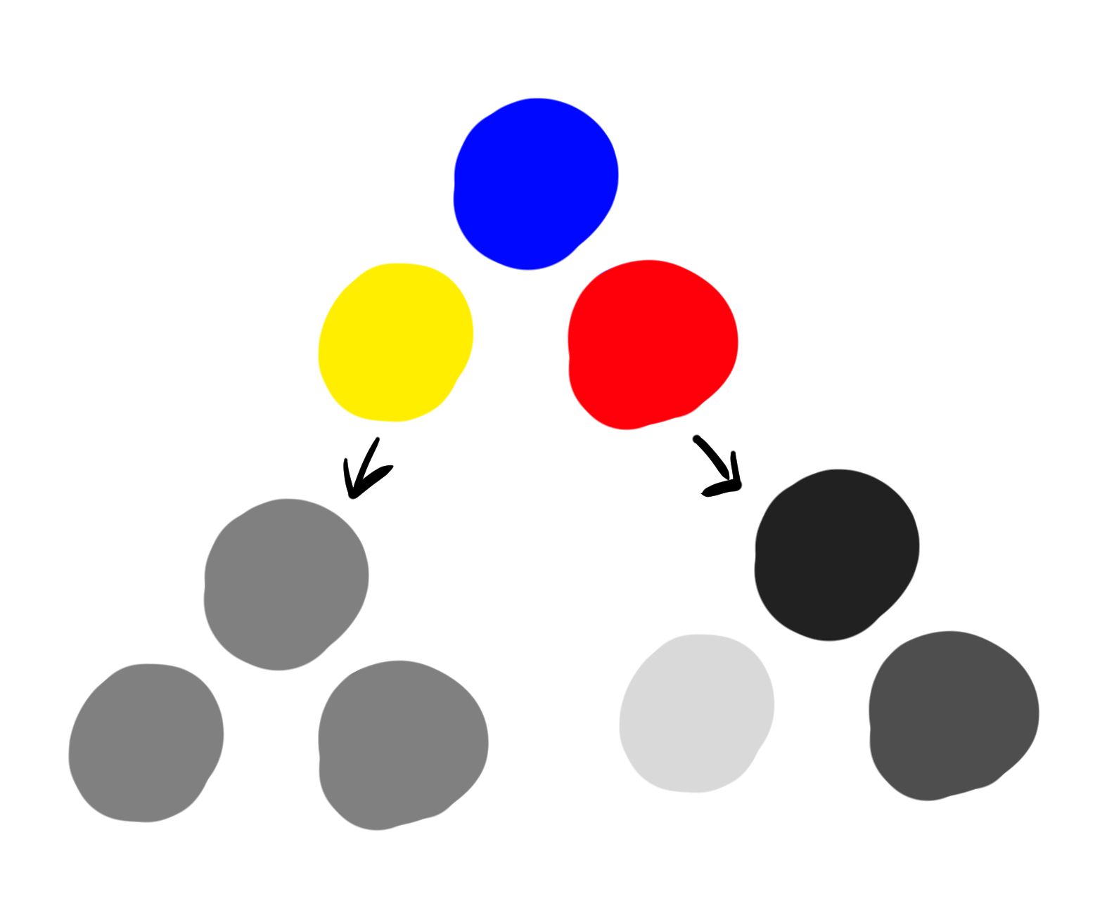
左:色彩・彩度調整レイヤーで白黒にしたもの
右:レイヤー効果「カラー」で白黒にしたもの
*Note
When you make the image grayscale,
Create a new layer, set the layer effect to "Color" and fill it with white or black.
Or, change the Layer Properties' Expression Color item to "Gray".
Never use the "Color and Saturation Adjustment Layer" to reduce the saturation.
The difference is as follows
Left: with the "Color and Saturation" layer
Right: with the "Color" layer
この画像から分かる通り、彩度を落としただけでは色相による明暗差が反映されません。
以前紹介した本「光と色のチュートリアル」で知ったことなのですが、数年気づきませんでした。
As you can see from this image, simply reducing saturation does not reflect the difference in lightness and darkness due to hue.
I learned this from the book "光と色のチュートリアル" that I introduced earlier, but did not notice it for several years.
・色相をずらす
色相とは、赤黄緑青…といったような色味の違いです。
最初の方にも軽く記述しましたが、色相によって色の明暗が変わります。↓
Shift the hue
Hue is the difference between colors such as red, yellow, green, blue, and so on.
As lightly described at the beginning of this section, hue changes the lightness or darkness of a color. ↓
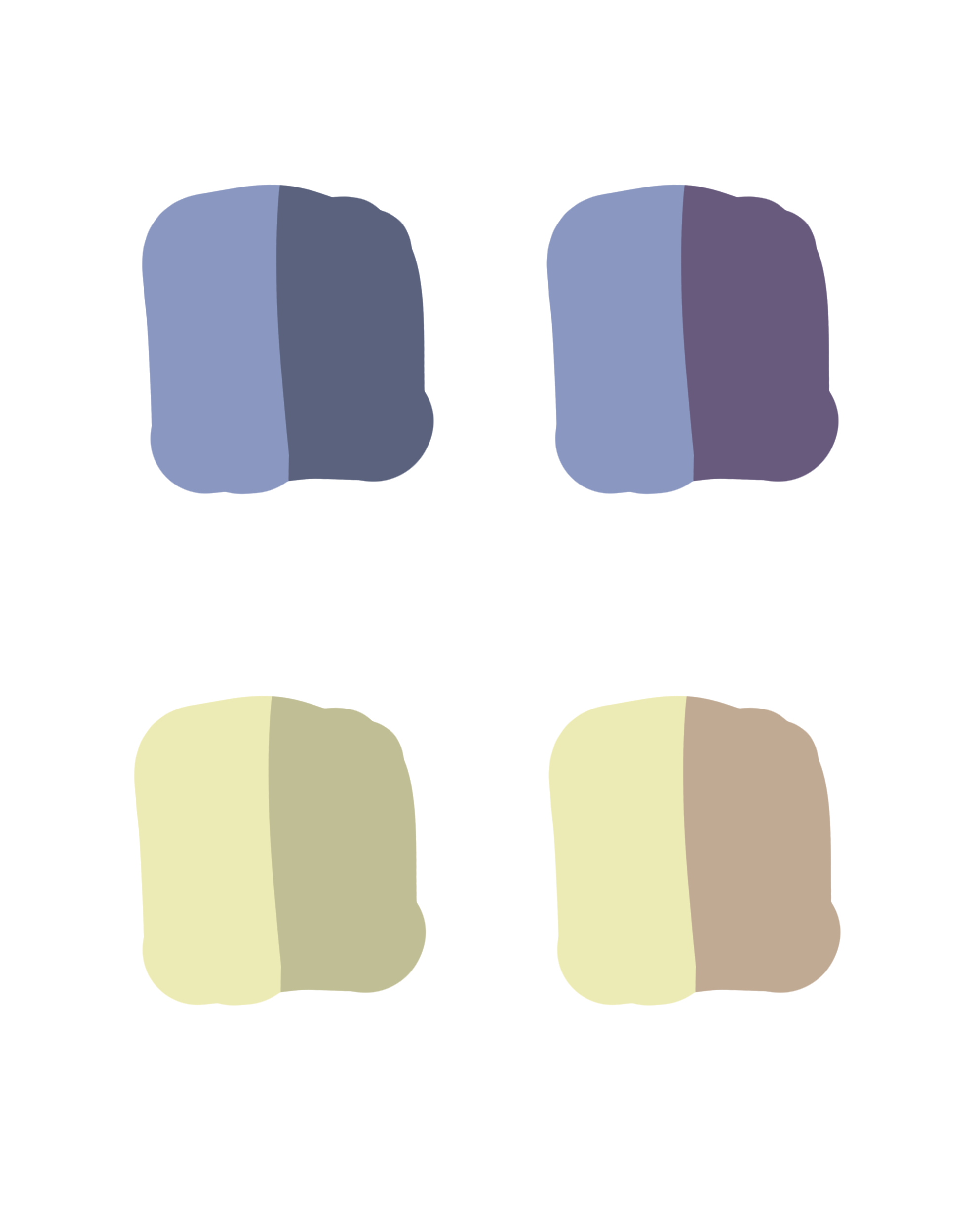
この特徴を着彩時に応用します。
例えば、ベース色が水色の場合は影の色を近い色相である青~紫にずらしたり。
影色を選択する時のもう一つの方法として、単純にベース色から彩度と明度を落とすという方法もあります。
カラーサークルにある四角い枠の中でカーソルをただ左下にずらしていくあの行動ですね。
これも一応影色にはなるのですが、単調でくすんだ印象になりがちです。
カーソルをそのまま下か右下にずらした場合は、彩度が下がったわけではないのでくすんだ印象はなくなるのですが、単調さは残ってしまいます。
This characteristic is applied when coloring.
For example, if the base color is light blue, the shadow color can be shifted to a close hue of blue to purple.
Another way to select a shadow color is to simply drop the saturation and lightness from the base color.
This is that action of simply shifting the cursor down to the left in the square frame in the color circle.
This also creates a shadow color, but it tends to give a monotonous and dull impression.
If the cursor is moved down or to the lower right, the color saturation is not reduced and the impression of dullness disappears, but the monotony remains.
簡単な比較を作ってみました。↓
左:ベース色と同じ色相
右:色相ずらし
両方とも彩度と明度は固定しています。
第一印象として左より右の方が色彩豊かな感じを与えるかと思います。
I made a simple comparison. ↓
Left: same hue as base color
Right: shift the hue
Saturation and lightness are fixed in both cases.
The first impression is that the right color is more colorful than the left.
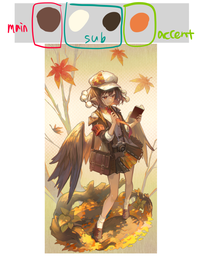
・配色の割合
縦横無尽に色を使いすぎると全体的に濁ったり、まとまりのないイラストになるので、配色の割合というものを決めておく必要があります。
自分は大体以下の割合で色を使っています。
メインカラー:60%程
サブカラー:30%程
アクセントカラー:10%程
※体感的な割合です
配色の割合がバランス良く分けられていれば、使っている色自体は多くてもまとまりのある画面が作れます。
これはどちらかというと背景ありの一枚絵よりは、立ち絵のようなキャラクター主体の絵の時に考えます。
キャラクターの衣装デザイン時はかなり役に立ちます。
逆に複数人スチルイラストのような一枚イラストは色々なモチーフが出てくるので色合いの割合を決めるということが難しいです。
その場合は、色合いを工夫するというよりかは、空気感や遠近感を出してうまく画面のまとまりを作るしかないです。
Color Scheme Ratio
Too many colors used in all directions will make the overall illustration look muddy and uncoordinated, so it is necessary to decide on the proportion of colors to be used in a given color scheme.
I generally use the following color proportions.
Main color: about 60%
Sub-colors: about 30%
Accent color: about 10%
This is a sensible ratio
If the color scheme is well balanced, a coherent screen can be created even if the number of colors used is large.
This is more useful for character-driven pictures, such as standing pictures, rather than single pictures with backgrounds.
This is very useful when designing character costumes.
On the other hand, in a single illustration, such as a multiple-character illustration, it is difficult to decide on the proportion of tints because various motifs appear in the picture.
In such cases, rather than devising color tones, the only way is to create a coherent picture by creating a sense of air and perspective.
ちなみに、このイラストはまずキャラクターの配色を決めてから背景の色を考えています。
色を増やす時はメインカラーに近い色合いを多めに選んでおけば全体が大きく破綻することはないです。
何か物足りない、単調な色合いだと感じる場合は大抵、選んでいる色が近隣の色相ばかりになっていることが多いです。
上に述べた通り、同じような色合いを使っていれば大きく破綻することはないのですが、良くも悪くも無難という印象になります。
その場合はメインカラーとは真逆の色(補色や反対色、彩度や明度が大きく変わる色等)を調味料のように入れておくと見栄えが変わります。
これが所謂アクセントカラーです。
In this illustrations, the color scheme for the characters is decided first, and then the background colors are considered.
When adding more colors, choose more shades that are close to the main colors, so the whole will not break up too much.
If you feel that something is missing or the colors are monotonous, it is usually because the colors you have chosen are all neighboring hues.
As mentioned above, if similar shades are used, the screen will not break down significantly, but it will give the impression of being safe, for better or worse.
In such cases, you can change the appearance by adding colors that are the exact opposite of the main colors (complementary or opposite colors, colors that differ greatly in saturation or lightness, etc) as if they were seasonings.
This is what is called an accent color.
目を惹く絵というものは大体「対比」が上手いことが多いです。
パッと思いつくものだと以下のようなものでしょうか?
多分Twitter等で時々見かけるかと思います。
・無彩色と有彩色
→例)無彩色の中にぽつぽつと彩度の高い目立つ色が入っているハイセンスなイラスト
・密と疎
→例)画面内に色々な要素が散りばめられていて一見複雑そうに見えるがまとまりがあって見やすいイラストや余白の美しさを感じるイラスト
・動と静
→例)曲線が多くて躍動感のある人体+何もない背景の組み合わせのイラスト
こういった対比は知っていても、実際に使いこなせるかは別の話です。いつかちゃんと使いこなせるといいなと思っています。
Eye-catching paintings usually have a good "contrast".
The following are just a few that come to mind.
You may see them on Twitter, etc.
-Colored and achromatic colors
Example: A sophisticated illustration with a few prominent, chromatic colors amongst the achromatic colors.
-Dense and sparse
Example: An illustration with various elements scattered on the screen that looks complex but is coherent and easy to see, or an illustration with beautiful margins.
-Motion and stillness
Example: An illustration that combines a human body with many curves and a sense of movement with an empty background.
Even if you know these contrasts, it is another story whether you can actually use them. I hope to be able to use them properly someday.
・色の影響
物体の色は周りの色に影響されるという法則があります。↓
Color Influence
There is a rule that the color of an object is influenced by the color of its surroundings. ↓
イラスト講座系であるあるの球体を使った例ですね。
それはともかく、これが所謂環境光の影響というやつです。
一枚絵で背景と人物が馴染まないという悩みは大体これがうまくいってないのが原因です。
例としては、背景は夕焼けなのに人物は寒色系カラーしか使われていなかったりなど、背景の色合いと人物の色合いが合っていない状態です。
This is an example of the use of a sphere, which is common in illustration courses.
Anyway, this is what is called the effect of ambient light.
When you have a problem that the background and the character in a single picture do not blend well, it is usually due to the background tones do not match the tones of the character,
such as when the background is a sunset but only cold colors are used for the character.
簡単な解決方法としては、以下の方法があります。
1,ベース色を塗った人物レイヤーの上に背景と同じようなカラーで塗りつぶした乗算orハードライトレイヤーを乗せる
2,ハイライトを入れたりオーバーレイ等で色味の微調整をしたり、必要に応じて加筆
上の方法を使わず、最初から背景と合わせたカラーをベース色にして進めるのも良いのですが、調整が面倒なのと割と頭を使う羽目になるのであまりおすすめしません。
A simple solution is as follows
1,A multiply or hard light layer filled with the same color as the background is placed on top of the person layer with the base color painted.
2,Tweak the color by adding highlights, overlays, etc., and add more if necessary.
It is also possible to use the same color tone as the background as the base color from the beginning without using the above method, but this is not recommended because it is troublesome to adjust and you will have to use your head.
背景と人物の色合いを合わせることを意識したのが分かりやすいのは以下の2枚でしょうか↓
The following two pictures are the ones where I was conscious of matching the background and the color of the character↓
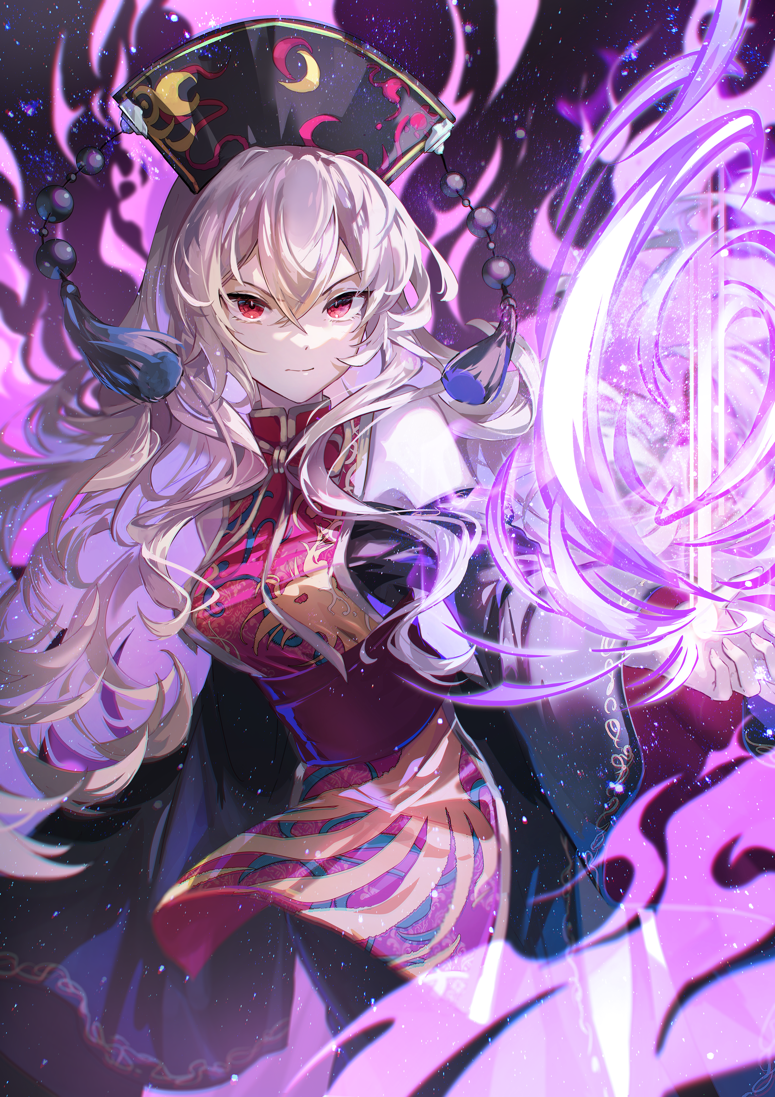
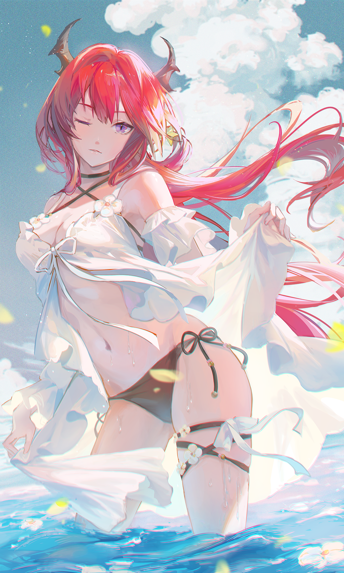
・色の強調
上記は割と現実世界の法則に乗っ取ったような色の使い方でしたが、敢えて盛大に嘘をつくというのも絵の世界ではありです。
最近のイラストだとこれが一番色の強調という嘘をついたイラストだと思います。↓
Emphasis on color
The above was a use of color that seemed to follow the laws of the real world, but it is also possible in the world of painting to dare to tell a big lie.
I think this is the most recent illustration in which I lied about the emphasis of color. ↓
現実世界ではこんな色鮮やかにはならないですが、せっかく「絵」を描いているのでリアルさより面白さや見栄えを重視しても良いはずです。
なので、敢えて彩度を高くしたり、肌の赤みや水による青みを強調しています。
人間の肌というものは半透性の物質なので、光があたると皮膚の下にある血液の赤みが見られます。
試しに電灯や太陽の光に向けて手をかざしてみると分かりやすいです。
手のふちに赤みが見えるはずです。
その特徴を強調したものが上のイラストになります。
髪の毛も本来ならここまで彩度が高くはならないのですが、寒色系の空とは対比的にしたかったので敢えてこうしています。
In the real world, colors would not be this vivid, but since we are painting a "painting," it should be more interesting and presentable than realistic.
Therefore, I dared to increase the color saturation and emphasize the redness of the skin and the bluish tones caused by the water.
Human skin is a semi-transparent substance, so when light hits it, you can see the reddish color of the blood under the skin.
It is easy to see this when you hold your hand up to an electric light or the sun's rays as a test.
You should see redness on the edge of your hand.
This feature is highlighted in the illustration above.
The hair would not normally be this saturated, but I wanted to create a contrast with the cold sky, so I did this.
・色に慣れる練習方法
1,好きな色合いのイラストをひたすらスポイトして色の変化を確認する
一見暗いように見える色でも意外と彩度が高めだったり、無彩色だと思っていた色が有彩色だったり、明暗差が思ったより激しかったり、色々発見があると思います。
2,大体法則のようなものが分かったら、自分のイラストを描く際に取り入れてみる
3,目指すイラストと自分のイラストを並べて、理想に近づけるようにひたすら試行錯誤(これに関しては色の練習に限らず使えます。)
あとは着彩後はグレースケール化して明暗バランスを確認するのを徹底してみてください。
段々色による明暗差というものが感覚に刻み込まれていきます。
How to practice getting used to colors
1,Confirm the color changes by continuously dropper an illustration of your favorite color style.
You may find that a color that looks dark at first glance has unexpectedly high saturation, or a color you thought was achromatic is chromatic, or the difference between light and dark is more dramatic than you thought.
2,Once you have a general idea of what the rules are, try to apply them to your own illustrations.
3,Line up the illustration you are aiming for with your own illustration, and try to get it as close to the ideal as possible through trial and error (this is useful not only for practicing colors).
After coloring, try to check the balance of light and dark by grayscaling.
If you repeat this process, the contrast between the colors will gradually become ingrained in your senses.
色選びがそもそも苦手という場合は、こういったカラージェネレーターを使うというのも手です。↓
If you are not good at choosing colors, you can use a color generator. ↓
embed: color.adobe.comこれでひとまずは色彩のtips解説は終了します。
今後新しい発見等あればまた記事を作成したいと思います。
This concludes the explanation of color tips for the moment.
If I find anything new in the future, I would like to write another article.
何か至らない点があればコメントにてお伝えください。
その他要望や感想、質問等もお気軽にコメントへどうぞ!
If you have any requests, impressions, or questions, please feel free to comment!
Files