Home
Home

 Artists
 Search
 Recent
 Random
 Posts
Posts
 DMs
DMs
 Tags
Tags
 Random
 Importer
 Import
 FAQ
FAQ
 Account
 Register
 Favorites
 Login
Login

【2022/03】Process - Our Toy (Part 9) | 過程 - Our Toy (Part 9) (Pixiv Fanbox)
Content
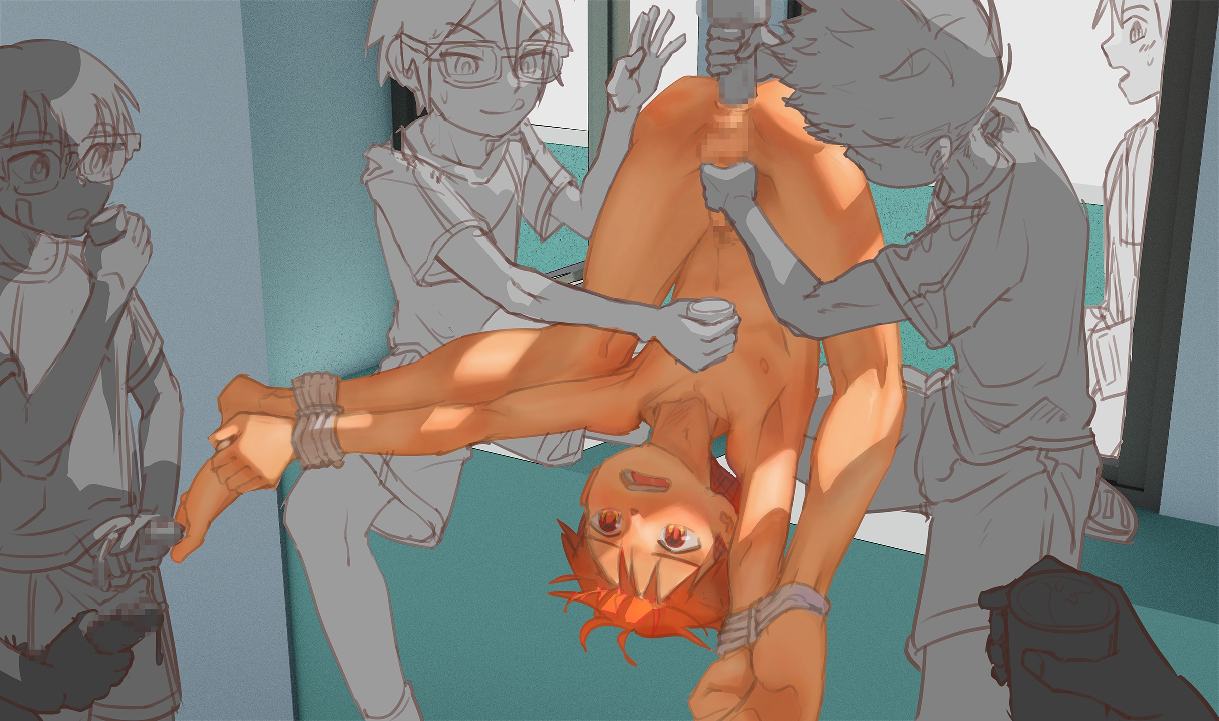
Draft | 草稿
"i really can't cum anymore, please let me go"
"Looks like he needs a lil refill"
Our Toy (Part 9) (。•̀ᴗ-)✧! Mutoh is kindly providing protein supplements for his classmates today, I'm sure it's voluntary (・ัω・ั). Special thanks to autumn (@Aut_Autumn_V2)'s boy "Kay" and smmania135's boy "VIKTOR" for cameo! (Glasses on VIKTOR was based on request XD)
「我真的射不出來了,拜託放我走」
「看來只能幫你補充一下了呢」
Our Toy (Part 9) (。•̀ᴗ-)✧!武藤非常好心地為同學們提供了本日的蛋白質補充服務,大概是自願的吧 (・ัω・ั)。特別感謝 autumn (@Aut_Autumn_V2)的孩子「Kay」以及 smmania135的孩子「VIKTOR」來這次的客串!(VIKTOR的眼鏡是對方要求的XD)
Color Test | 顏色測試
So Twitter randomly showed me this tweet, which I thought it's a process I wanted to try out myself. With a bit of tweaks here and there, above was what I came up with. However, I wasn't very happy with the result. While the process is really cool, I don't think it works well with my style ୧(﹒︠ᴗ﹒︡)୨
推特給我看了上面那則推文,我覺得這過程挺酷的,於是就嘗試了一下。自己有稍微做些調整,上面就是我測試的結果,但我對結果不是很滿意。儘管流程很酷,但在我的風格上似乎有些突兀 ୧(﹒︠ᴗ﹒︡)୨
Here's another test I did, the color is based on the Taiko doodle I did before, but the process is completely different. I guess this can also be a practice/test for me to see how well I know my layer blend mode and adjustment layers ww
這是我做的另一個測試,上面的顏色是根據我那張太鼓塗鴉來配的,但這次使用的流程完全不同。我猜這可以算是一個練習/考驗自己使用圖層混合模式跟調整圖層的能力ww
With some contrast adjusted, this was the version I decided to keep and apply to all other characters
在調整了一些對比後,這是我最後決定套用在所有其他角色上的顏色
Colored Draft | 顏色草稿
Dark skin boy with tanlines (*´ч ` *)👌 I guess I'll still have to add a sky background, and add some clothes on Mutoh as variations.
深色皮膚配曬痕(*´ч ` *)👌 我想之後還會要弄個天空背景,以及在武藤身上加點衣服當差分
Rendering (Character) | 細修(角色)
Rendering (Background) | 細修(背景)
I feel like I always rush the background a bit after rendering the characters since it's so tiring to render so many characters already. Perhaps next time I'll render the background first 🤔
感覺自己背景總是會有點偷懶,因為細修完一堆角色之後真的有夠累,也許以後我該嘗試先細修背景再修角色🤔
Post Processing | 後製
Now that I think about it, I definitely exaggerated the lighting a bit too much because I wanted to make the steamy/smelly hot feeling of the room, to the point that the lighting can be seen as inconsistent (^._.^;). Though, I must say, it makes the image readability pretty good.
Time to work on 40,000 project and variations :3c
現在想想,為了做出環境有點蒸氣/臭味的感覺,我好像誇示光影有點太超過了,甚至可能會覺得我的光影不太統一(^._.^;)。不過目前圖片的可讀性還挺高的
是時候回去做40,000企劃及畫差分了 :3c
Files