 Home
Home

 Artists
 Search
 Recent
 Random
 Posts
Posts
 DMs
DMs
 Tags
Tags
 Random
 Importer
 Import
 FAQ
FAQ
 Account
 Register
 Favorites
 Login
Login

[ Ayato / Thoma / guards ] Step-by-step TUTORIAL (+HD + PSD) (Patreon)
Downloads
Content
I'm going into much more details about the process of this coloring style, because I've experimented with it for long enough to have it perfectioned* and rationalized to a point I can explain it step by step⁓
*there's no limit to perfectioning art, but I feel like this stage is solid enough for you to learn something from it and maybe explore it further or develop it how you feel like!
✧ FOREWORD
There's a huge difference between this coloring technique I'm about to explain (1) and my digital painting, fully-rendered, highly detailed one (2)...
(1) ALWAYS follows the SAME process!
No matter the background, the color palette, the characters... once you pick the base colors, all that's left is following the very same steps I'll tell you and paint over the couple details you want to fix!
(2) is never the same...
I can explain in details how I've worked on a single illustration, but most of the times there's no exact scheme I follow. After setting the base colors I try many many adjustment layers and different shadows/highlights combinations until it work then blend, repaint, fluidify...
✧ OVERVIEW
These are the works I've done following the technique I'm about to show you:

I like how the technique works with or without background and allows you to more or less blend the characters with the surrounding! It was the possibility and freedom I had been looking for for long!
These are the coloring steps I use and that I'll be showing you:
- flat colors
- shadows
- subsurface scattering
- highlights
- reflected lights
- rendering
- final touches
⚠ The following tutorial explains my coloring process in Photoshop. I'm aware that some of the features I use are not available in other software (though they can be recreated), but if you wanted to try them in a Photoshop environment... there's a Photoshop web version, completely online and free, called Photopea, where you can upload, edit and create psd files!
⚠ FIND IN ATTACHMENTS THE PDF WITH THE PROCESS IMAGES! You can browse it to better follow this tutorial and more easily notice the differences from a stage to the other!
Let's begin⁓
✧ FLAT COLORS
Layer blending mode: Normal
Opacity: 100%
This is the starting point - clean lineart, grey fill:

At this stage I've taken various screenshots of the location I have in mind and laid out some of them behind the characters until I find the most suitable. Deciding the background before coloring is essential.

I often color-pick from the background and, when the colors I need can't be found in the right saturation and lightness settings, I adjust them later or blend them with the base hue of that color.
(🔴) Ayato's white suit, gold accents and Itto's horns colors are color-picked directly from the background.
(🔵) Other colors are picked from nearby areas with the same value, then altered through the Hue/Saturation palette (see below) (shortcut: CTRL+U). Move the arrow along the Hue bar.
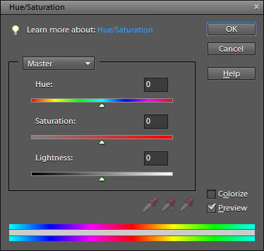
After coloring most of the illustration, you'll be able to autonomously pick out of the color wheel the "missing colors" you can't find in the background. If you later notice some colors don't match the nearby ones, always remember the Hue/Saturation palette can come handy! Try operating on all 3 bars!
An additional cool touch you can add at this point is ✨colored lineart!✨

✧ SHADOWS
Layer blending mode: Multiply
Opacity: variable*
*This layer's opacity depends on two factors:
- the lightness of flat colors;
- the amount of contrast you want to create;
both inherently depend on the background.
Once you're done with flat colors (don't be obsessed with perfection, until the rendering stage you can still adjust anything very easily!) here's what we want to do:
1️⃣ Duplicate and merge the colors layer(s) (CTRL+ALT+E)
2️⃣ Set the new layer's blending mode to Multiply
3️⃣ Create a Layer Mask (see after progress image) and invert it (CTRL+I)
4️⃣ Select the the Layer Mask (by clicking on its icon) and paint the shadows. Be sure you're always painting/erasing the Layer Mask, not the layer itself!

ABOUT LAYER MASKS - quick tips!
(they'll make your life much easier, please get used to them! They're easily used than explained!)
▶ A Layer Mask is created by clicking on the rectangle icon with a circle in it at the bottom of the Layers palette (see below).
▶ Painting on a Layer Mask means painting its respective layer's opacity.
WHITE = 100% opacity (layer visible)
BLACK = 0% opacity (layer invisible!)
GREY = 99% to 1% according to it's lightness.
▶ Always paint WHITE or BLACK on your Layer Mask, because painting grey will make it harder to manage the Layer Mask. If the intent is blending, I suggest you use a soft brush instead.

✧ SUBSURFACE SCATTERING
Layer blending mode: Overlay / Hard Light
Opacity: variable, just try and see how you like it better!
Subsurface scattering is a mechanism of light transport that happens when light penetrates the surface of a translucent object (see Wikipedia for the scientific explanation) and visually results in a highly saturated portion of the surface between the shadow area and the illuminated area (see below).

So, how to recreate subsurface scattering? In Photoshop, the process is almost automatic:
1️⃣ Duplicate the shadows layer (CTRL+J), make sure the new layer is on top
2️⃣ Set the new layer's Fill to 0% ←IMPORTANT!!
3️⃣ Double-click on the layer to open the Layer Style palette and double-click on the Inner Glow tab. These are my settings (sorry Italian), you can adjust yours differently of course - I recommend Overlay or Hard Light as blending mode!

4️⃣ Once you're happy with your settings, close the Layer Style palette by clicking OK.
5️⃣ Right-click on the layer and choose "Rasterize Layer Style", then set the layer's blending mode to Overlay (or the same blending mode you had previously chosen in the Layer Style palette) so it appears the same as at point 4️⃣!
6️⃣ Select the characters skin only, then invert the selection (CTRL+SHIFT+I) and erase the area (DEL). After this you can further erase the subsurface scattering effect where you think it makes the skin too unnaturally red, it's up to you!

✧ HIGHLIGHTS
Layer blending mode: Color Dodge (Add)
Opacity: variable
This step is essentially the same as the SHADOWS one, with slightly different settings:
1️⃣ Duplicate the shadows layer (CTRL+J) and move the new layer on top of the subsurface scattering one
2️⃣ Set the new layer's blending mode to Color Dodge (Add)
3️⃣ Create a Layer Mask and invert it (CTRL+I)
4️⃣ Select the the Layer Mask (by clicking on its icon) and paint the highlights. Once again, be sure you're always painting/erasing the Layer Mask, not the layer itself!

✧ REFLECTED LIGHT
Layer blending mode: Normal
Opacity: 100%
The reason why you're able to see even the areas in the shadows is because light is reflected by all the surfaces, light is everywhere⁓ The bright areas are illuminated by direct light, shadowy areas are illuminated by reflected light. The color of the reflected light is the color of the closest surface to the object we're considering... the closest object to our characters? The blue sky*.
*This is arguable. You could say it's the brown wood of the building. I genuinely believe the sky's more powerful but honestly I chose blue over brown for aesthetic and contrast reasons.
In practice, this step is very easy:
1️⃣ Create a new layer (CTRL+SHIFT+N) on top of all the previous ones
2️⃣ Select the shadows layer's pixels (CTRL+click on its thumbnail)
3️⃣ Use a soft brush to paint inside the selection with your chosen reflected light color!

✧ RENDERING
Layer blending mode: Normal
Opacity: 100%
Everything's set at this point! If you've been precise enough, you could even skip this step... if you're a lazy perfectionist and you had left things for later and now you want to spend 2 to 4 more hours to detail what's missing, well, bear with me.
This is how I proceed:
1️⃣ Select all the layers created so far (except for the background layer) and create a group (CTRL+G), then duplicate and merge the group (CTRL+ALT+E)
2️⃣ Hide the group, from now on we'll work on the new layer!
Why? Imagine you want to erase Itto's horns - if you work with separate layers, you'll have to erase the horns from every single one of them which is gonna terribly slow you down. What if you wanted to use the Fluidify tool... well you can't use it on separate layers* (unless you're a CSP 2.0 user, you lucky)
*but you can Filter > Filter gallery (CTRL+ALT+F) to apply the latest used filter - in our case the Fluidify effect - to every layer you select though I am NOT here to encourage you to follow the hard way fghjk
3️⃣ Give up working on separate layers and render! I do it in a couple stages...
1️st) Blend and detail what you have

2️) Paint additional details

✧ FINAL TOUCHES
▶ Background blurring + effects
I added the final background at the RENDERING stage, but I'm gonna explain how I edited the screenshot here.
I always apply two filters:
Filter > Filter Gallery > Paint Daub
(Brush size: 10, Sharpness: 0, Brush type: blurred)
Filter > Blur > Blur
(Radius: 5-9 pixels)
My favorite final touches to the background are painting thin dust and enhancing the brightness of the light source (which I haven't done in this illustration since the contrasts balance was already good!)

▶ Aerial perspective
So it is called the effect the atmosphere has on the appearance of objects progressively far from the viewer, resulting in the contrast between closer and farther objects to decrease.
Visually, it translates to progressively further objects fading into the background, progressively turning the predominant background color. This color is usually the same as the one chosen for REFLECTED LIGHT, which, in this case, is the blue of the sky.
I add aerial perspective by selecting each character shape and using a big soft brush to paint around where they overlap, then I lower the layer's opacity as I please.
Layer blending mode: Normal
Opacity: variable

▶ Rework the colors brightness and contrasts (if needed)
It was needed. The colors were nice but they could be nicer!
I adjusted them with a simple trick (this one is Photoshop only):
Image > Adjustments > Color Lookup > 3Strip.look
Layer blending mode: Normal
Opacity: 44%

▶ Check the outcome the day after!
You need fresh eyes to check your work and find out what else can possibly be improved! Can you spot the big change here and guess how and why I did it?

▶ Add text
I've learned how dialogues not only enhance the illustration for the viewers, but also help the artist define during the sketching phase the direction they want to take. I write dialogues to help me decide the characters expressions and I later re-read them to keep the focus and further detail the faces!
The settings of my speech bubbles:
Layer blending mode: Normal
Opacity: 75-100%
Font: VTC Letterer Pro Regular
Font size: 12 - 14 px (in a 4764×2867px, 300 dpi canvas)

-
If you made it this far, I genuinely hope you found the "tutorial" useful!
I'm available to clear any doubt about this process or Photoshop, you can comment here or better (because I can send images) on Discord, in the ⛲ FOUNTAIN Patrons' dedicated channel!
💌 HD + PSDs in attachments!
Files

