Home
Home

 Artists
 Search
 Recent
 Random
 Posts
Posts
 DMs
DMs
 Tags
Tags
 Random
 Importer
 Import
 FAQ
FAQ
 Account
 Register
 Favorites
 Login
Login

Welcome to New Dawn pg. 5. (Patreon)
Published:
2018-04-12 17:43:41
Imported:
2021-05
Content
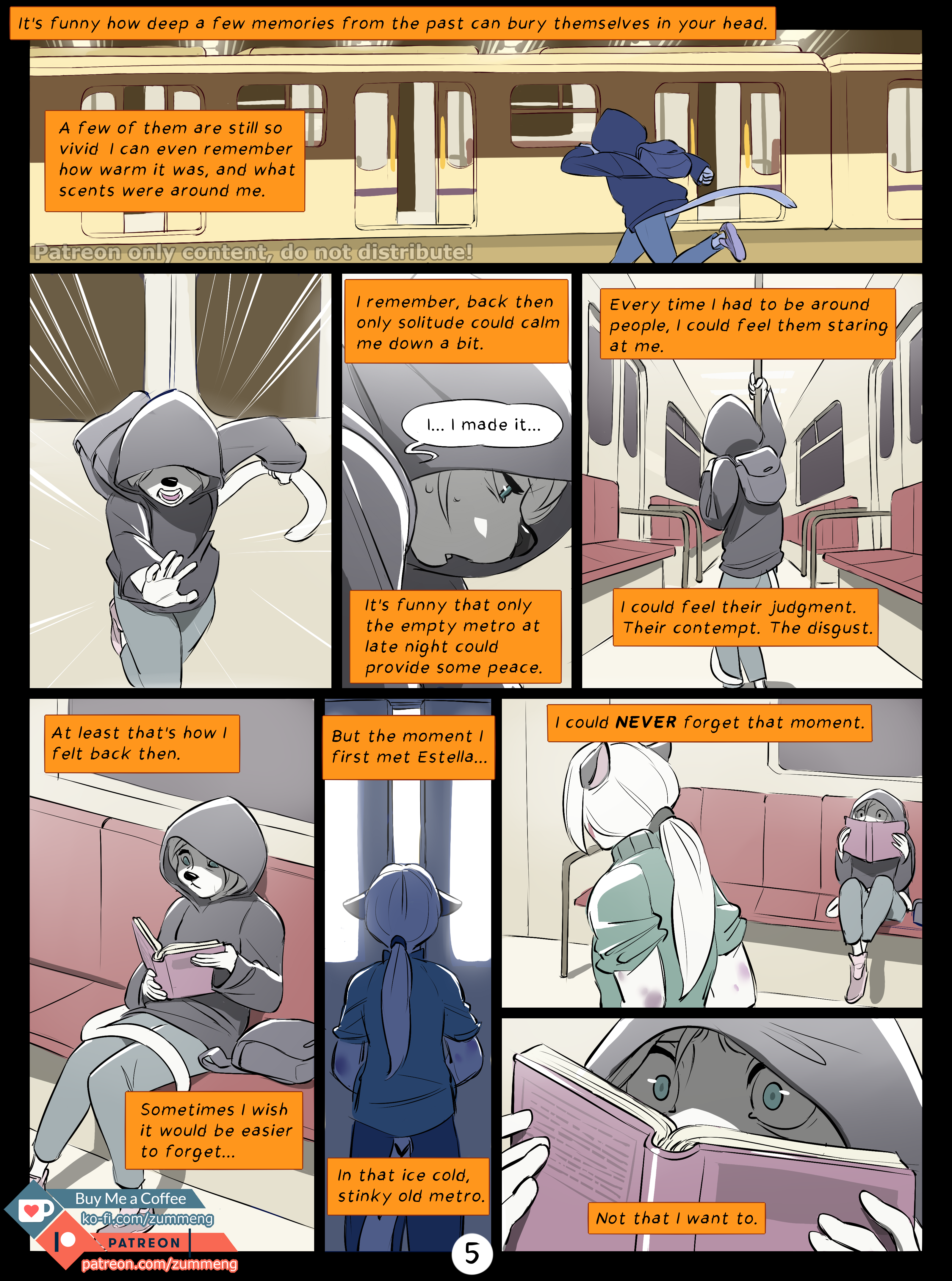
Here is page 5. :)
Colors are much more pale and pastel-like on this page than on the previous ones. I tought that would give a nice feeling to the dark past :)
Files