Home
Home

 Artists
 Search
 Recent
 Random
 Posts
Posts
 DMs
DMs
 Tags
Tags
 Random
 Importer
 Import
 FAQ
FAQ
 Account
 Register
 Favorites
 Login
Login

New UI - Rejected No More (Patreon)
Content
Hi guys,
I know that some of you didn't like the fact that you had to search for buttons in the scene, because it was not too intuitive.
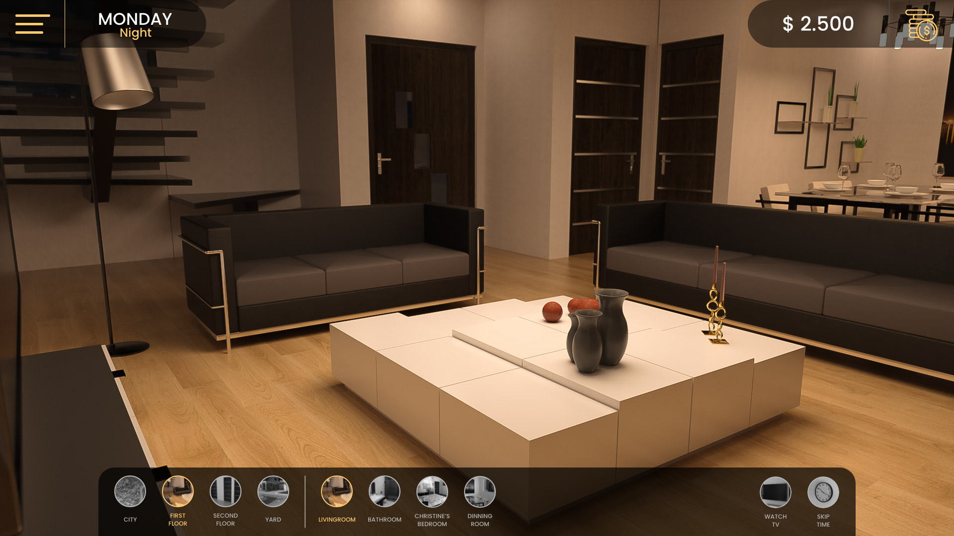
I just finished the new UI. From now on there will be a footer which will be split in two. On the left side you have the navigation part. The rooms you can go to from the current one, while on the right side you have all the actions you can perform in that rom.
Also the Skip Time button will appear always except for when it's late night. In that case you'll need to go in your room and sleep.
The previous way of navigating in the scenes will still be available, so that means if you want to leave the room you either click on the door or you can click the button to leave it. The same thing goes for everything else.
UPDATE*
Reading your comments I came up with a solution that could work well. Having all the rooms in the footer and the actions you can perform in one room might look bad on the eye, so I decided to split the house in 3.
1. First floor : Livingroom, bathroom, Christine's room and dinning room
2. Second floor : Hallway, Justin's room, Bathroom and Jackie's room
3. Yard: Back Yard, Front Yard, Patio and Tools Room.
Also the first button for every building will always be the City, where you can go to the map.
The first 8 buttons will be available in every room of that floor. If you are in the bathroom you can still go in the yard or directly to Christine's room.
On the left side there will be the activites you can do in each room.
I hope you like this design better.
Best regards,
Jason
Files