Home
Home

 Artists
 Search
 Recent
 Random
 Posts
Posts
 DMs
DMs
 Tags
Tags
 Random
 Importer
 Import
 FAQ
FAQ
 Account
 Register
 Favorites
 Login
Login

Let's talk about constructive critique! (Patreon)
Content
You've probably all heard me rant by now about how much I loathe unsolicited critique. One of the most common responses to people saying they dislike unsolicited critique is "how will you improve?" But the word "unsolicited" is there for a reason — most artists do seek critique, we just do so on our own terms and from specific people whose expertise we trust! But since I normally seek critique privately from trusted friends and peers, I wanted to give you guys a little window into how that process works for me.
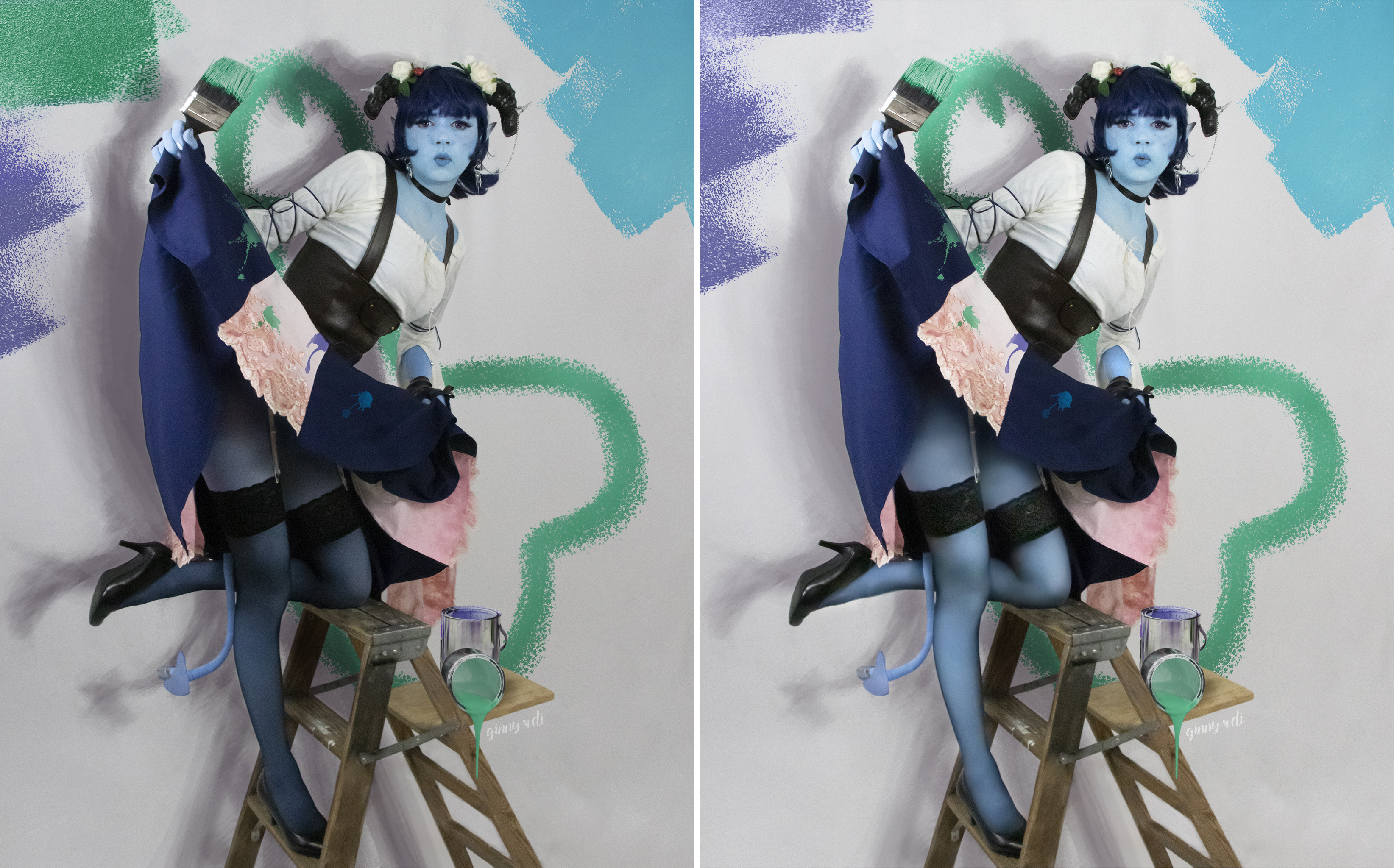
I shared my finished pin-ups with some personal friends recently to ask for critique before I released them to the public. Here's are some of the edits I incorporated into the featured image, at the suggestion of my friends:
- The paint colors are overwhelming. I wanted to keep the paint a little chaotic (because that's Jester!) but I simplified the color range by keeping the upper corner paint swipes in just two colors instead of three.
- The shadow is distracting. Because the back wall was already so busy, I toned down and softened the shadow a little to make it easier for the eye to find the focus of the image.
- The legs are too dark. The way I had the lighting set up for this shot, the legs were much, much darker in this image than the face, and darker than the legs in any of the other photos. I brightened them to bring more balance to the image.
While we're at it, here is a critique I chose to disregard:
- The green shape behind her is distracting. I messed with the shape (yes, it's a penis) a little in response to this critique, but I found that everything I did either made it look less like a penis (bad! some people already didn't see it until it was pointed out) or too much like a penis (I don't want people to specifically avoid buying the print because it has an obvious penis and they don't want that on their wall!)
Here's another before-and-after:

Critiques I took:
- The tail is the same in every photo. Due to the way I had the tail suspended from my skirt, it happened to be hanging the same way in each shot. By changing it out with a different tail shape from an unused shot, I both brought some variety to the print set, and made the tail more noticeable in this shot.
- The legs are too dark, but the thigh is brighter than the face. Generally, the eye goes to the brightest part of a photo, so by brightening the face, I made sure that my butt wasn't the center of attention! I also brightened up the legs under the stockings just a bit to better balance the picture.
- The shadow is too heavy. By having the shadow fade out a little sooner, I made it feel more natural and allowed the silhouette of the figure to be highlighted more.
Critique I didn't take:
- Photoshop in a real lollipop. A friend sent me some really cool images where I photographer had photoshopped in a real (small) lollipop at large size with a model, and it for sure looked really cool! But since I use this specific lollipop in all my Jester images, I wanted to stick with the theme. Plus, I knew I'd get a lot of Jester cosplayers asking me where I got the lollipop, and "I Photoshopped it" is not an answer I really enjoy giving!
As you can see, the changes between versions are pretty slight, but I think they improved the final product and helped me feel more confident that I was putting my best foot forward. I strongly encourage any artist to seek critique so you can improve, but please don't feel like you're obligated to listen to any ol' stranger on the internet in order to grow as a creator. Not everyone's critique is going to help you, so you should feel free to a) seek it from the sources you trust, and b) choose not to act on it if you don't think it's going to benefit your final product.
Files